12.5 Regression line
Add a regression line with geom_smooth(). A smoothed line can help highlight the dominant pattern/trend.
ggplot(data=geneexp, mapping=aes(x=WT1, y=WT2)) +
  geom_point(color="red", size=2.5, shape="diamond") +
  ggtitle(label="my first ggplot") +
  theme_linedraw() +
  geom_smooth()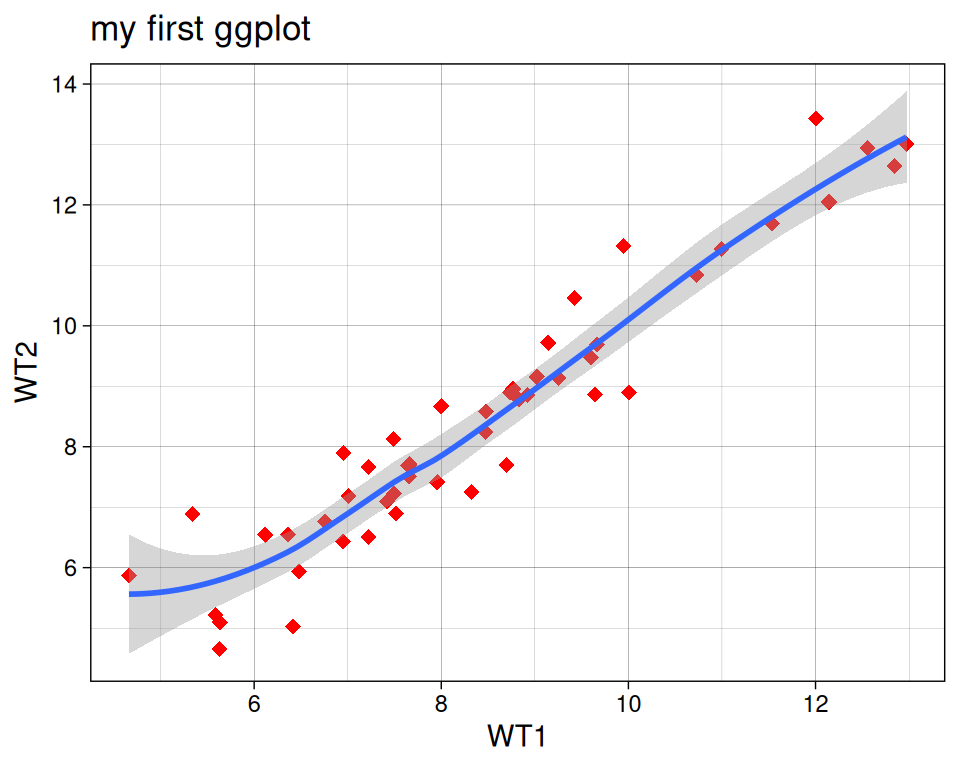
Remove the confidence interval:
ggplot(data=geneexp, mapping=aes(x=WT1, y=WT2)) +
  geom_point(color="red", size=2.5, shape="diamond") +
  ggtitle(label="my first ggplot") +
  theme_linedraw() +
  geom_smooth(se=FALSE)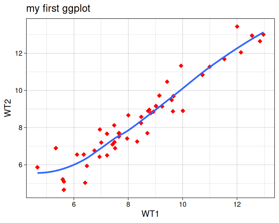
Different methods can be used to fit the smoothing line:
- “lm”: linear model.
- “glm”: generalized linear model.
- “gam”: generalized additive model.
- “loess”: local polynomial regression.
- A function (more advanced)
By default, the smoothing method is picked based on the size of the largest group across all panels.
ggplot(data=geneexp, mapping=aes(x=WT1, y=WT2)) +
  geom_point(color="red", size=2.5, shape="diamond") +
  ggtitle(label="my first ggplot") +
  theme_linedraw() +
  geom_smooth(se=FALSE, method="lm")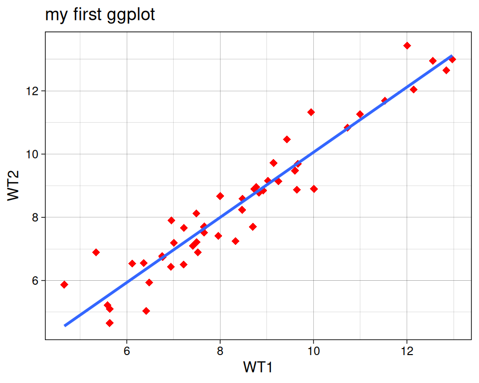
More advanced (as reference, or if someone asks): add correlation coefficient:
You can add the correlation coefficient between the 2 variables, using another function from the {ggpubr} package:
ggplot(data=geneexp, mapping=aes(x=WT1, y=WT2)) +
  geom_point(color="red", size=2.5, shape="diamond") +
  ggtitle(label="my first ggplot") +
  theme_linedraw() +
  geom_smooth() +
  ggpubr::stat_cor(method = "pearson", label.x = 5, label.y = 12)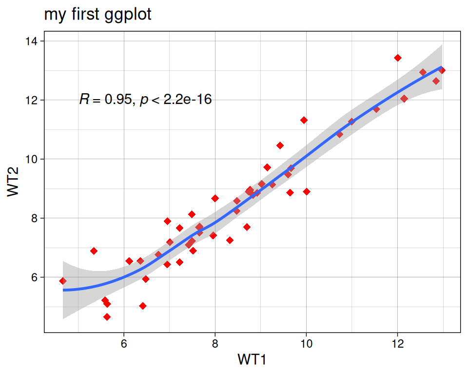
Note: with label.x and label.y, you decide where the label will be located in the plotting area (these parameters are not compulsory).