13.1 Exercise 2 - Barplots
- Import GSE277039/gencode.vM38.annotation_sample.csv in an object that you will call gtf. You can check the first 20 rows of gtf using the head() function: check the help page to see how it works.
correction
The data in gtf represents a small subset of the gencode vM38 mouse gene annotation.
## # A tibble: 20 × 7
##    chr       start       end strand gene_id               gene_type      gene_symbol
##    <chr>     <dbl>     <dbl> <chr>  <chr>                 <chr>          <chr>
##  1 chr10  41361638  41366365 -      ENSMUSG00000019822.13 protein_coding Smpd2
##  2 chr19   3901773   3944369 +      ENSMUSG00000024843.16 protein_coding Chka
##  3 chr4   37297905  37298025 +      ENSMUSG00000088718.4  snoRNA         Gm22732
##  4 chr9   99125420  99182457 +      ENSMUSG00000056267.15 protein_coding Cep70
##  5 chr14  18063426  18072247 -      ENSMUSG00000095056.8  protein_coding Gm3159
##  6 chr7  135886020 135901318 -      ENSMUSG00000127332.1  lncRNA         Gm72246
##  7 chr16  34470291  34498988 +      ENSMUSG00000022832.12 protein_coding Ropn1
##  8 chr11  46345762  46372082 +      ENSMUSG00000020399.15 protein_coding Havcr2
##  9 chr6    5767578   5768992 -      ENSMUSG00000136477.1  lncRNA         Gm67521
## 10 chr7   42258950  42292012 -      ENSMUSG00000074158.10 protein_coding Zfp976
## 11 chr15 102426627 102432111 +      ENSMUSG00000023051.13 protein_coding Tarbp2
## 12 chr12  85253391  85255602 -      ENSMUSG00000126100.1  lncRNA         Gm59518
## 13 chr9  109946776 110069246 +      ENSMUSG00000032481.18 protein_coding Smarcc1
## 14 chr3   94882042  94914154 +      ENSMUSG00000038861.15 protein_coding Pi4kb
## 15 chr15  83960298  83989955 -      ENSMUSG00000018865.10 protein_coding Sult4a1
## 16 chr13  48298781  48310585 +      ENSMUSG00000127329.1  lncRNA         Gm52065
## 17 chr17  46875397  46940430 -      ENSMUSG00000023972.11 protein_coding Ptk7
## 18 chr5  143950816 143950919 +      ENSMUSG00000119602.1  snRNA          Gm24311
## 19 chr7   41485238  41522136 -      ENSMUSG00000090383.3  protein_coding Vmn2r58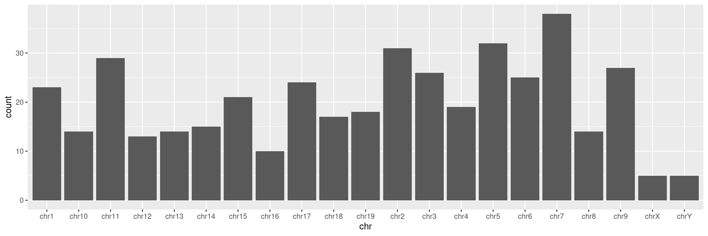
## 20 chr3 89344013 89358259 + ENSMUSG00000042613.10 protein_coding Pbxip1- Create a simple barplot displaying the number of genes per chromosome (tip: you want to visualize each chromosome on the x axis):
3. Keep chromosomes on the x axis, and split the barplot per gene type.
TIP: remember how we set color= in mapping=aes() function in the scatter plot section? Give it a try here!
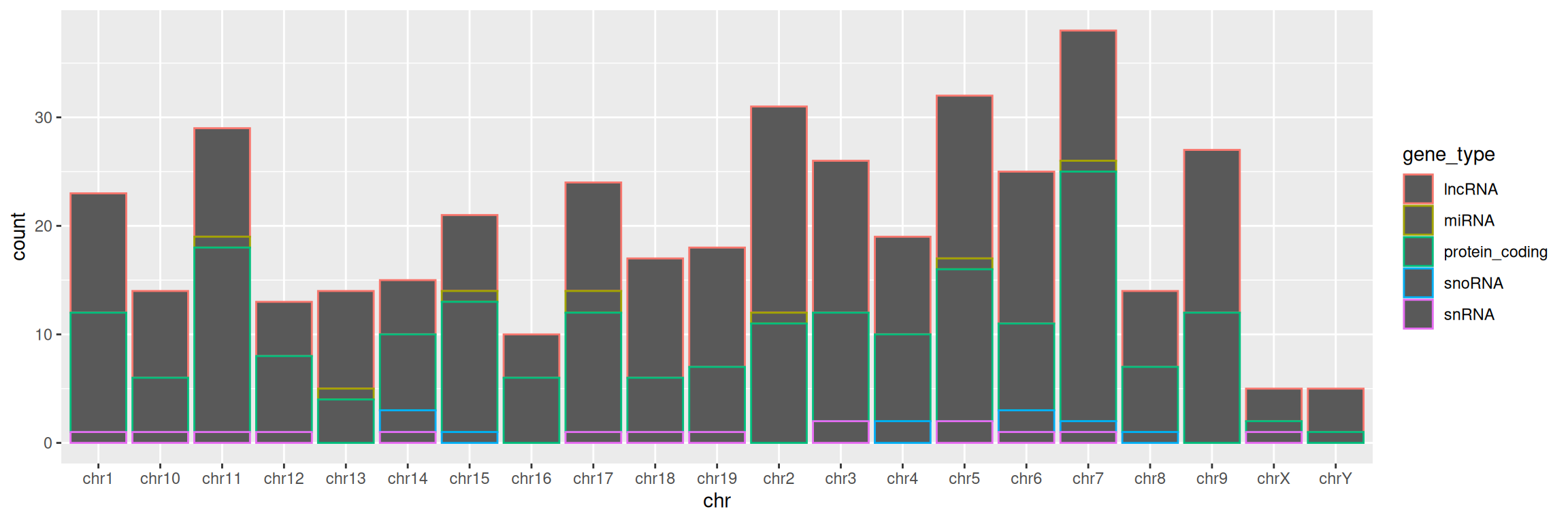
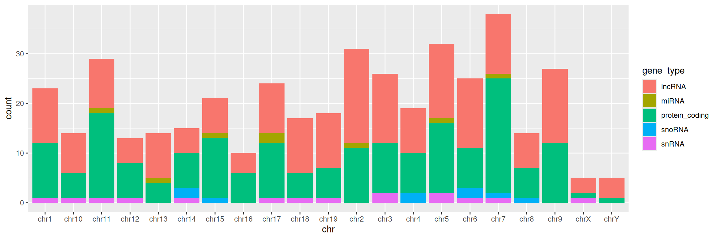
4. Change color= with fill= in aes(). What changes?
5. Add a title to the graph:
correction
ggplot(data=gtf, mapping=aes(x=chr, fill=gene_type)) +
geom_bar() +
ggtitle(label = "Number of genes per chromosome, split by gene type")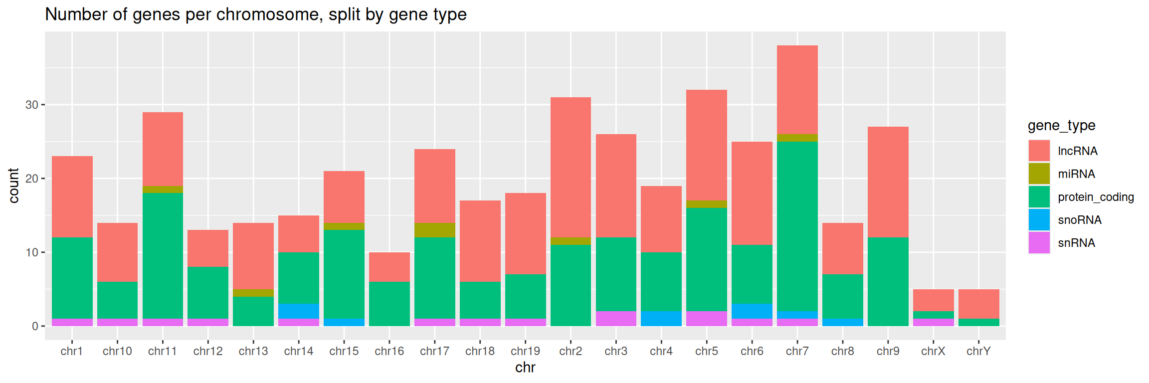
6. Change the default theme:
correction
ggplot(data=gtf, mapping=aes(x=chr, fill=gene_type)) +
  geom_bar() +
ggtitle(label = "Number of genes per chromosome, split by gene type") +
theme_bw()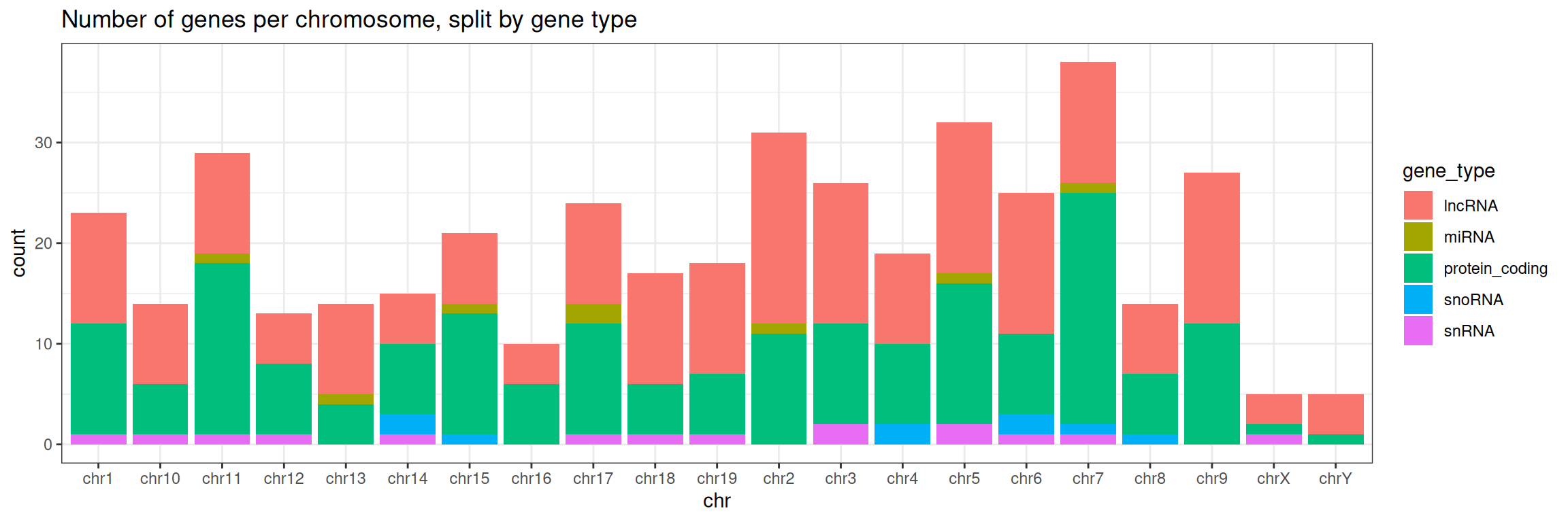
7. Save the graph in PNG format in the workshop’s directory.