11.3 Exercise 1 - scatter plots
Time for our first exercise!
Starting from the same object geneexp:
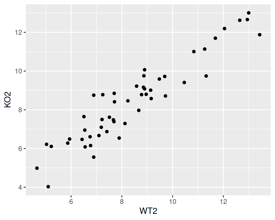
- Create a scatter plot of WT2 (x-axis) versus KO2 (y-axis).
2. Change the point color (blue) and size (2).
3. Change the point shape (“square cross”)
correction
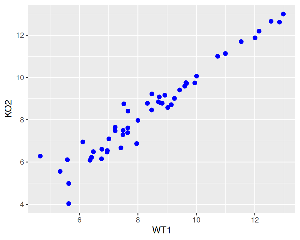
ggplot(data=geneexp, mapping=aes(x=WT1, y=KO2)) +
  geom_point(color="blue", size=2, shape="square cross")
4. Add a title (of your choice).
correction
ggplot(data=geneexp, mapping=aes(x=WT1, y=KO2)) +
  geom_point(color="blue", size=2, shape="square cross") +
  ggtitle(label="WT1 vs KO2")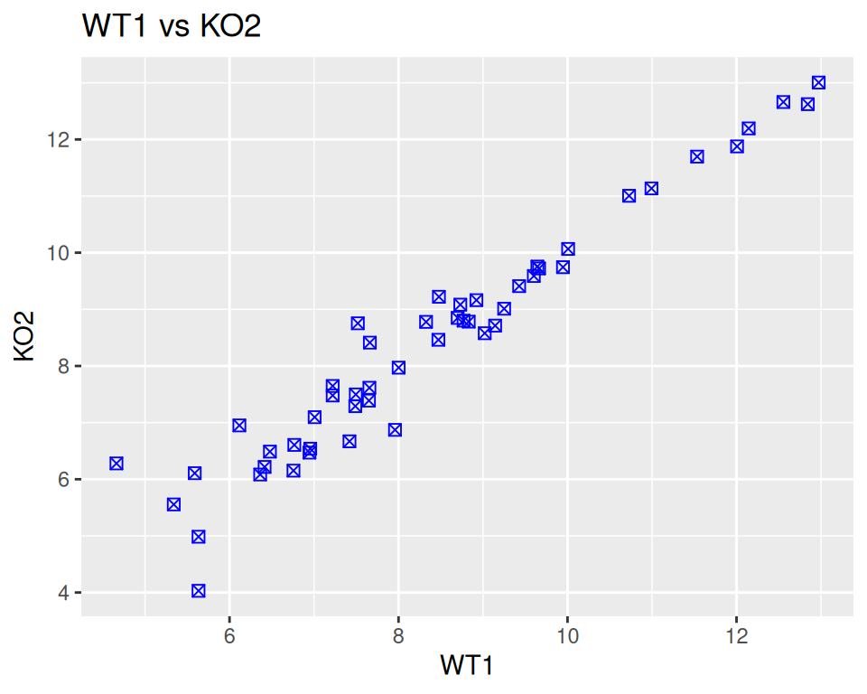
5. Add a subtitle (wait: that’s new! Check ggtitle help page and/or search the internet for “ggtitle subtitle” and see if you can find!)
correction
ggplot(data=geneexp, mapping=aes(x=WT1, y=KO2)) +
  geom_point(color="blue", size=2, shape="square cross") +
  ggtitle(label="WT1 vs KO2", subtitle="nice blue squares")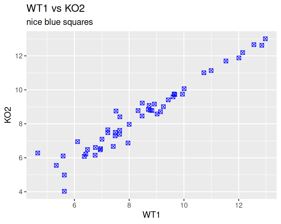
6. Save your plot as a JPEG file, in the workshop folder, with dimensions 600X600 pixels.
correction
From the interface:
Bottom-right panel -> Plots tab -> Export -> …
From the console:
# first, save in an object
mybluescatterplot <- ggplot(data=geneexp, mapping=aes(x=WT1, y=KO2)) +
  geom_point(color="blue", size=2, shape="square cross") +
  ggtitle(label="WT1 vs KO2", subtitle="nice blue squares")

# then save with ggsave
ggsave(filename="WT1_versus_KO2.jpg", plot=mybluescatterplot,
       device="jpeg",
       units="px", width=600, height=600)