19.1 Exercise 4 - Scatter plots
The objective of this exercise is give you the opportunity to practice some of the fine-tuning we have just learned.
For this exercise, we will use a different dataset (less relevant for biologists, but great for practicing!) the diamonds dataset
diamonds is a built-in data set that is automatically loaded with {ggplot2}.
The dataset containing the prices and other attributes of almost 54,000 diamonds.
If {ggplot2} is loaded, you can readily use diamonds:
## # A tibble: 53,940 × 10
##    carat cut       color clarity depth table price     x     y     z
##    <dbl> <ord>     <ord> <ord>   <dbl> <dbl> <int> <dbl> <dbl> <dbl>
##  1  0.23 Ideal     E     SI2      61.5    55   326  3.95  3.98  2.43
##  2  0.21 Premium   E     SI1      59.8    61   326  3.89  3.84  2.31
##  3  0.23 Good      E     VS1      56.9    65   327  4.05  4.07  2.31
##  4  0.29 Premium   I     VS2      62.4    58   334  4.2   4.23  2.63
##  5  0.31 Good      J     SI2      63.3    58   335  4.34  4.35  2.75
##  6  0.24 Very Good J     VVS2     62.8    57   336  3.94  3.96  2.48
##  7  0.24 Very Good I     VVS1     62.3    57   336  3.95  3.98  2.47
##  8  0.26 Very Good H     SI1      61.9    55   337  4.07  4.11  2.53
##  9  0.22 Fair      E     VS2      65.1    61   337  3.87  3.78  2.49
## 10  0.23 Very Good H     VS1      59.4    61   338  4     4.05  2.39
## # ℹ 53,930 more rows- Create a new object that only contains diamonds with “Ideal”
cut
- From this new filtered object, create a scatter plot of carat (x-axis) vs price (y-axis), with colors mapped to the depth.

- Facet / split the plot per clarity (a column in diamonds).
correction
ggplot(data=ideal, mapping=aes(x=carat, y=price, color=depth)) +
geom_point() +
facet_wrap(~clarity)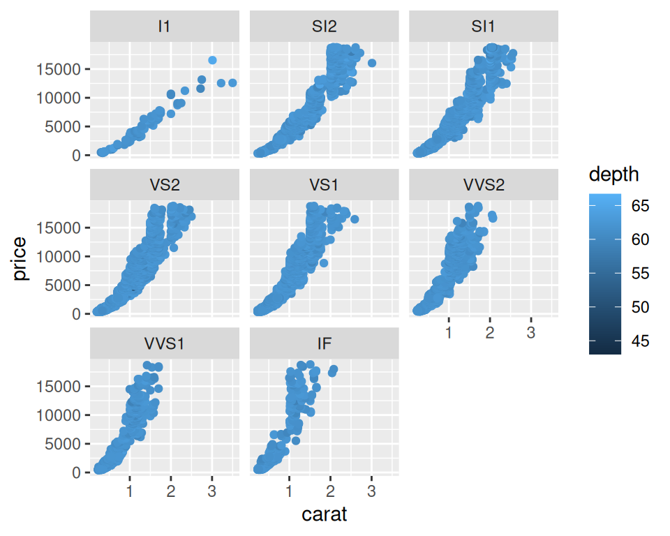
- Change the defaut theme (to theme_bw(), theme_minimal(), for example) and increase the base text size, and add a title to the overall plot.
correction
ggplot(data=ideal, mapping=aes(x=carat, y=price, color=depth)) +
  geom_point() +
facet_wrap(~clarity) +
theme_minimal(base_size = 15) +
ggtitle("Ideal cut diamonds carat, price, depth and clarity")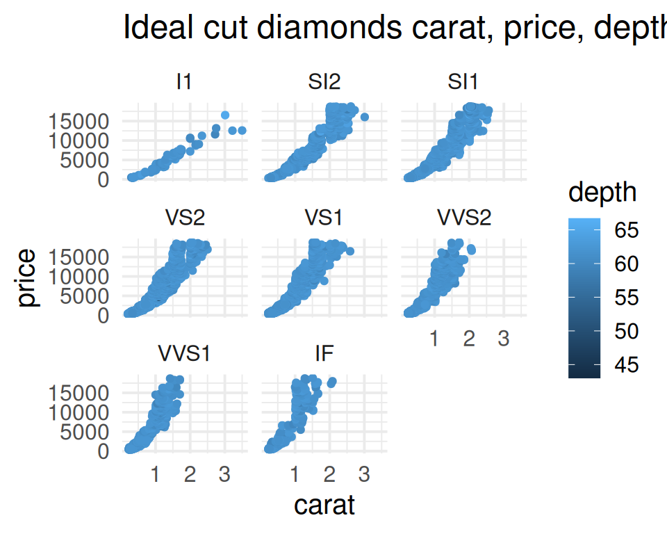
- Change the color palette to the one of your choice. You can pick one from RColorBrewer, for example.
correction
ggplot(data=diamonds, mapping=aes(x=carat, y=price, color=cut)) +
  geom_point() +
  facet_wrap(~clarity) +
  theme_minimal(base_size = 15) +
  ggtitle("Diamonds carat, price, cut and clarity") +
  scale_color_brewer(palette="Dark2")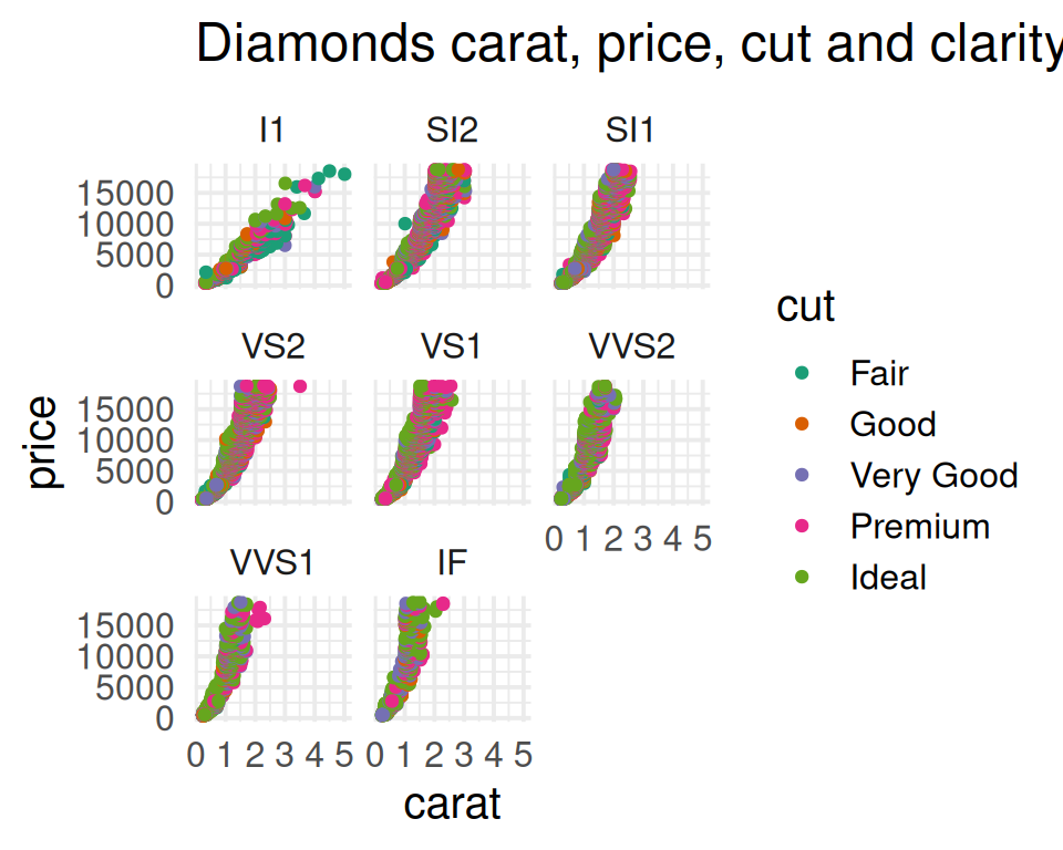
- Play with the theme() function. For example:
- Rotate the x-axis labels to 90 degrees.
- Make the individual titles larger bold (this is done with strip.text parameter).
correction
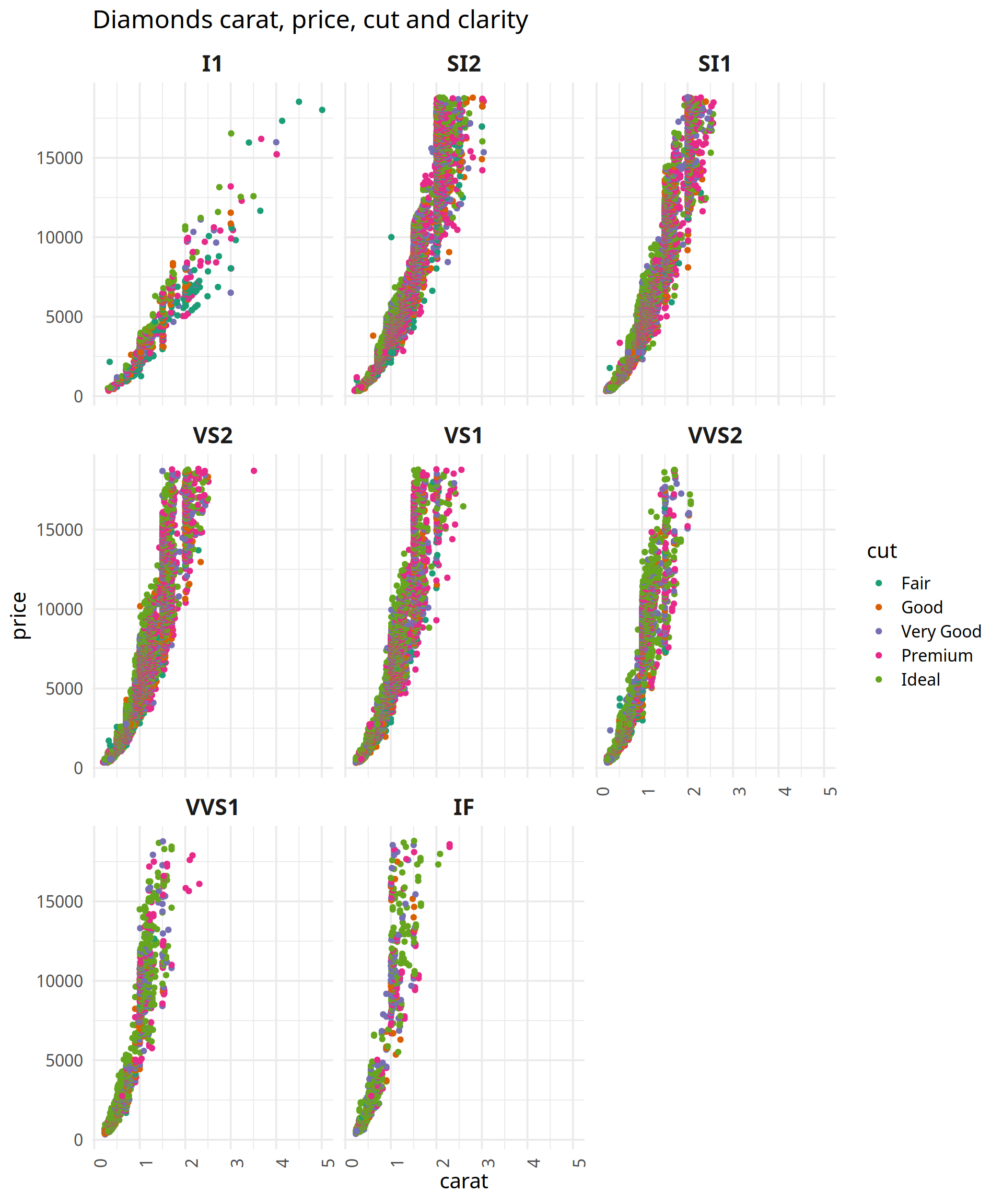
ggplot(data=diamonds, mapping=aes(x=carat, y=price, color=cut)) +
  geom_point() +
  facet_wrap(~clarity) +
  theme_minimal(base_size = 15, base_family = "Padauk") +
  ggtitle("Diamonds carat, price, cut and clarity") +
  scale_color_brewer(palette="Dark2") +
  theme(axis.text.x = element_text(angle=90), strip.text = element_text(size = 16, face = "bold"))