20.1 Histograms and density plots
Histograms and density plots are both visualizations of the distribution of quantitative variables.
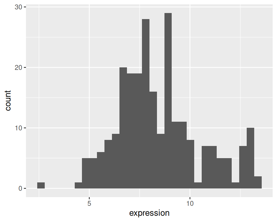
20.1.1 Histogram
We will use a previous object to create a histogram, with geom_histogram. You can get it back with:
We will work on a subset of this data.
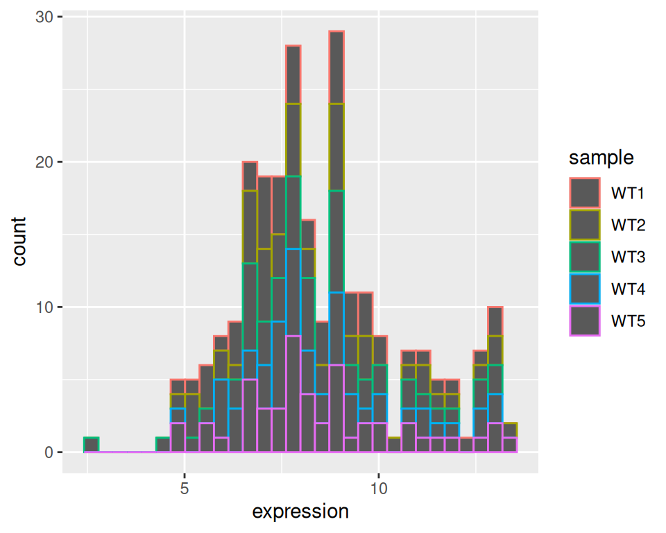
Filter only samples from WT group:
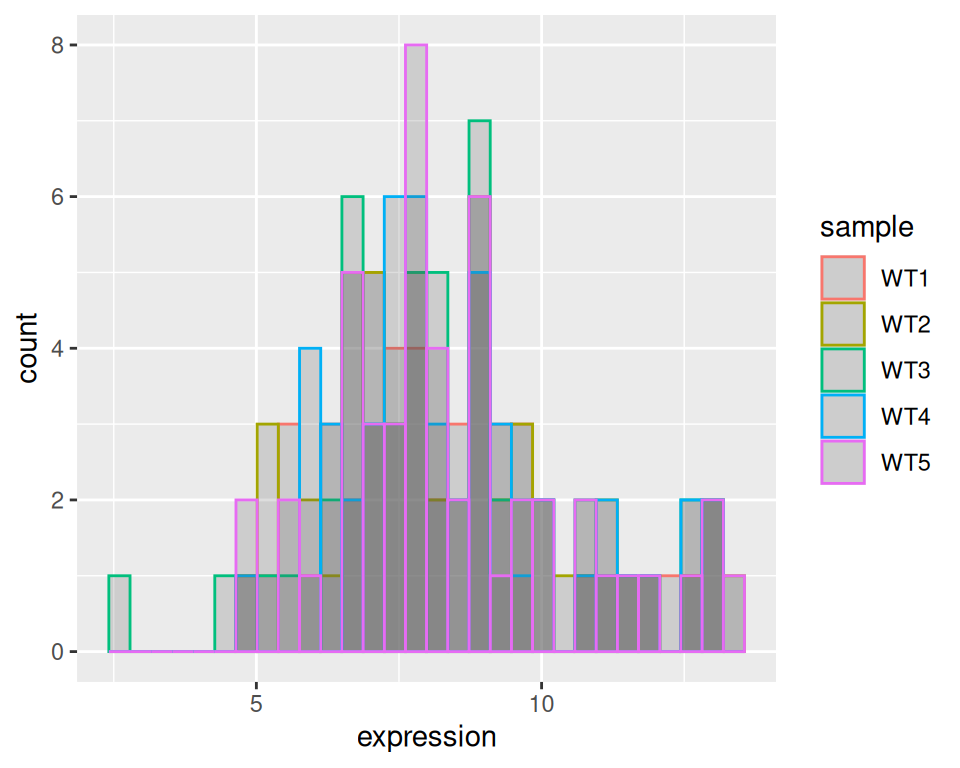
Split the histogram per sample:
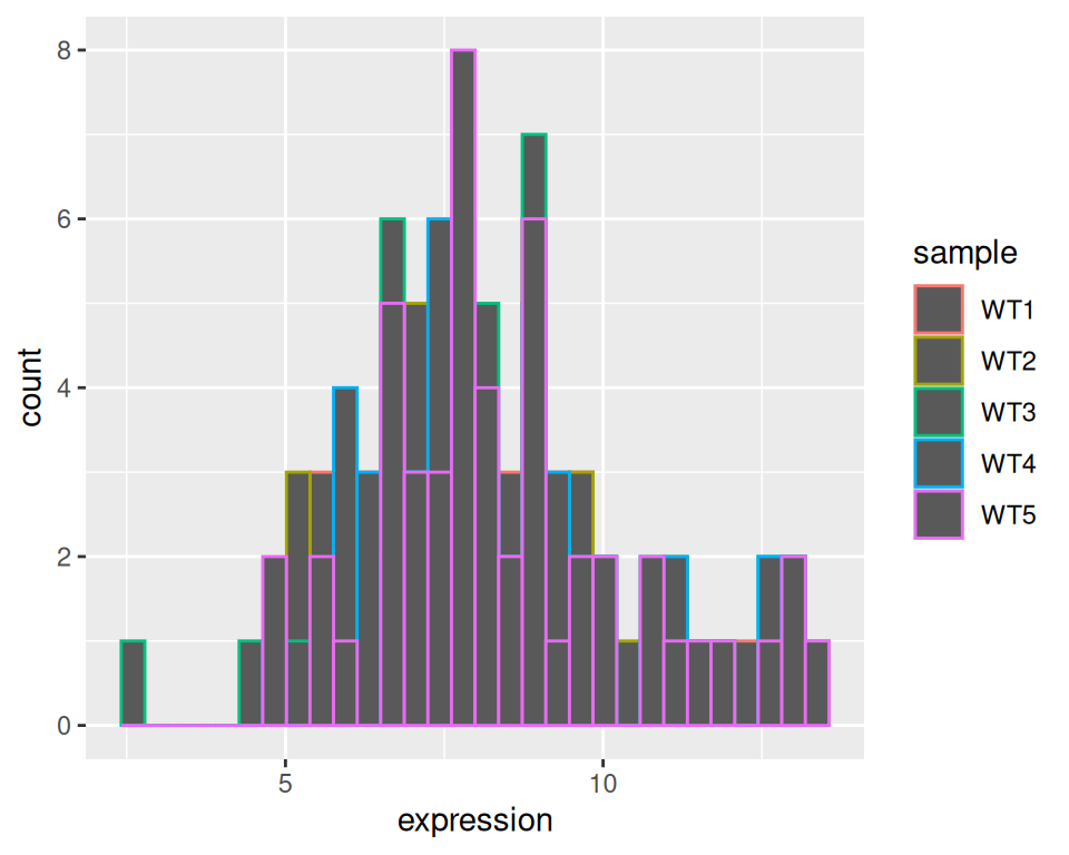
Set position to “identity”: histograms will not be “on top of each other” but on a comparative scale:
Set alpha (transparency to 0.2):
Express as density instead of counts:
ggplot(wt, aes(x=expression, color=sample)) +
  geom_histogram(aes(y=after_stat(density)), position="identity", alpha=0.2) +
  theme_classic()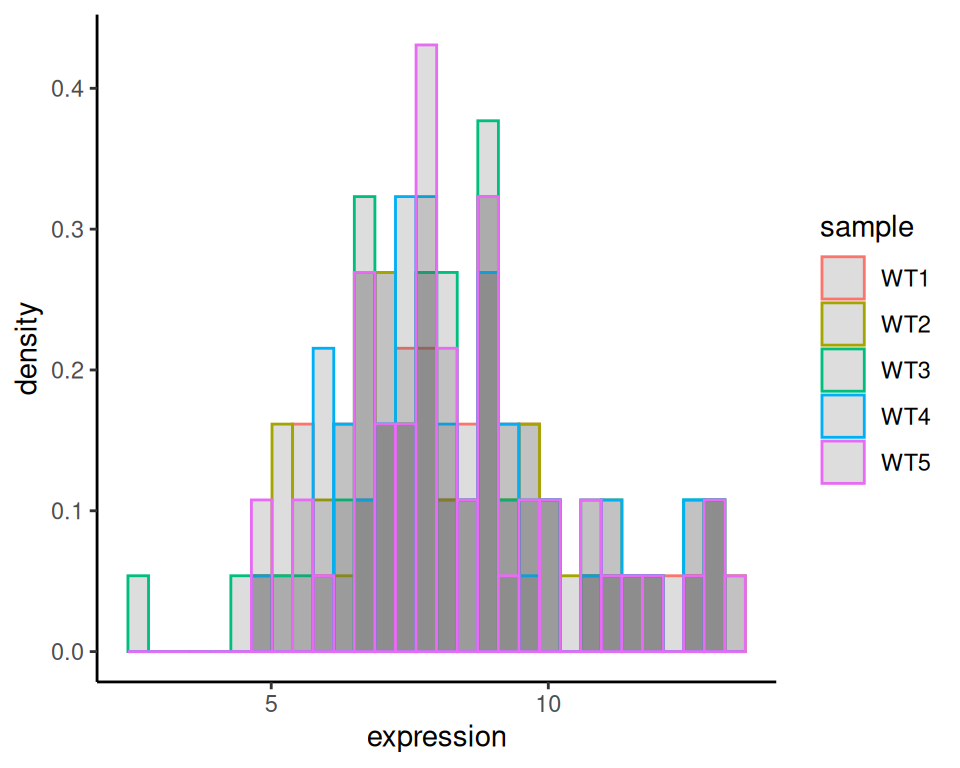
20.1.2 Density plot
It is similar to create a density plot, using geom_density:
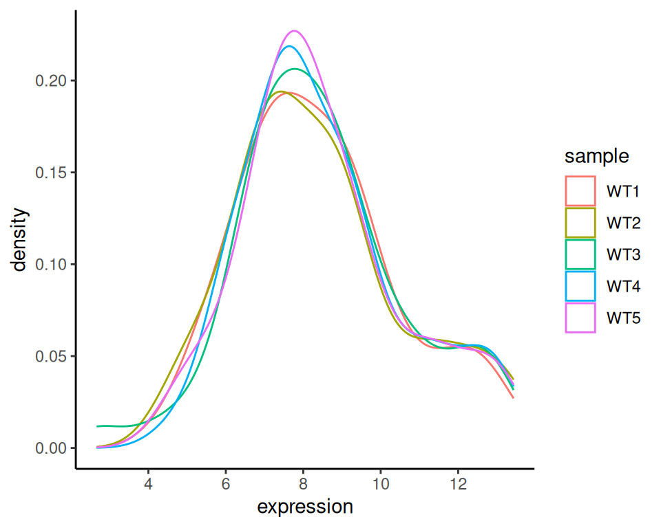
You can use fill instead:
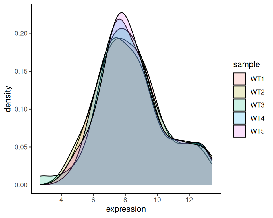
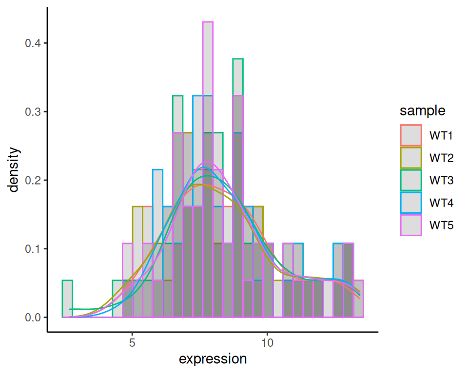
20.1.3 Histogram + density
As we combined geom_boxplot and geom_violin in a previous exercise, we can also combine geom_histogram and geom_density:
ggplot(wt, aes(x=expression, color=sample)) +
  geom_histogram(aes(y=after_stat(density)), position="identity", alpha=0.2) +
  geom_density(alpha=0.2) +
  theme_classic()