12.1 Labels
Let’s label points with the genes they represent.
Two steps:
- set the label parameter, in the ggplot aes() function, pointing to the column that contains the labels
- add the geom_text() layer, to display the labels

We can decrease or increase label size:
ggplot(data=geneexp, mapping=aes(x=WT1, y=WT2, label=GeneSymbol)) +
  geom_point() +
  geom_text(size=3)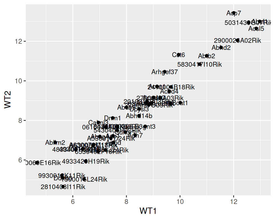
We can adjust the position of the labels relative to the points, so they do not overlap, with nudge_x (moves the labels horizontally / on the x axis).
ggplot(data=geneexp, mapping=aes(x=WT1, y=WT2, label=GeneSymbol)) +
  geom_point() +
  geom_text(size=3, nudge_x=1.5)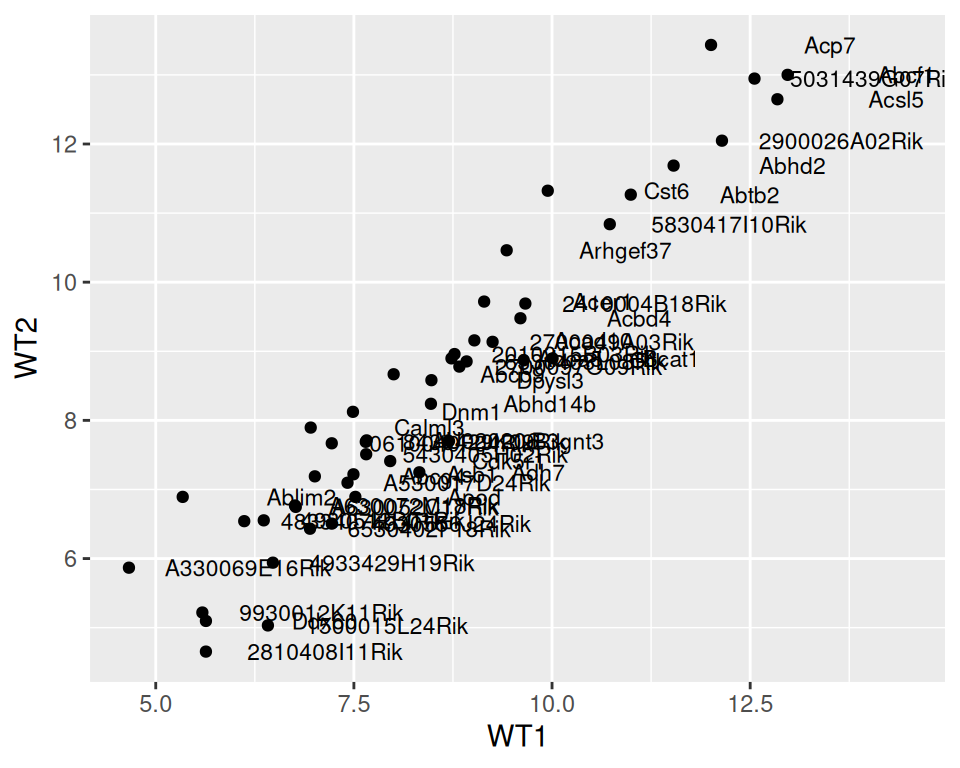
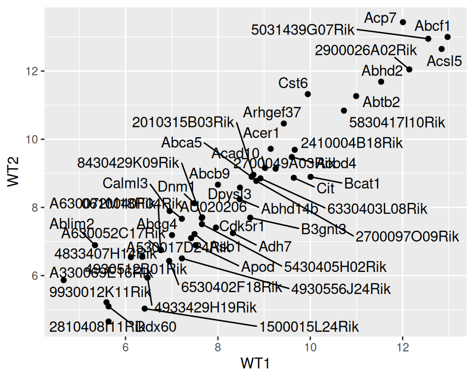
Note that {ggrepel} package can automate the automatic organization of labels, so they do not overlap:
- Load {ggrepel} to your R session
- Change geom_text() with geom_repel_text()
ggplot(data=geneexp, mapping=aes(x=WT1, y=WT2, label=GeneSymbol)) +
  geom_point() +
  geom_text_repel()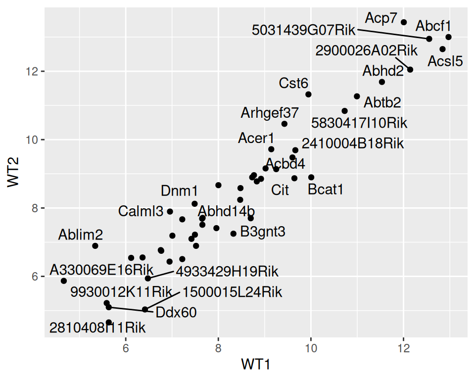
The warning related to the number of labels / overlaps the function will display by default. You can increase it with max.overlaps
ggplot(data=geneexp, mapping=aes(x=WT1, y=WT2, label=GeneSymbol)) +
  geom_point() +
  geom_text_repel(max.overlaps = 100)