Part17 Dotplots
One may want to focus on a particular gene and visualize its expression across all samples.
We will use the same “long” format as for the boxplots. In case you do not have it loaded:
Filter data for the gene of interest (pick the one you are interested in! Here we are extracting the most up regulated gene in KO in comparison with WT) and save the resulting data into a new object:
Customize with what we have learned!
ggplot(apod, aes(x=group, y=expression, label=sample, color=group)) +
  geom_point() +
  geom_text_repel() +
  theme_linedraw() +
  ggtitle("Apod gene expression between KO and WT")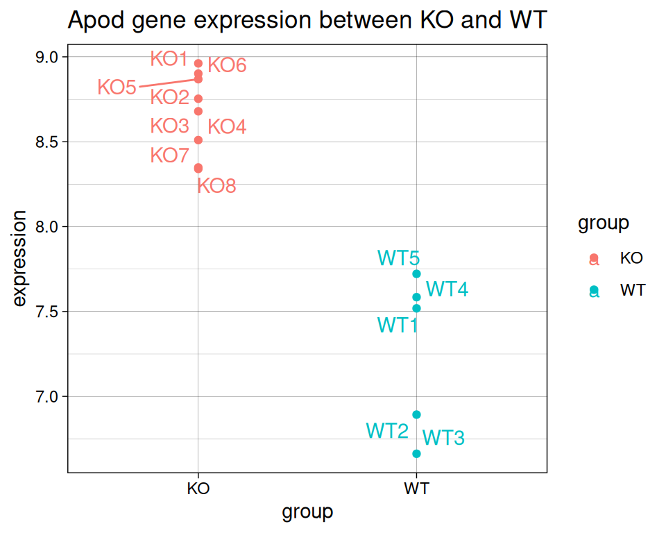
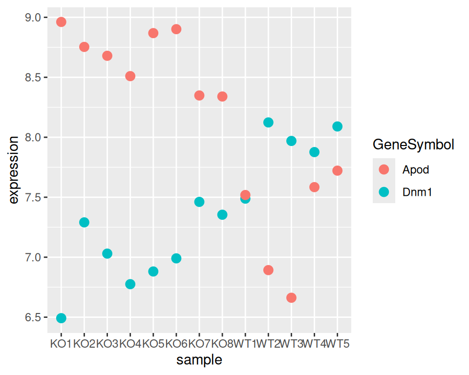
Challenge: can you visualize the expression of both Apod and Dnm1, showing each sample on the x-axis?
Try it yourself before revealing the code!
# select both genes: save in a new object
apod_dnm1 <- filter(geneexp2, GeneSymbol == "Apod" | GeneSymbol == "Dnm1")

# plot!
ggplot(apod_dnm1, aes(x=sample, y=expression, color=GeneSymbol)) +
  geom_point(size=3)