12.2 Mapping variables
Point color and shape can be modified conditionally, i.e. depend on another column / variable of the data.
This is called mapping an aesthetic to a variable.
Columns used to conditionally color or shape the points are set inside the aes() function.
Conditional shape:
ggplot(data=geneexp, mapping=aes(x=WT1, y=WT2, label=GeneSymbol, shape=DE)) +
  geom_point() +
  geom_text(nudge_x=1.2, size=3)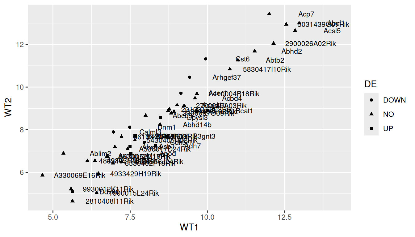
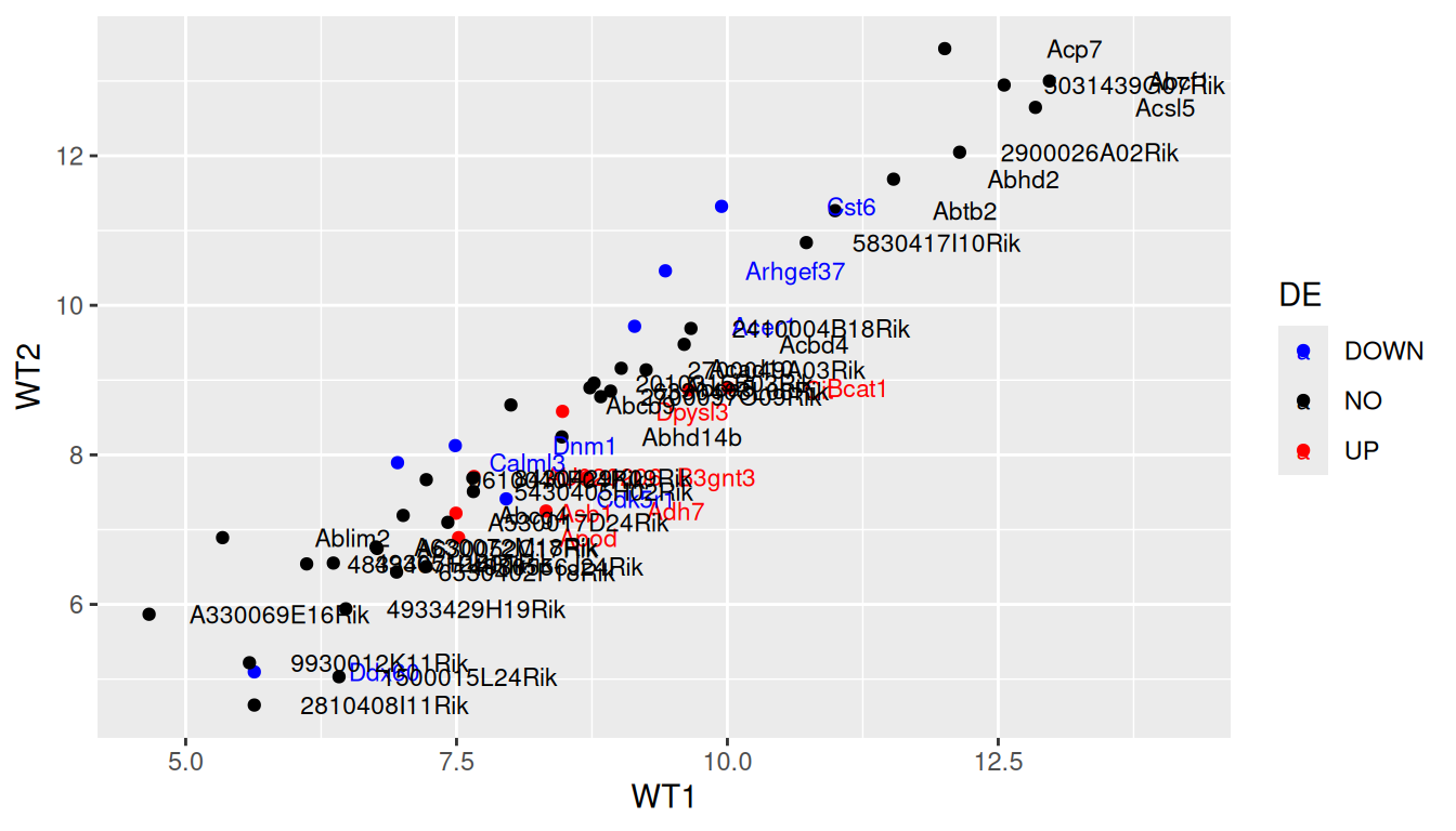
Conditional color:
ggplot(data=geneexp, mapping=aes(x=WT1, y=WT2, label=GeneSymbol, color=DE)) +
  geom_point() +
  geom_text(nudge_x=1.2, size=3)
TIP: remove the double labeling in the legend (a letter behind the point because both labels and colors are mapped to the same variable): set show.legend=FALSE in geom_text():
ggplot(data=geneexp, mapping=aes(x=WT1, y=WT2, label=GeneSymbol, color=DE)) +
  geom_point() +
  geom_text(nudge_x=1.2, size=3, show.legend=FALSE)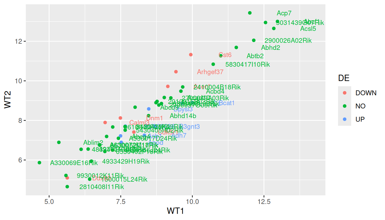
You can change the legend title with layer scale_color_discrete:
ggplot(data=geneexp, mapping=aes(x=WT1, y=WT2, label=GeneSymbol, color=DE)) +
  geom_point() +
  geom_text(nudge_x=1.2, size=3, show.legend=FALSE) +
  scale_color_discrete(name="DiffExp")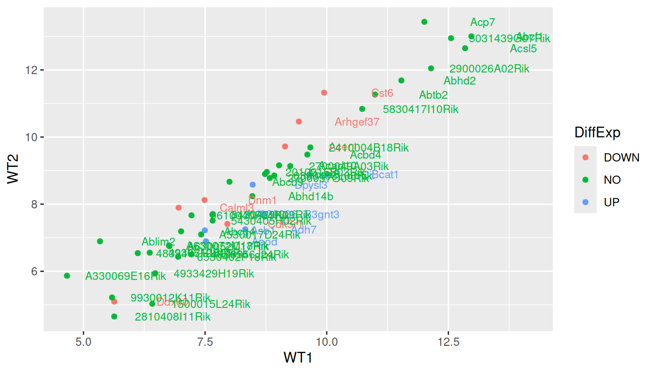
More advanced (as reference, or if someone asks): how to change default colors:
Colors can be set manually using (yet another) layer: scale_color_manual().
ggplot(data=geneexp, mapping=aes(x=WT1, y=WT2, label=GeneSymbol, color=DE)) +
  geom_point() +
  geom_text(nudge_x=1.2, size=3) +
  scale_color_manual(values=c(DOWN="blue", NO="black", UP="red"))