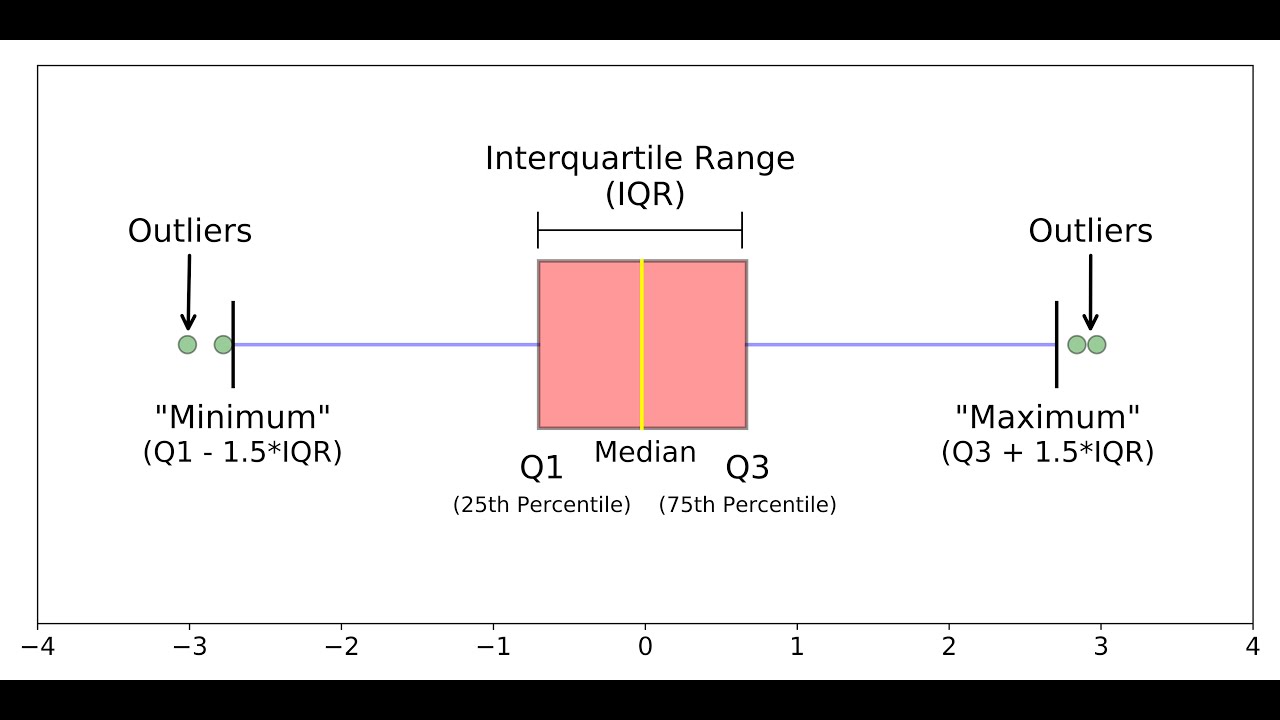
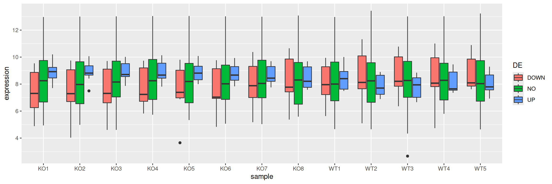
Part14 Boxplots: visualize data distribution
A boxplot aims to show data distribution.

We will import data from a file that contains the same information as geneexp but in a slightly different format (that we will explain in more details in a next section):
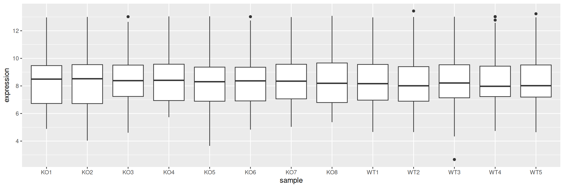
In our first boxplot, one box corresponds to one sample:
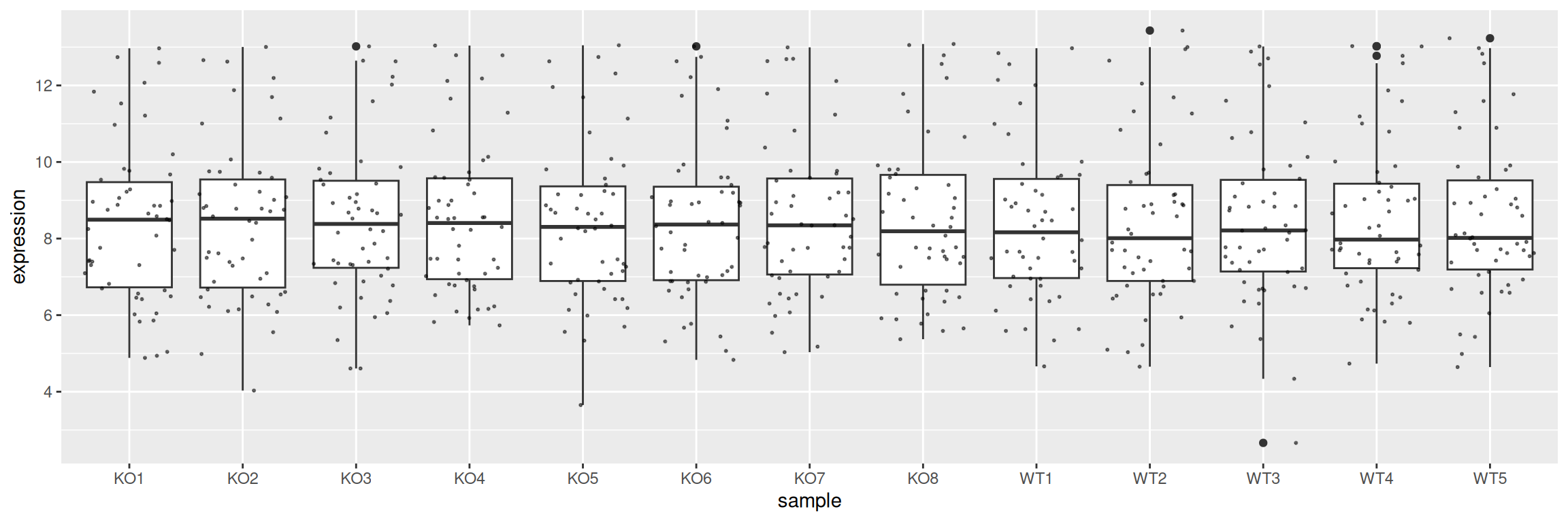
Display the individual data points with geom_jitter:
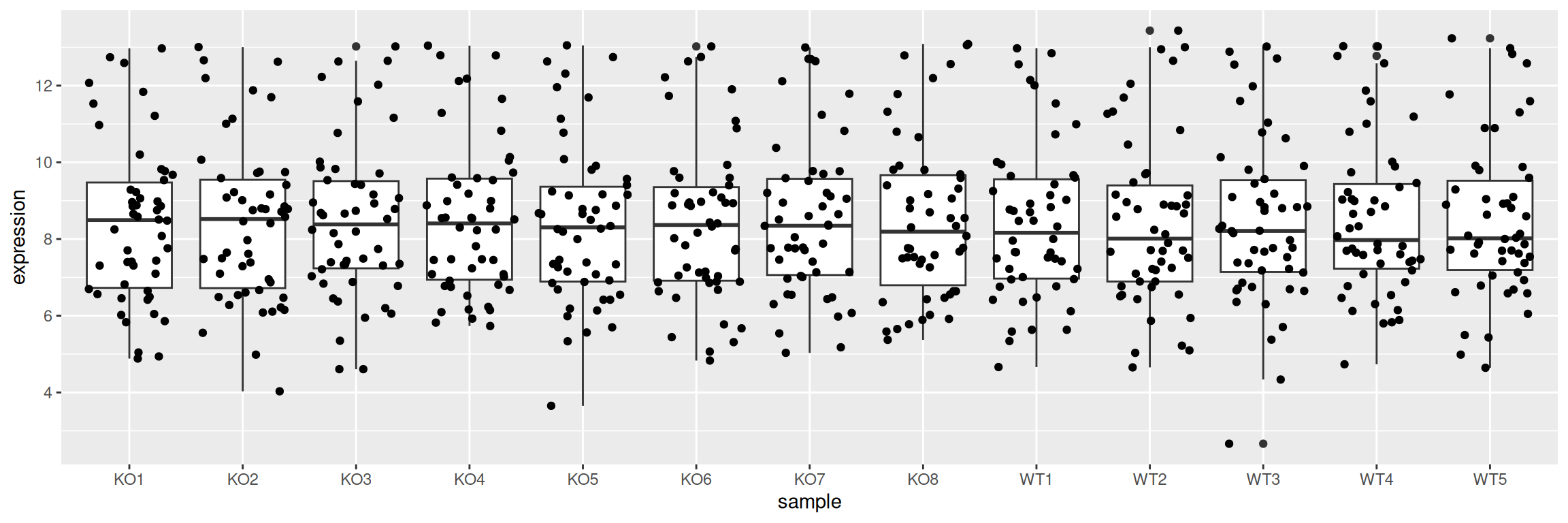
Adjust point size and transparency:
Split boxes using a discrete variable - the same way as is done for barplots - by mapping it to fill or color:
It is easy to change the box to a violin plot:
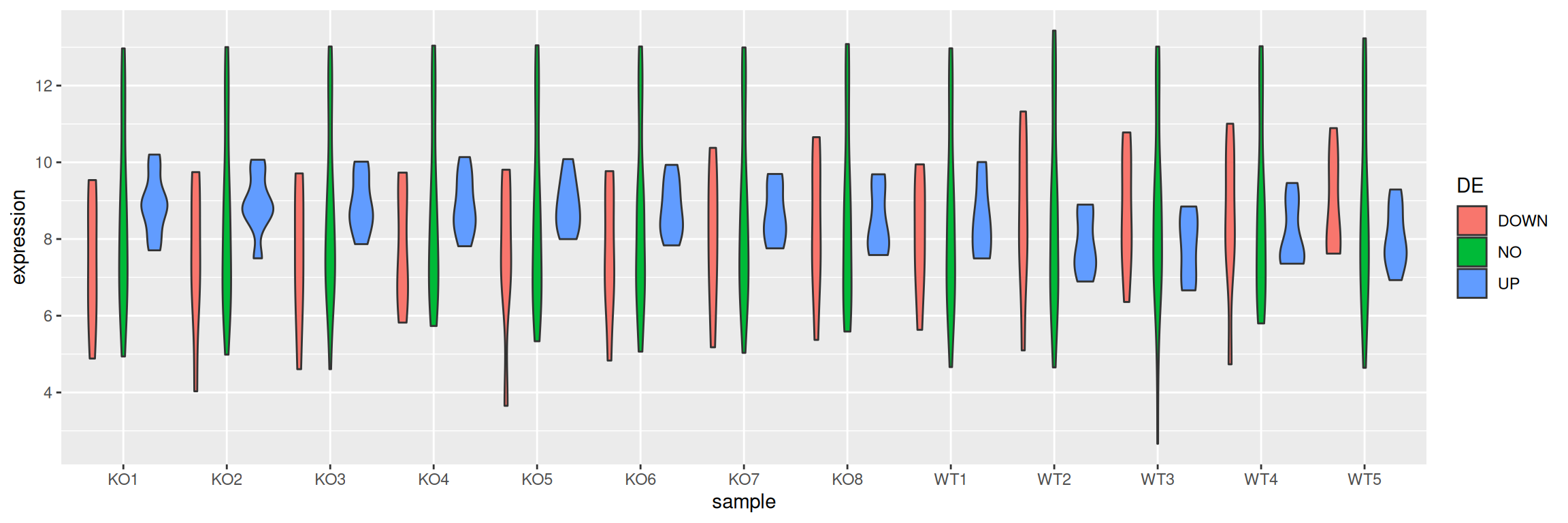
Violin plots also aim to visualize data distribution. While boxplots can only show summary statistics / quantiles, violin plots also show the density of each variable.