8.5 Scatter plots: more features
We can customize our scatter plot a bit more.
8.5.1 Labels
We may want to show the gene names that the points represent.
This is done by:
- setting the label parameter, in the ggplot aes() function
- adding the geom_text() layer
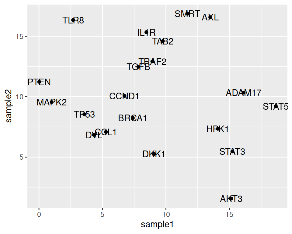
We can adjust the position of the labels relative to the points, so they do not overlap: this is done with nudge_x (moves the labels horizontally / on the x axis).
ggplot(data=geneexp, mapping=aes(x=sample1, y=sample2, label=Gene)) +
  geom_point() +
  geom_text(nudge_x=1.5)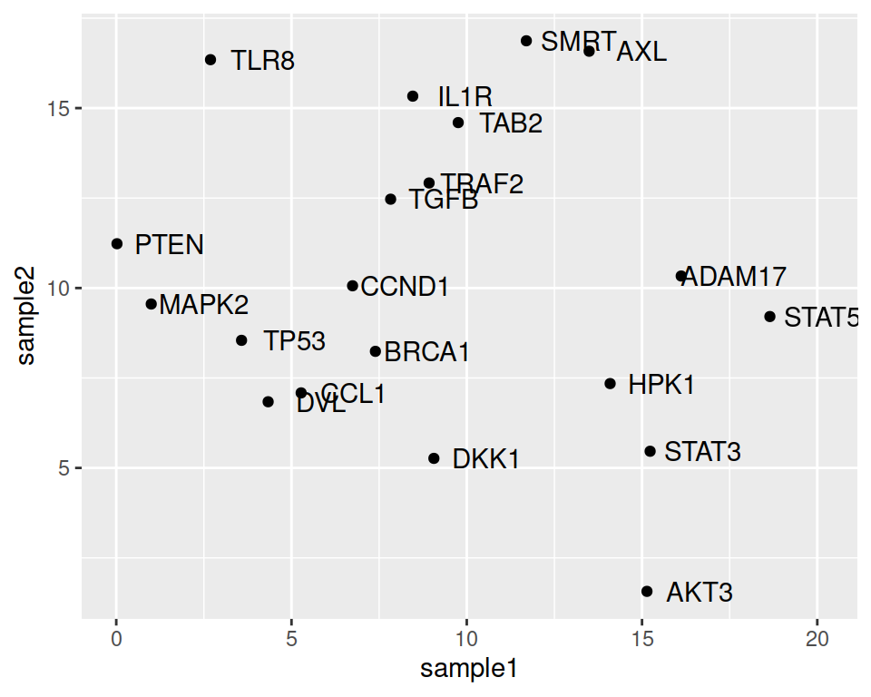
We can also decrease or increase the label size:
ggplot(data=geneexp, mapping=aes(x=sample1, y=sample2, label=Gene)) +
  geom_point() +
  geom_text(nudge_x=1.5, size=3)
You can also overrule the mapping of colors to labels and keep all labels black, for example:
ggplot(data=geneexp, mapping=aes(x=sample1, y=sample2, label=Gene)) +
  geom_point() +
  geom_text(nudge_x=1.5, size=3, color="black")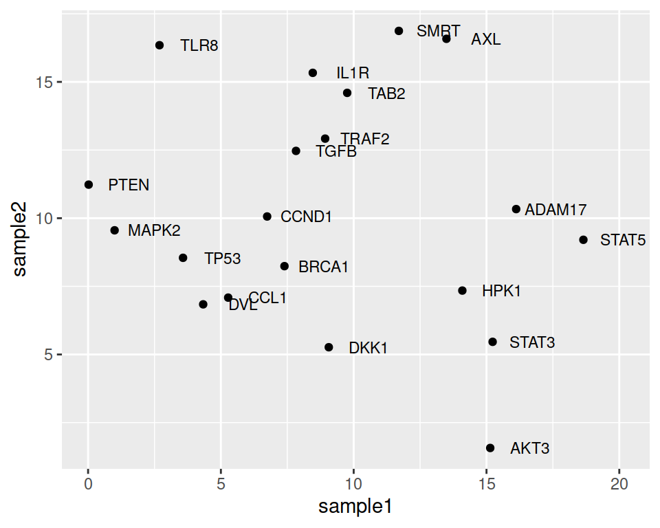
Note that the automatic organization of labels, so that they do not overlap, can be done using the {ggrepel} package.
You only need to load the package and change geom_text() with geom_repel_text():
ggplot(data=geneexp, mapping=aes(x=sample1, y=sample2, label=Gene)) +
  geom_point() +
  geom_text_repel()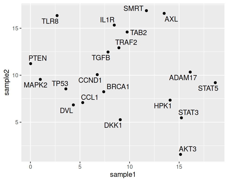
8.5.2 Color and shape mapping
Point color and shape can be dependent on another column / variable of the data. This is called mapping an aesthetic to a variable.
Columns used to conditionally color or shape the points are set inside the aes() function.
For shape:
ggplot(data=geneexp, mapping=aes(x=sample1, y=sample2, label=Gene, shape=DE)) +
  geom_point() +
  geom_text(nudge_x=1.2, size=3)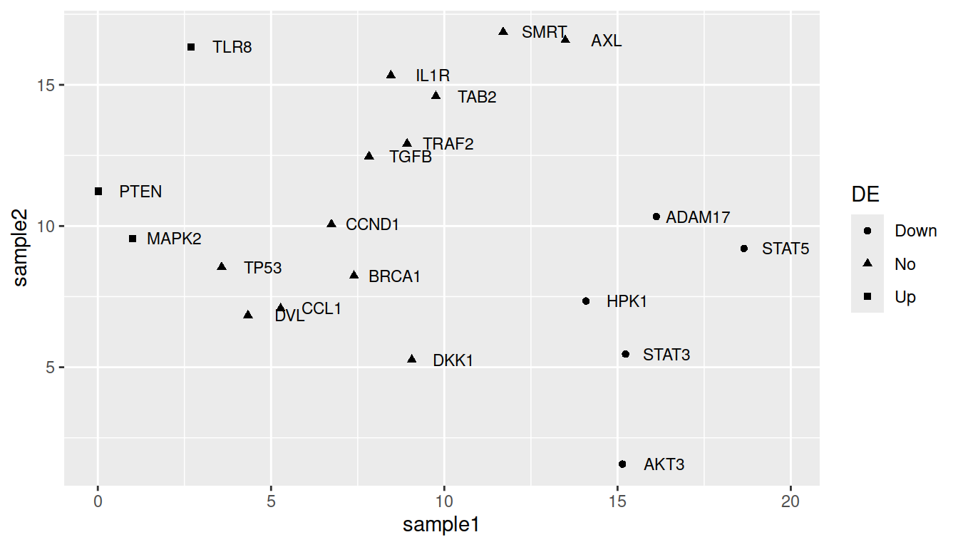
For color:
ggplot(data=geneexp, mapping=aes(x=sample1, y=sample2, label=Gene, color=DE)) +
  geom_point() +
  geom_text(nudge_x=1.2, size=3)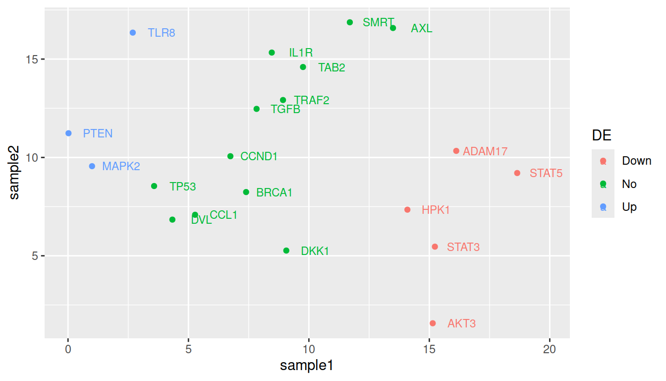
TIP: remove the double labeling in the legend (a letter behind the point because both labels and colors are mapped to the same variable): set show.legend=FALSE in geom_text():
ggplot(data=geneexp, mapping=aes(x=sample1, y=sample2, label=Gene, color=DE)) +
  geom_point() +
  geom_text(nudge_x=1.2, size=3, show.legend=FALSE)
You can change the legend title the following way:
ggplot(data=geneexp, mapping=aes(x=sample1, y=sample2, label=Gene, color=DE)) +
  geom_point() +
  geom_text(nudge_x=1.2, size=3, show.legend=FALSE) +
  scale_color_discrete(name="DiffExp")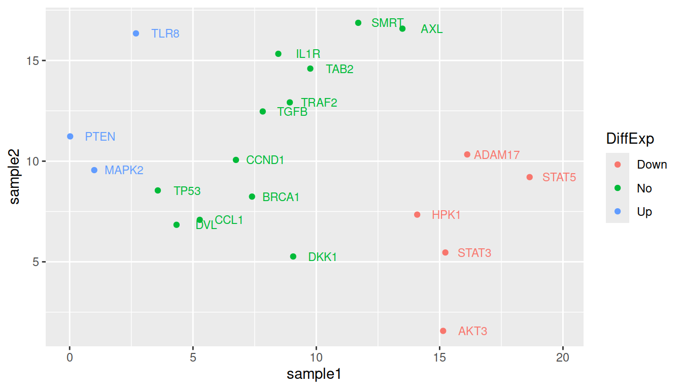
More advanced (as reference, or if someone asks): how to change default colors:
Colors can be set manually using (yet another) layer: scale_color_manual().
ggplot(data=geneexp, mapping=aes(x=sample1, y=sample2, label=Gene, color=DE)) +
  geom_point() +
  geom_text(nudge_x=1.2, size=3) +
  scale_color_manual(values=c(Down="blue", No="black", Up="red"))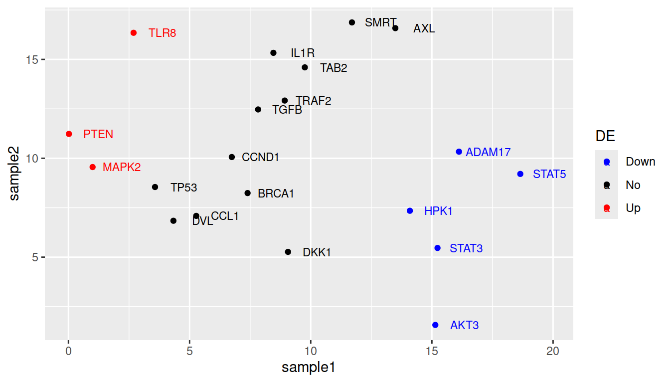
8.5.3 Additional ticks
geom_rug creates a compact visualization along the axes to help read the information of individual cases. You can simply add it as an additional layer.
ggplot(data=geneexp, mapping=aes(x=sample1, y=sample2)) +
  geom_point(color="red", size=2.5, shape="diamond") +
  ggtitle(label="my first ggplot") +
  theme_linedraw() +
  geom_rug()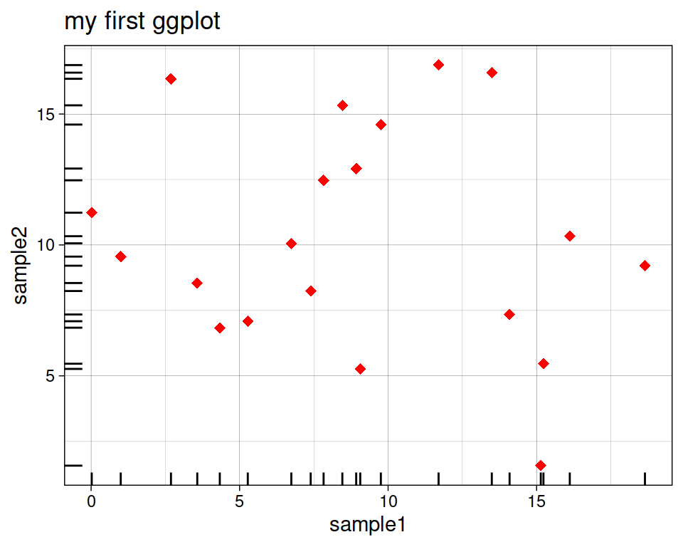
As usual, you can customize several parameters, such as:
- sides: sides where to draw the lines (top, bottom, right, left)
- alpha: opacity Ranges from 0 (transparent) to 1 (opaque).
- linewidth, linetype
ggplot(data=geneexp, mapping=aes(x=sample1, y=sample2)) +
  geom_point(color="red", size=2.5, shape="diamond") +
  ggtitle(label="my first ggplot") +
  theme_linedraw() +
  geom_rug(sides="tr", alpha=0.3, linewidth=1)
8.5.4 Density estimates
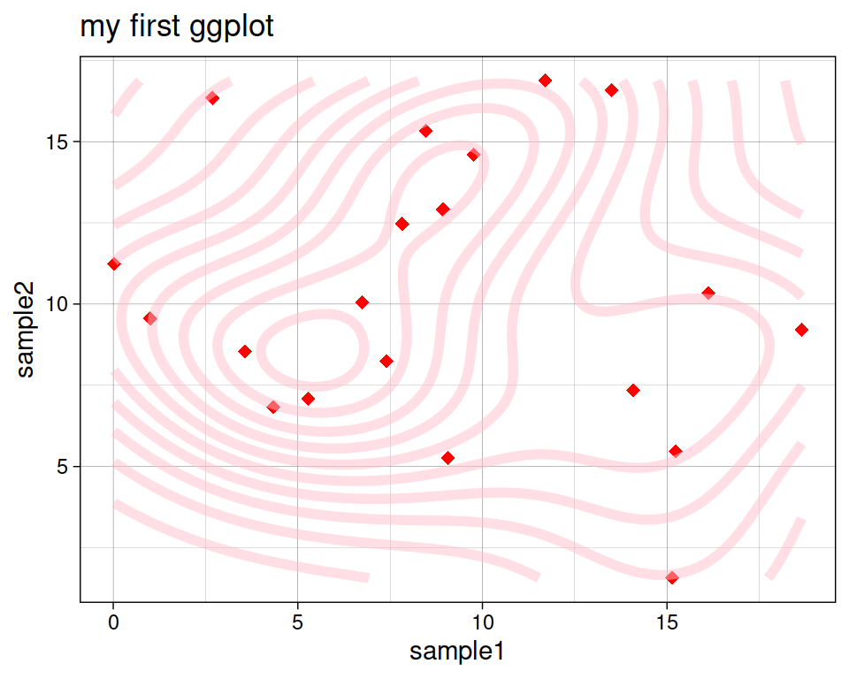
geom_density_2d performs a 2D kernel density estimation and displays the results with contours.
ggplot(data=geneexp, mapping=aes(x=sample1, y=sample2)) +
  geom_point(color="red", size=2.5, shape="diamond") +
  ggtitle(label="my first ggplot") +
  theme_linedraw() +
  geom_density_2d()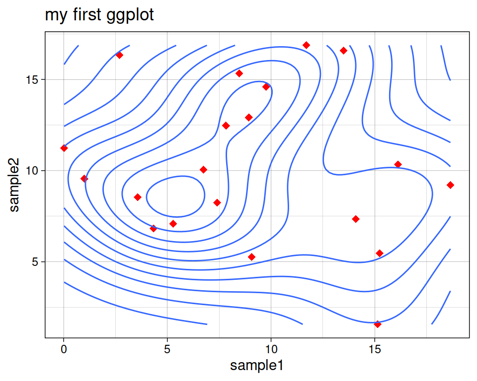
Play with some of the parameters we already know:
ggplot(data=geneexp, mapping=aes(x=sample1, y=sample2)) +
  geom_point(color="red", size=2.5, shape="diamond") +
  ggtitle(label="my first ggplot") +
  theme_linedraw() +
  geom_density_2d(color="pink", alpha=0.5, linewidth = 2)