8.9 Boxplots
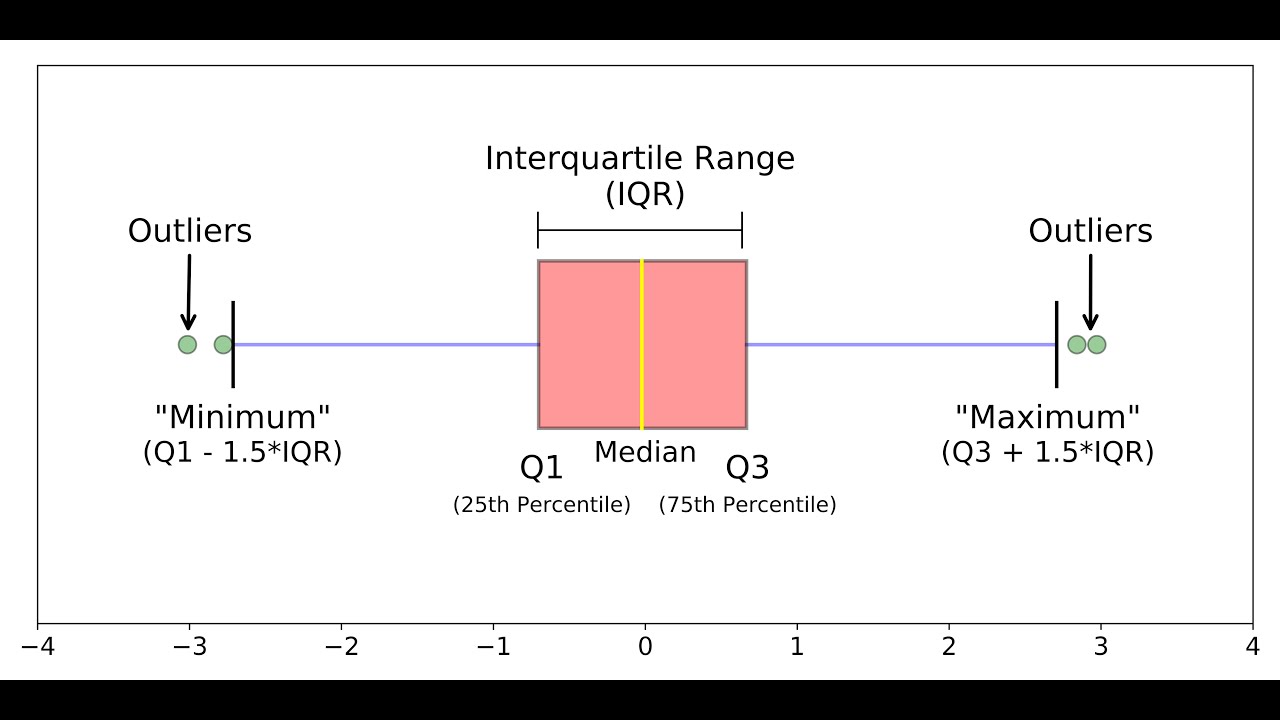
A boxplot is used to visualize the distribution of data.

We will import data from a file that contains the same information as geneexp but in a slightly different format:
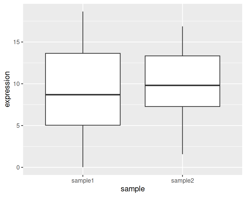
In our first boxplot, one box corresponds to one sample:

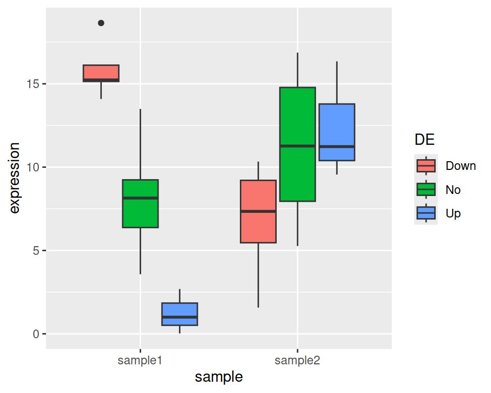
We can split boxes by DE, the same way we did for barplots, by mapping fill or color to the variable:

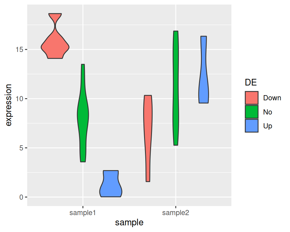
If you prefer a violin plot, it is easy:

Violin plots also aim to visualize data distribution. While boxplots can only show summary statistics / quantiles, violin plots also show the density of each variable.