10.2 Pie chart
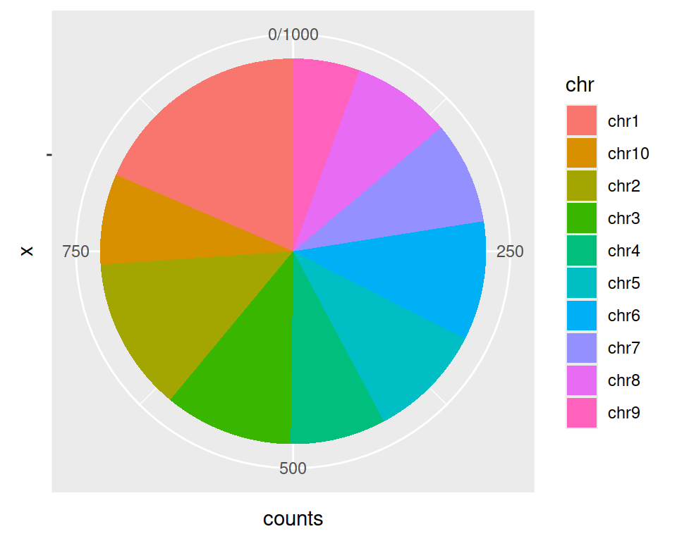
We will plot a pie chart representing the number of genes from gtf found in each chromosome.
Prepare data so as to obtain counts (that is more advanced dplyr manipulation - we will not go through details):
gtf_count_chr <- gtf %>%
  group_by(chr) %>% # group by allows to make the next calculations by the group specified
  summarise(counts=n())
The coord_polar() is needed here: pie plots are stacked barplots in polar coordinates.
ggplot(data=gtf_count_chr, mapping=aes(x="", y=counts, fill=chr)) +
  geom_bar(stat="identity") +
  coord_polar("y", start=0)
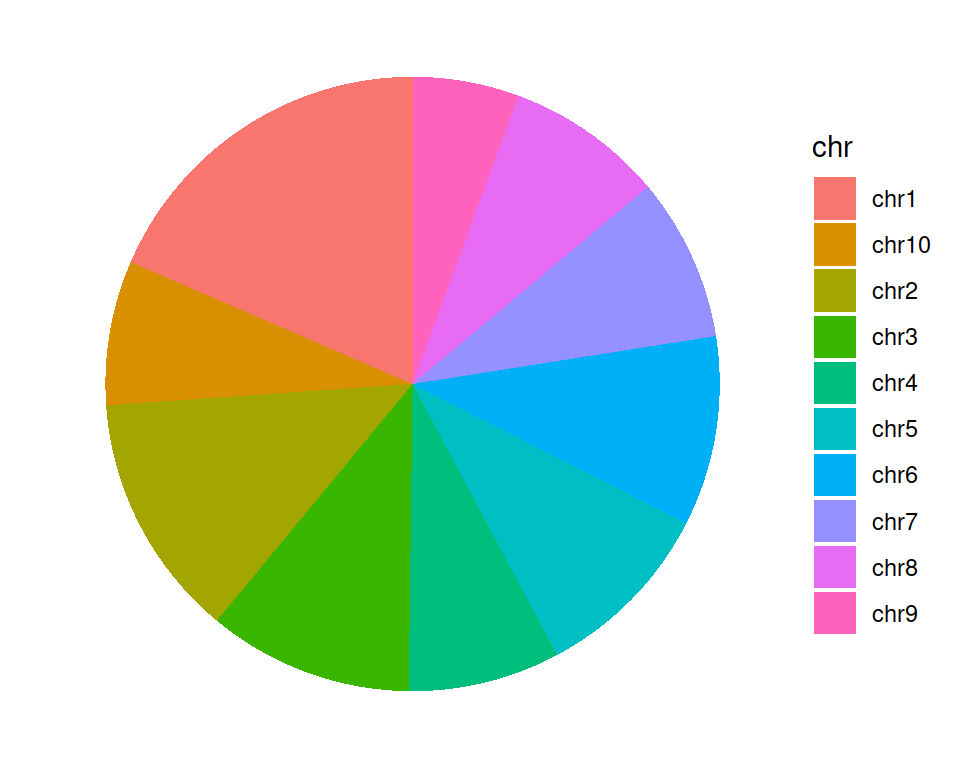
ggplot(data=gtf_count_chr, mapping=aes(x="", y=counts, fill=chr)) +
  geom_bar(stat="identity") +
  coord_polar("y", start=0) +
  theme_void()
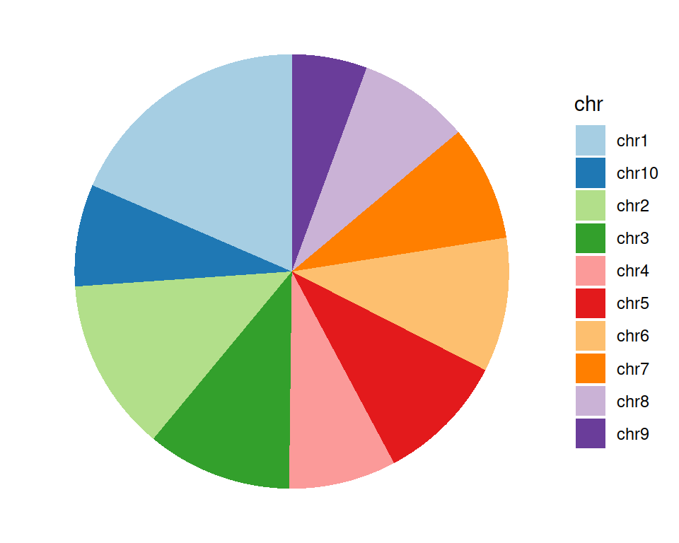
Change the color scale:
ggplot(data=gtf_count_chr, mapping=aes(x="", y=counts, fill=chr)) +
  geom_bar(stat="identity") +
  coord_polar("y", start=0) +
  scale_fill_brewer(palette="Paired") +
  theme_void()
Here is a nice page about more pie plot customization.