8.6 Barplots
A barplot (or barchart) is a graph that represents categorical data with rectangular bars, which heights are proportional to the values they represent.
The first layer of the ggplot() function is similar. However, note that only x= is set in aes() function (the basic way to plot a barplot):
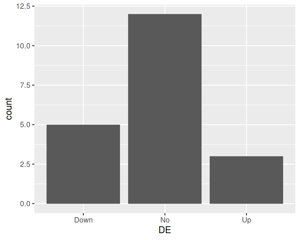
Using our previous geneexp data, we can produce a bar plot out of the DE column, such as:

This produces a barplots containing 3 bars: Down, No and Up: their height represents the number of genes found in each category.