8.13 Exercise 3
This exercise aims to give you the opportunity to practice some of the fine-tuning we have just learned.
For this exercise, we will use the diamonds dataset that is automatically loaded with ggplot2.
The dataset containing the prices and other attributes of almost 54,000 diamonds.
You can readily use it in your current session:
## # A tibble: 53,940 × 10
##    carat cut       color clarity depth table price     x     y     z
##    <dbl> <ord>     <ord> <ord>   <dbl> <dbl> <int> <dbl> <dbl> <dbl>
##  1  0.23 Ideal     E     SI2      61.5    55   326  3.95  3.98  2.43
##  2  0.21 Premium   E     SI1      59.8    61   326  3.89  3.84  2.31
##  3  0.23 Good      E     VS1      56.9    65   327  4.05  4.07  2.31
##  4  0.29 Premium   I     VS2      62.4    58   334  4.2   4.23  2.63
##  5  0.31 Good      J     SI2      63.3    58   335  4.34  4.35  2.75
##  6  0.24 Very Good J     VVS2     62.8    57   336  3.94  3.96  2.48
##  7  0.24 Very Good I     VVS1     62.3    57   336  3.95  3.98  2.47
##  8  0.26 Very Good H     SI1      61.9    55   337  4.07  4.11  2.53
##  9  0.22 Fair      E     VS2      65.1    61   337  3.87  3.78  2.49
## 10  0.23 Very Good H     VS1      59.4    61   338  4     4.05  2.39
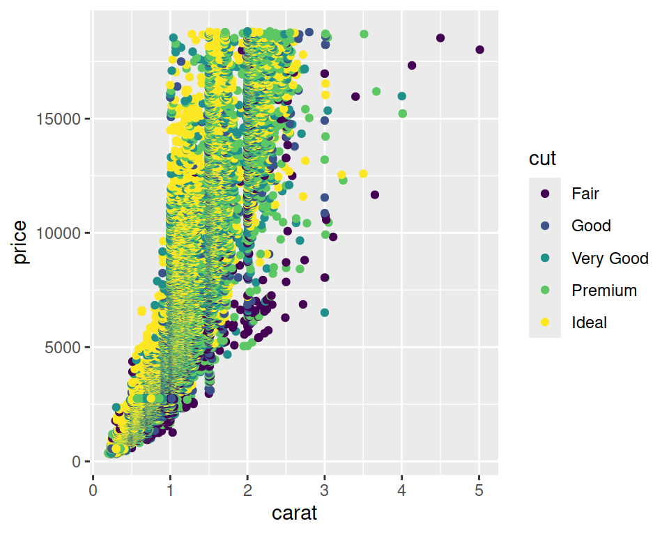
## # ℹ 53,930 more rows- Make a scatter plot of carat (x-axis) vs price (y-axis), with colors mapped to the cut.
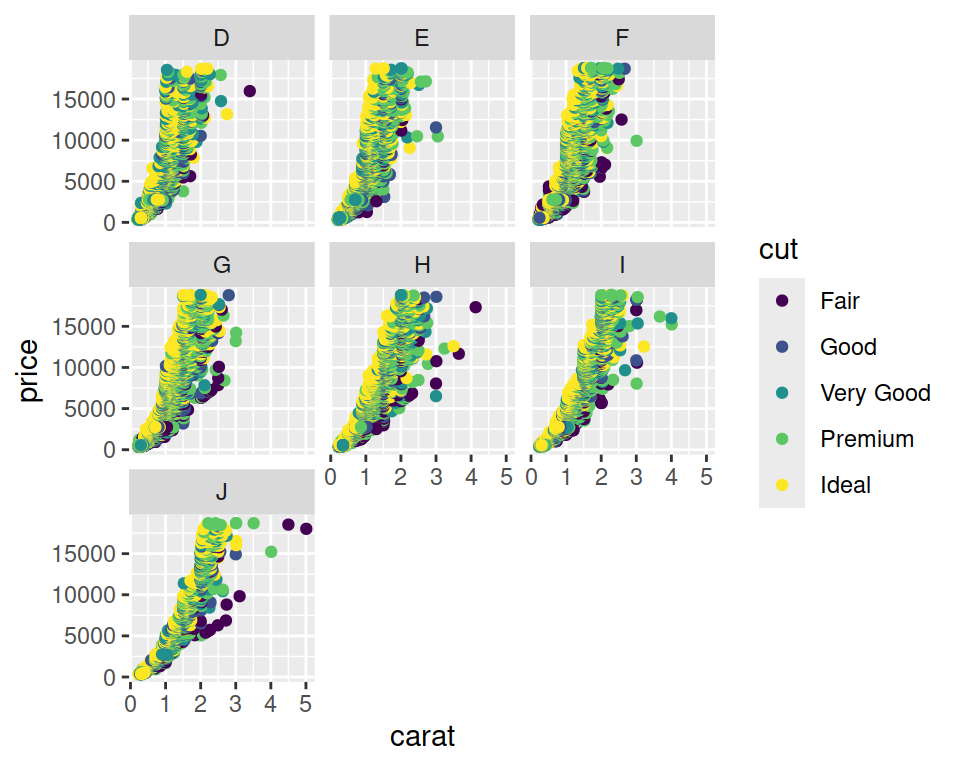
- Facet / split the plot per color (that is a column in diamonds).
correction
- Change the defaut theme (to theme_bw(), theme_minimal(), for example) and increase the base text size, and add a title to the overall plot.
correction
ggplot(data=diamonds, mapping=aes(x=carat, y=price, color=cut)) +
geom_point() +
facet_wrap(~color) +
theme_minimal(base_size = 15) +
ggtitle("Diamonds carat, price and cut")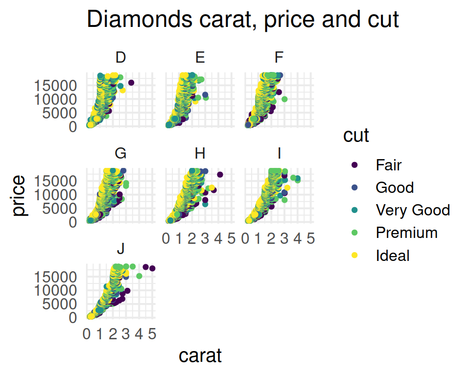
- Change the color palette to the one of your choice. You can pick one from RColorBrewer, for example.
correction
ggplot(data=diamonds, mapping=aes(x=carat, y=price, color=cut)) +
  geom_point() +
facet_wrap(~color) +
theme_minimal(base_size = 15) +
ggtitle("Diamonds carat, price and cut") +
scale_color_brewer(palette="Dark2")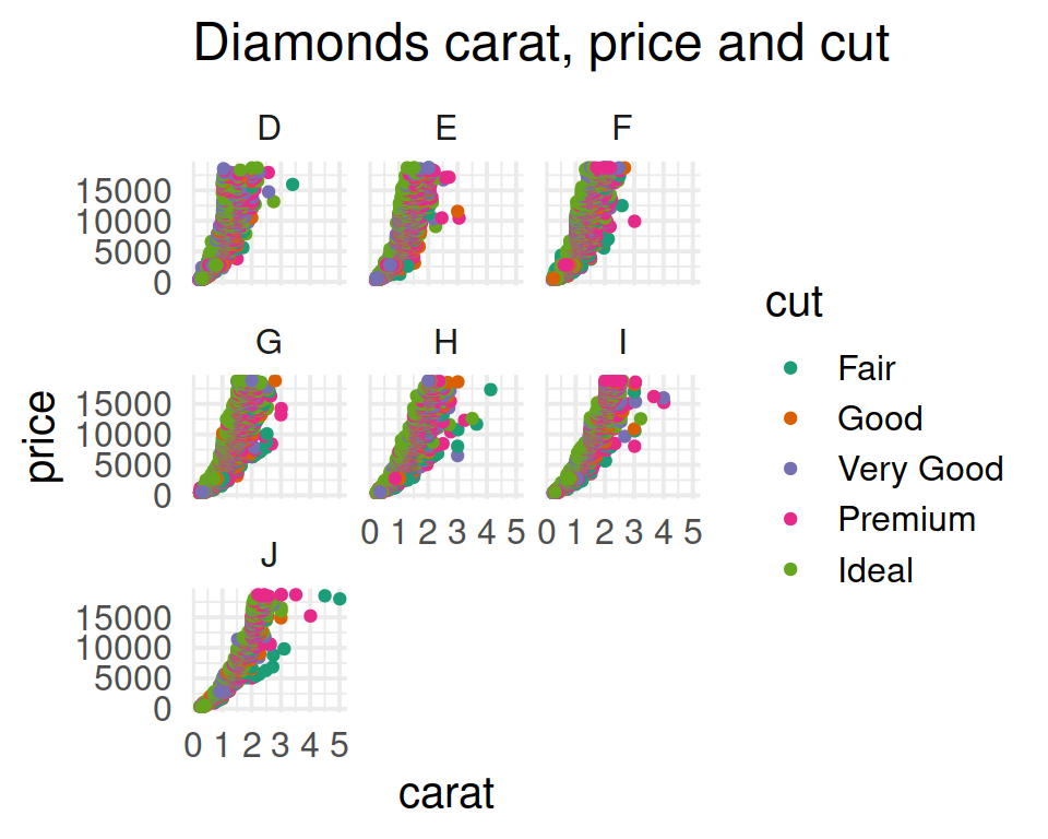
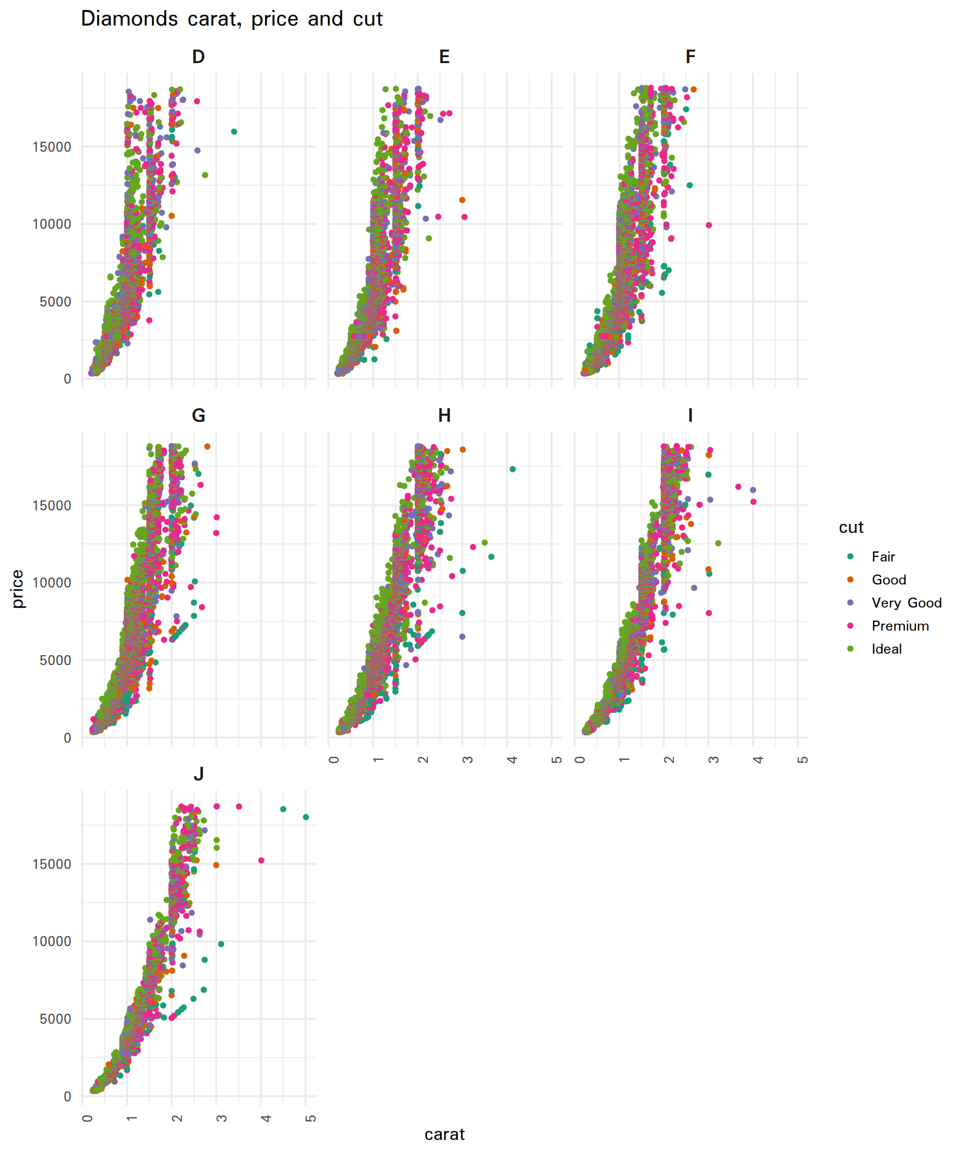
- Play with the theme() function. For example:
- Rotate the x-axis labels to 90 degrees.
- Make the individual titles larger bold (this is done with strip.text parameter).
correction
ggplot(data=diamonds, mapping=aes(x=carat, y=price, color=cut)) +
  geom_point() +
  facet_wrap(~color) +
  theme_minimal(base_size = 15, base_family = "Padauk") +
  ggtitle("Diamonds carat, price and cut") +
  scale_color_brewer(palette="Dark2") +
  theme(axis.text.x = element_text(angle=90), strip.text = element_text(size = 16, face = "bold"))