11.2 Exercise 6: scatter plot
- Import DataViz_source_files-main/files/GSE150029_rnaseq_log2.csv into an object called rnaseq.
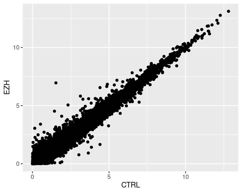
- Create a scatter plot that represents sample CTRL on the x axis and sample EZH on the y axis.
3. Color the points according to the gene_biotype
3. Not very readable! Filter and plot only data corresponding to either lincRNA OR miRNA.
correction
rnaseq_linc_mirna_filter1 <- filter(rnaseq, (gene_biotype=="lincRNA" | gene_biotype=="miRNA"))

ggplot(data=rnaseq_linc_mirna_filter1, mapping=aes(x=CTRL, y=EZH, color=gene_biotype)) +
  geom_point()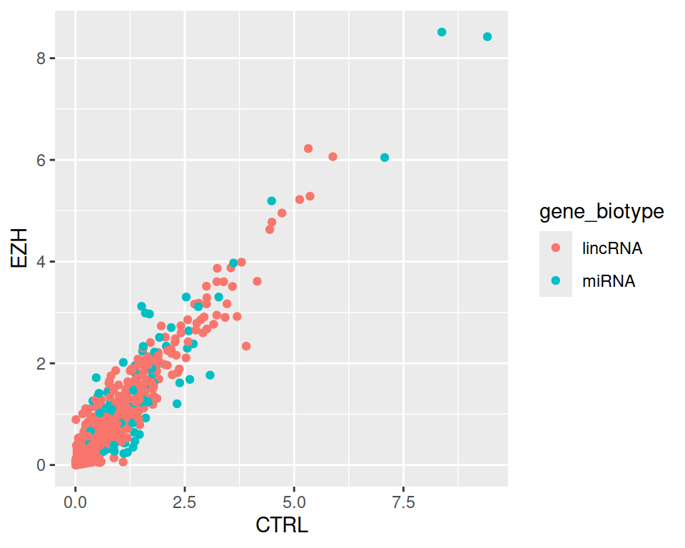
4. Now keep only those lincRNAs and miRNAs that are expressed in CTRL at least 1.5 times more than in EZH.
correction
rnaseq_linc_mirna_filter2 <- filter(rnaseq, (gene_biotype=="lincRNA" | gene_biotype=="miRNA") & CTRL > 1.5*EZH)

ggplot(data=rnaseq_linc_mirna_filter2, mapping=aes(x=CTRL, y=EZH, color=gene_biotype)) +
  geom_point()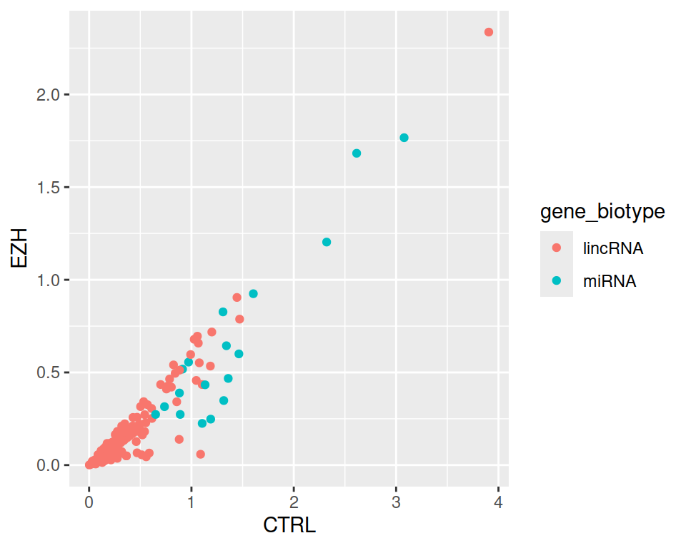
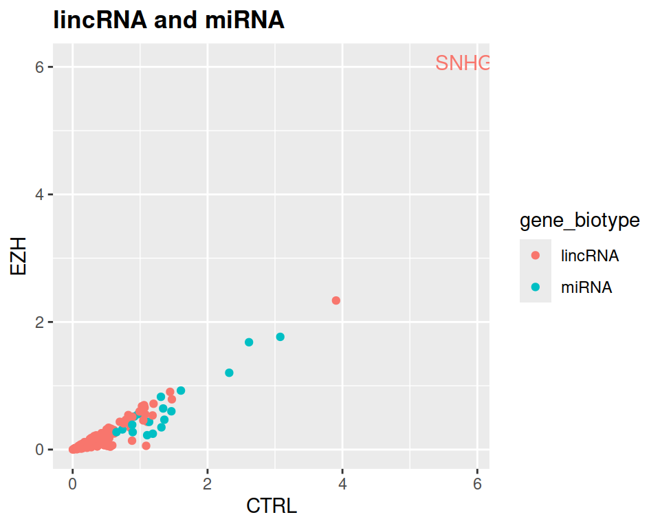
- Add a title to the plot, and make it bold (see theme() section of the course)
correction
ggplot(data=rnaseq_linc_mirna_filter2, mapping=aes(x=CTRL, y=EZH, color=gene_biotype)) +
  geom_point() +
  ggtitle("lincRNA and miRNA") +
  theme(plot.title = element_text(face = "bold"))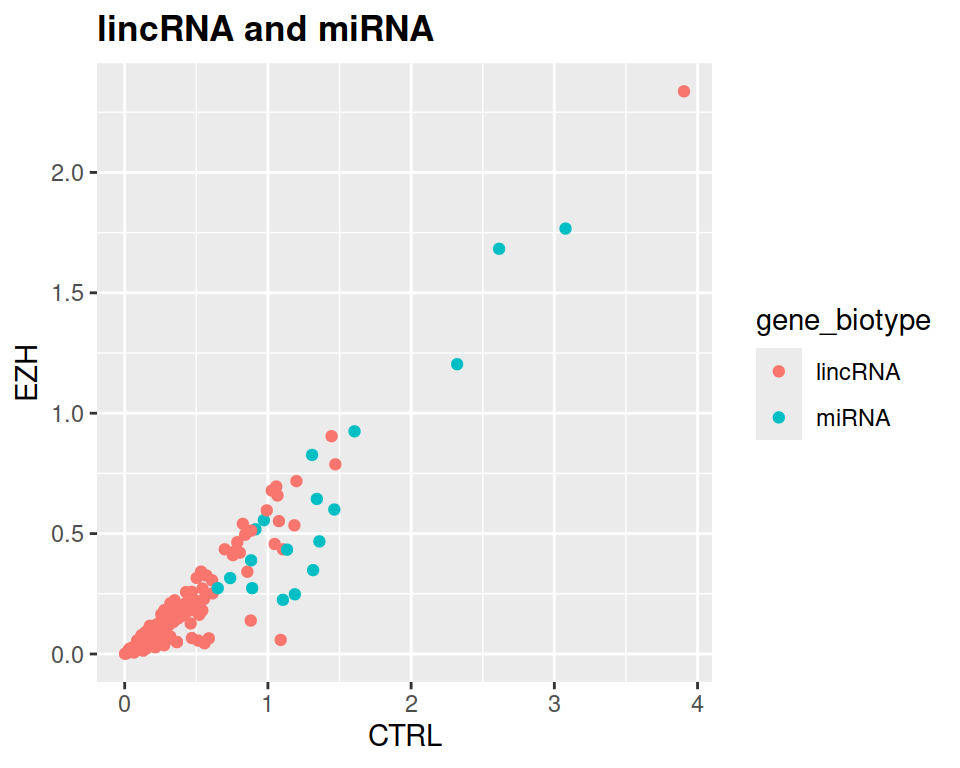
NOTE: If you want to label only one (or few) point(s), click here.
First, filter the data frame:
Then, add it to geom_text:
ggplot(data=rnaseq_linc_mirna_filter2, mapping=aes(x=CTRL, y=EZH, color=gene_biotype)) +
  geom_point() +
  ggtitle("lincRNA and miRNA") +
  theme(plot.title = element_text(face = "bold")) +
  geom_text(data=SNHG8, label="SNHG8", show.legend = FALSE)