8.11 Text fine-tuning
Controlling the font size and style of the different components of the graph (axis text, title, legend, etc.) is essential for the understanding and impact of the figure.
Text size and style in ggplot2 graphs can be modified using the theme() function. While very powerful, it can take some time to get used to the structure.
We will illustrate how to make some changes using theme() layer on our first scatter plot.
- Change overall font size:
ggplot(data=geneexp, mapping=aes(x=sample1, y=sample2)) +
  geom_point() +
  ggtitle("scatter plot") +
  theme(text = element_text(size = 20))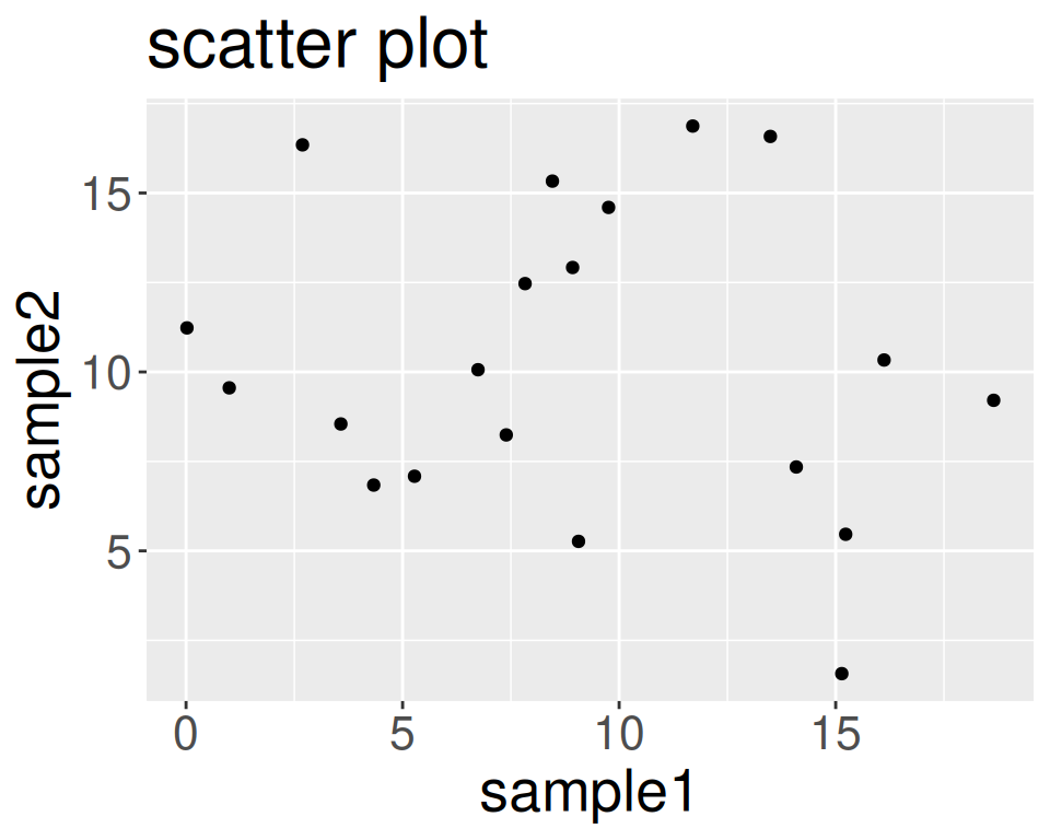
- Change font size of axis text:
ggplot(data=geneexp, mapping=aes(x=sample1, y=sample2)) +
  geom_point() +
  ggtitle("scatter plot") +
  theme(axis.text = element_text(size = 20))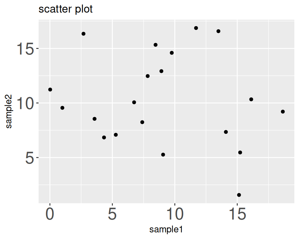
- Change font size of axis titles:
ggplot(data=geneexp, mapping=aes(x=sample1, y=sample2)) +
  geom_point() +
  ggtitle("scatter plot") +
  theme(axis.title = element_text(size = 20))
- Remove axis titles (e.g. below: removing x-axis title):
ggplot(data=geneexp, mapping=aes(x=sample1, y=sample2)) +
  geom_point() +
  ggtitle("scatter plot") +
  theme(axis.title.x = element_blank())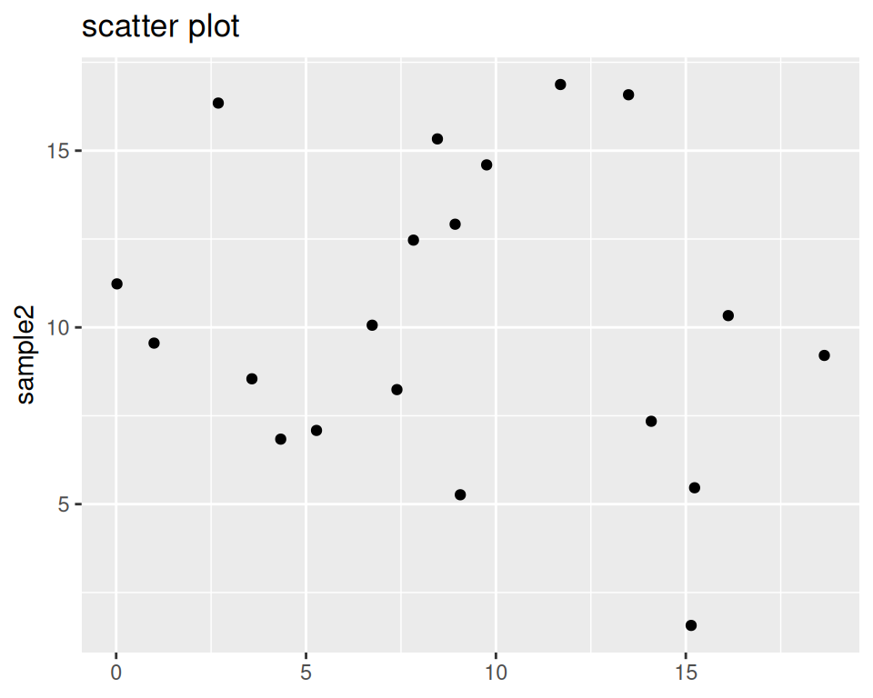
- Shift the graph title to the right (it is by default centered to the left):
ggplot(data=geneexp, mapping=aes(x=sample1, y=sample2)) +
  geom_point() +
  ggtitle("scatter plot") +
  theme(plot.title = element_text(hjust = 0.5))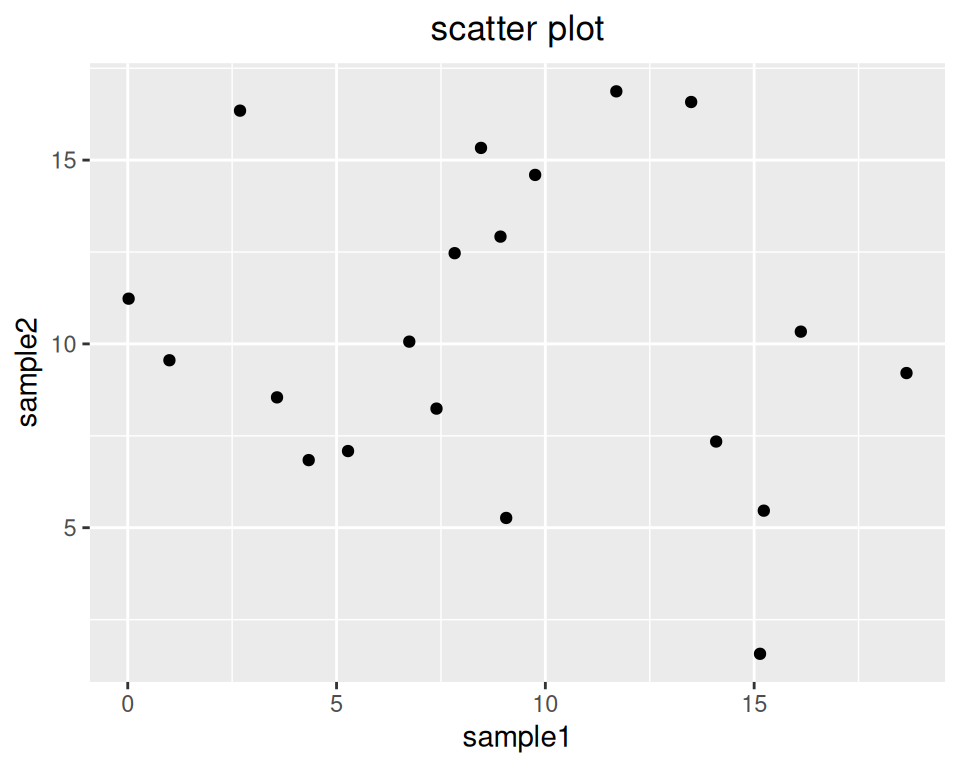
- Change font size of the graph title:
ggplot(data=geneexp, mapping=aes(x=sample1, y=sample2)) +
  geom_point() +
  ggtitle("scatter plot") +
  theme(plot.title = element_text(size = 20, hjust = 0.5))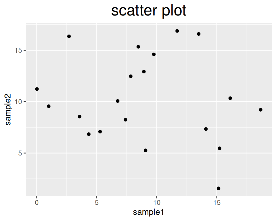
- Change the color of the title, and make it bold:
ggplot(data=geneexp, mapping=aes(x=sample1, y=sample2)) +
  geom_point() +
  ggtitle("scatter plot") +
  theme(plot.title = element_text(size = 20, hjust = 0.5, face = "bold", colour = "blue"))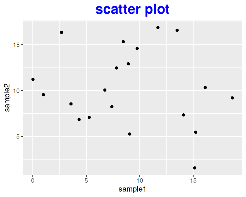
- You can also use theme() to rotate the x-axis label of plots, for example:
ggplot(data=geneexp, mapping=aes(x=sample1, y=sample2)) +
  geom_point() +
  ggtitle("scatter plot") +
  theme(axis.text.x = element_text(angle=90))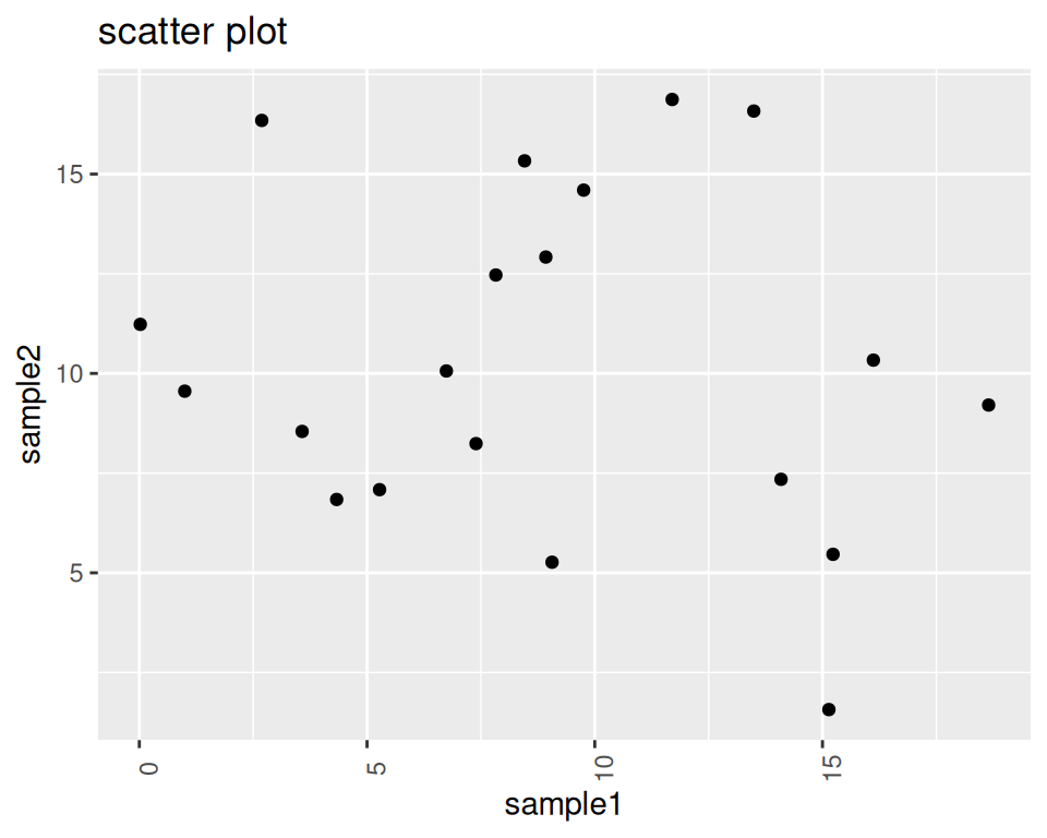
- As a last examples, let’s see how we can control the plot’s legend:
Colored background:
ggplot(data=geneexp, mapping=aes(x=sample1, y=sample2, color=DE)) +
  geom_point() +
  theme(legend.background = element_rect(fill="yellow"))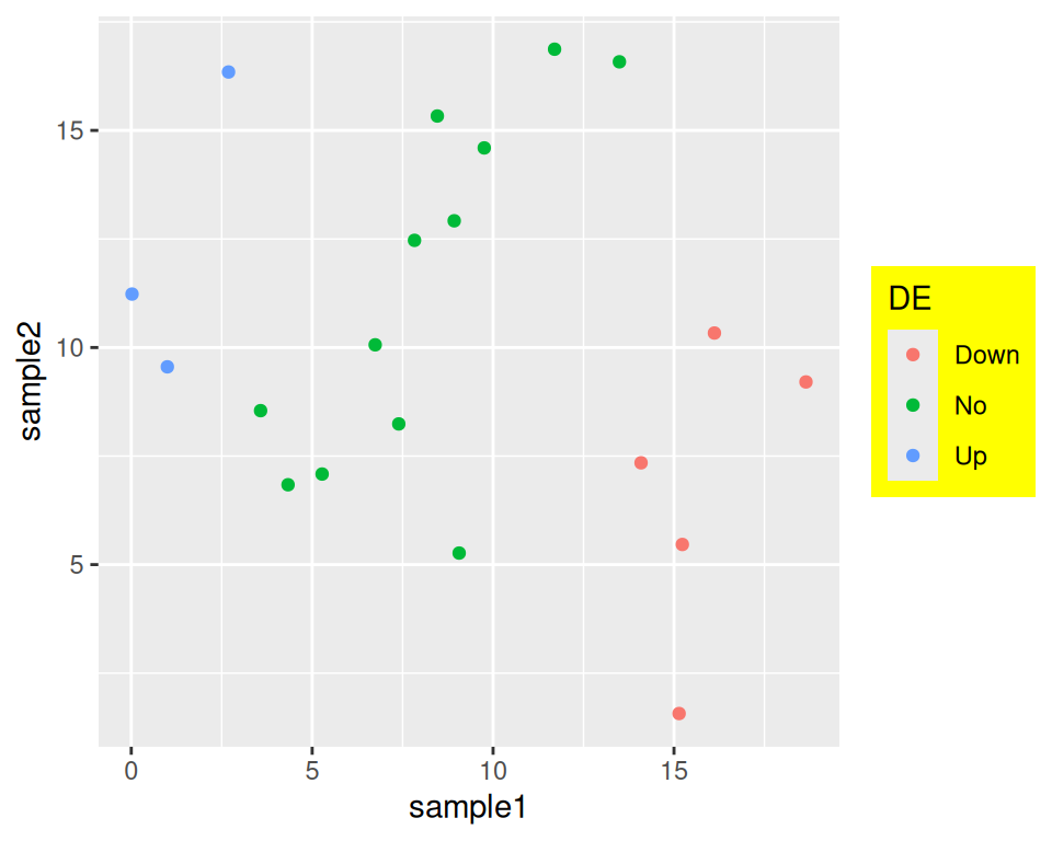
Decrease or increase the space between the legend box and the plot:
ggplot(data=geneexp, mapping=aes(x=sample1, y=sample2, color=DE)) +
  geom_point() +
  theme(legend.box.spacing = unit(3, "cm")) # default is 0.4cm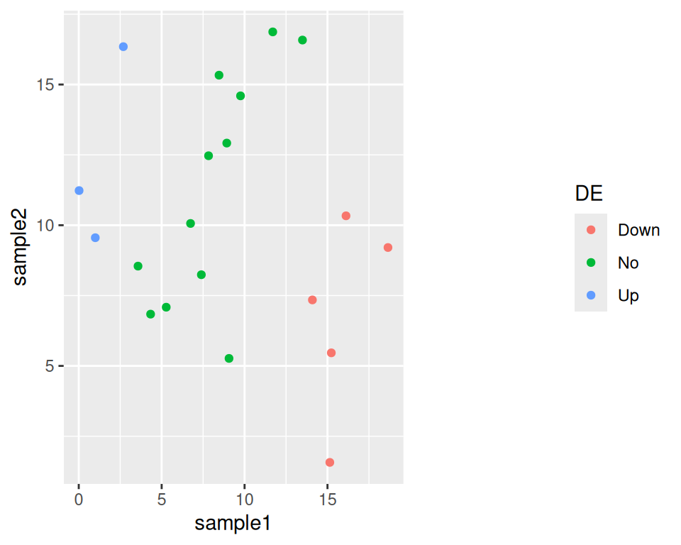
Remove the key background:
ggplot(data=geneexp, mapping=aes(x=sample1, y=sample2, color=DE)) +
  geom_point() +
  theme(legend.key = element_blank())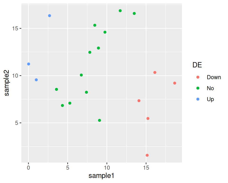
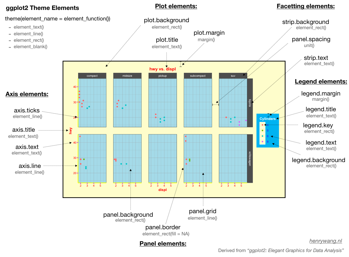
Graphical summary of the different theme elements:
To learn more, check: