8.2 Scatter plot
8.2.1 Base plot
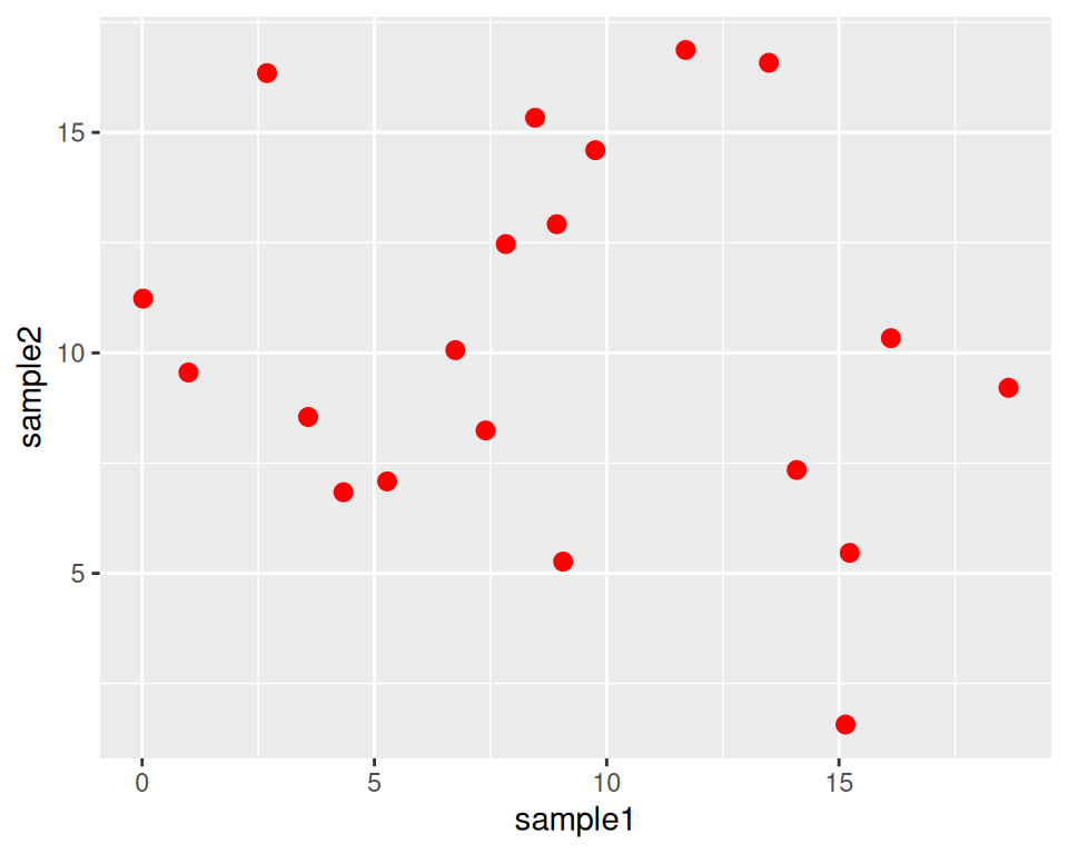
We can start from the geneexp object, that contains data from expression_20genes.csv: we will represent sample1 on the x axis and sample2 on the y axis.
The base layer is built as follows (Copy-paste this in the console, and hit Enter):
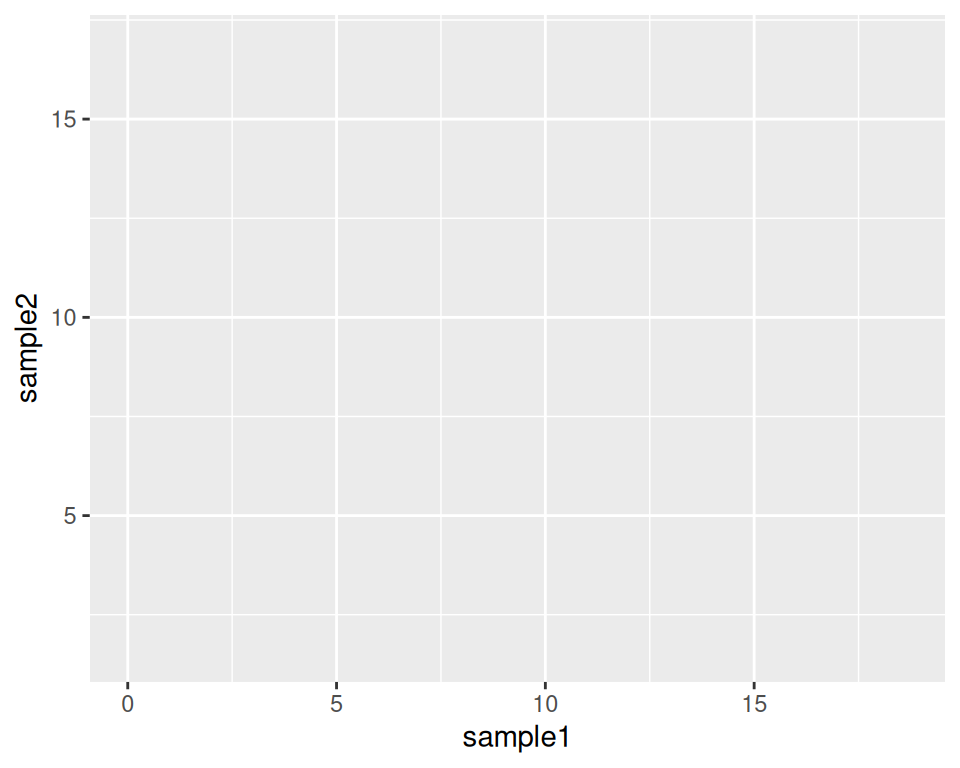
As you can see, nothing is plotted yet, but the base is set.
We then add a geometrics geom_point() to the base layer: this tells ggplot to produce a scatter/point plot:
# This line is a comment: a comment is not interpreted by R.
# Example of a scatter plot: add the geom_point() layer
ggplot(data=geneexp, mapping=aes(x=sample1, y=sample2)) +
  geom_point()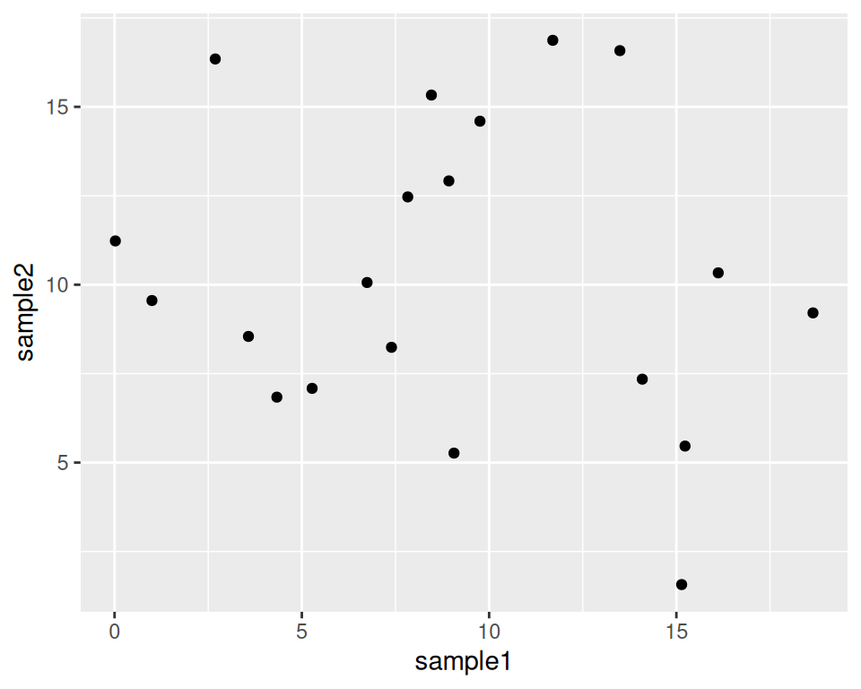
Please, copy this code to your script, and execute it!
Your plot should appear in the “Plots” tab in the bottom-right panel.
8.2.2 Customize the points
geom_point() can take parameters, including the point color and size:
Color all points in red:
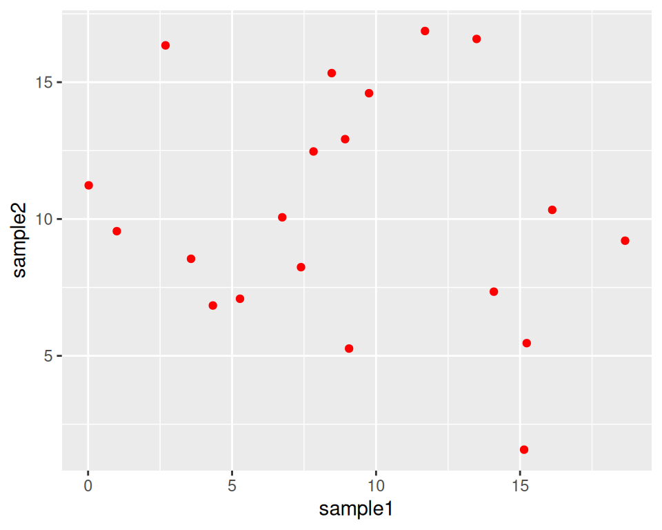
Increase point size (default size is 1.5):
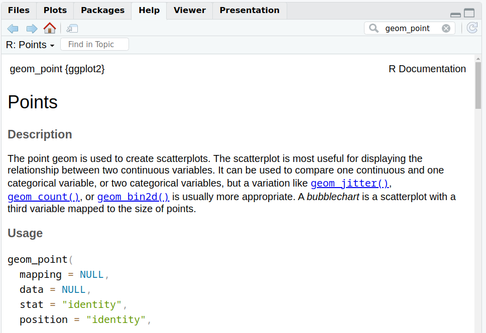
How do you know how a function works?
Functions in ggplot2 (and tidyverse in general) are richly documented.
While documentation/help pages can be quite technical it is a good practice to take a look at them.
You can access the help page of a function in the Help tab in the bottom-right panel. Give it a try with “geom_point”:
Back to our customization: we can change the point shape by setting the shape parameter in geom_point().
Points can become, for example, triangles:
ggplot(data=geneexp, mapping=aes(x=sample1, y=sample2)) +
  geom_point(color="red", size=2.5, shape="triangle")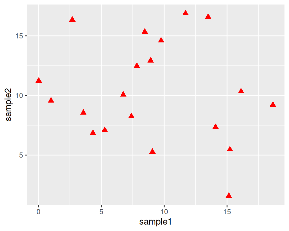
See more options in the following image:

Image from ggplot2 documentation
Note that you can also replace the points by any character, the following way:
ggplot(data=geneexp, mapping=aes(x=sample1, y=sample2)) +
  geom_point(color="red", size=2.5, shape="$")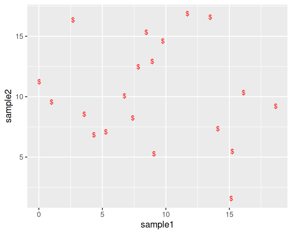
8.2.3 Add more layers
We can add more layers to the plot, using the same structure (+ layer_name())
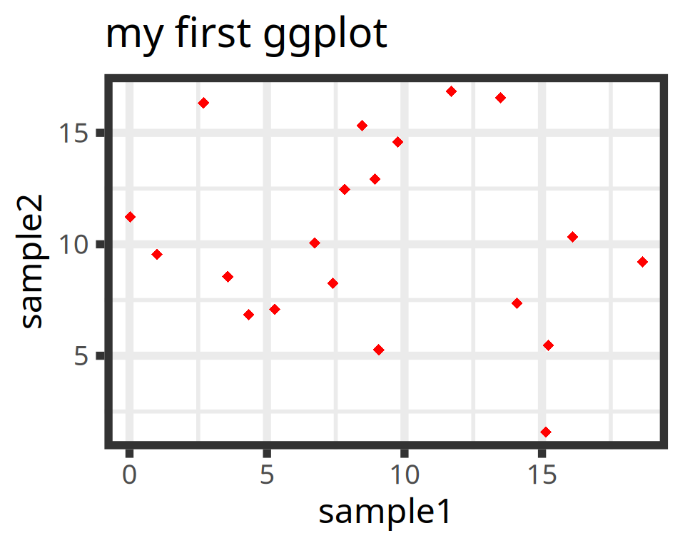
8.2.3.1 ggtitle()
Add a title using the ggtitle() layer:
ggplot(data=geneexp, mapping=aes(x=sample1, y=sample2)) +
  geom_point(color="red", size=2.5, shape="diamond") +
  ggtitle(label="my first ggplot")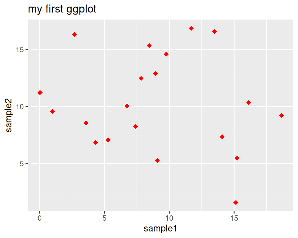
label is a parameter of ggtitle() function.
8.2.3.2 Background
Not a big fan of the default grey background?
This is the default “theme”, but there are more options.
Examples:
ggplot(data=geneexp, mapping=aes(x=sample1, y=sample2)) +
  geom_point(color="red", size=2.5, shape="diamond") +
  ggtitle(label="theme grey (the default theme)") +
  theme_grey()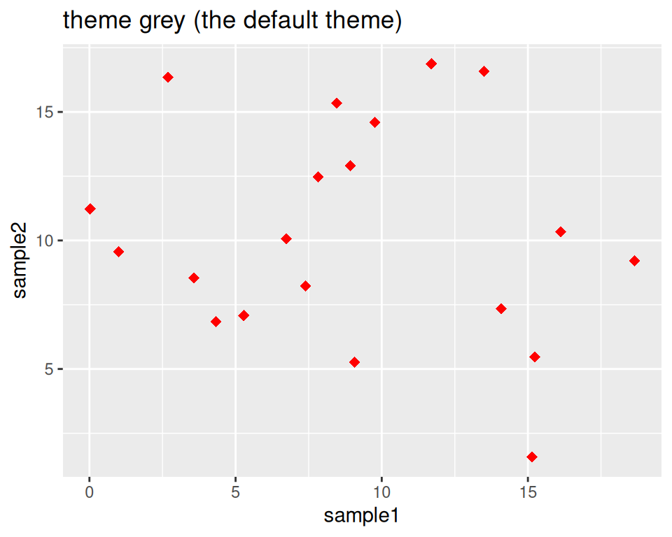
ggplot(data=geneexp, mapping=aes(x=sample1, y=sample2)) +
  geom_point(color="red", size=2.5, shape="diamond") +
  ggtitle(label="theme linedraw") +
  theme_linedraw()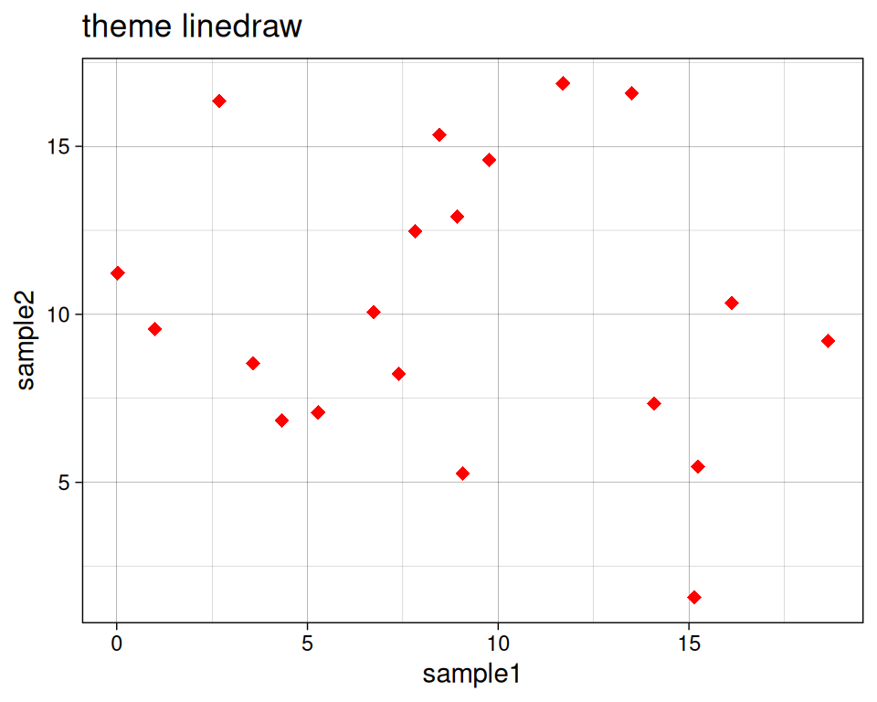
ggplot(data=geneexp, mapping=aes(x=sample1, y=sample2)) +
  geom_point(color="red", size=2.5, shape="diamond") +
  ggtitle(label="theme bw = black and white") +
  theme_bw()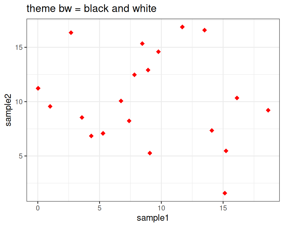
ggplot(data=geneexp, mapping=aes(x=sample1, y=sample2)) +
  geom_point(color="red", size=2.5, shape="diamond") +
  ggtitle(label="theme void") +
  theme_void()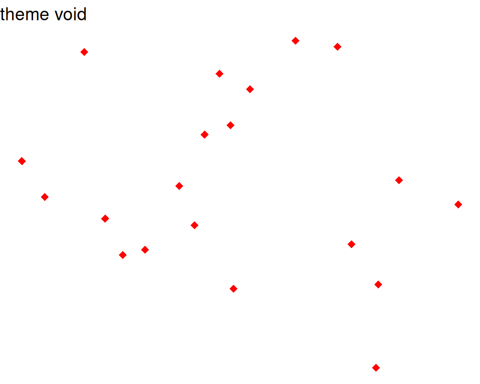
Good webpage to check the different backgrounds: https://ggplot2-book.org/themes#sec-theme
You can also change some settings globally as you use a new theme, e.g.
- base_size: by default, 11.
- base_family: the font (uses by default arial or sans). To check the fonts that are available, type systemfonts::system_fonts()$family
- base_line_size: by default, base_size/22.
- base_rect_size: by default, base_size/22
# get full list of available fonts in your system with:
ggplot(data=geneexp, mapping=aes(x=sample1, y=sample2)) +
  geom_point(color="red", size=2.5, shape="diamond") +
  ggtitle(label="my first ggplot") +
  theme_bw(base_size=18, base_family = "Laksaman", base_line_size = 2, base_rect_size = 4)