8.9 Barplots: bars position
We can modify the bars position. By default, position is stack, i.e. categories are stacked on top of each other.
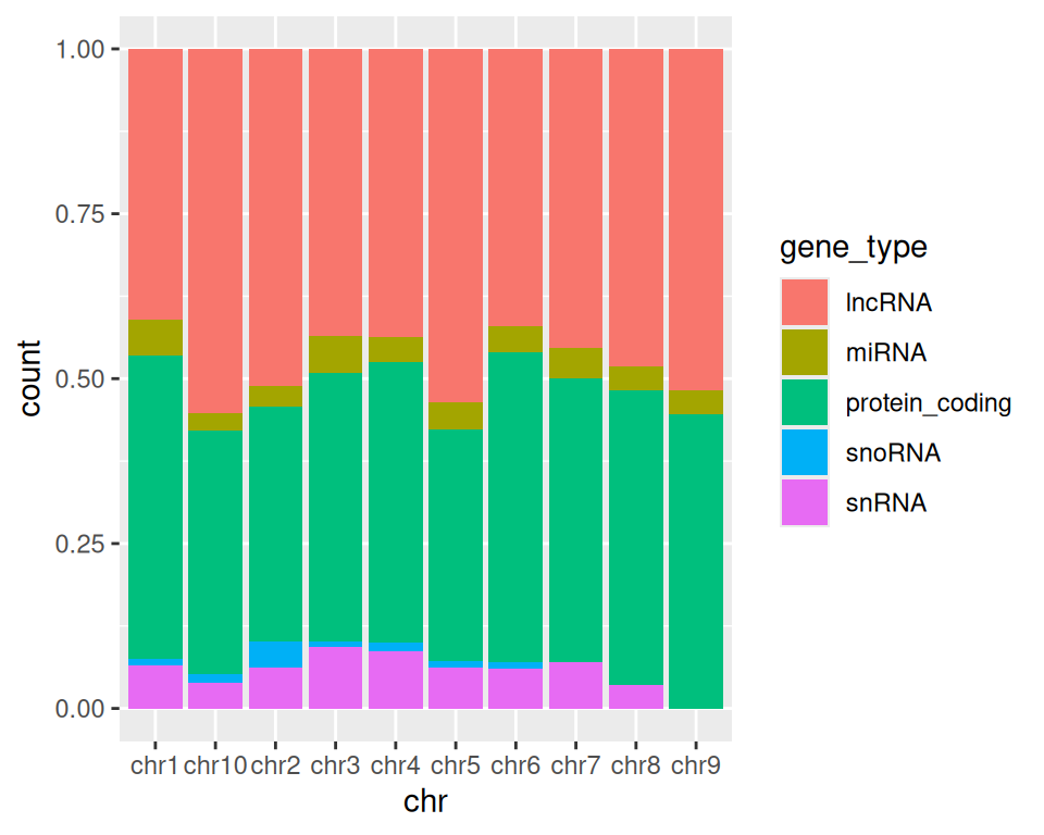
Position fill scales data so the upper bound is always 1, i.e. fill shows proportions, instead of absolute values:
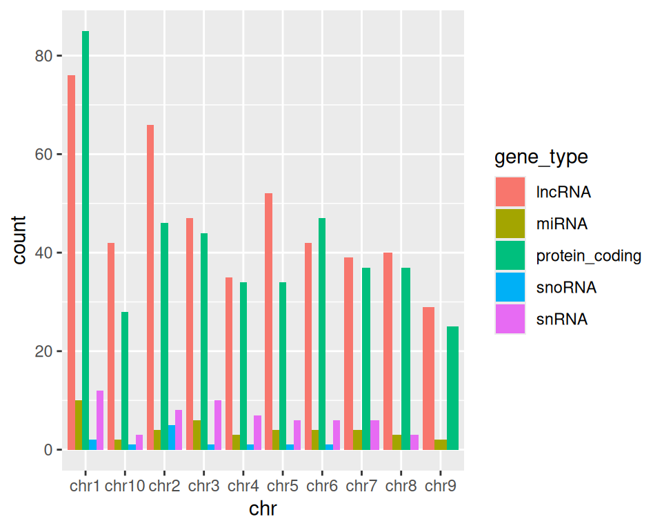
Position dodge organizes each category (here, gene types) side-by-side:
More advanced (as reference, or if someone asks): how to reorder x-axis labels:
Factors are a data type in R representing categorical data. Using factors requires a bit more understanding of how R works/thinks, but here is a useful application using ordered factors/categories to re-order bars in a barplot:
ggplot(data=gtf, mapping=aes(x=factor(chr, levels=c("chr1", "chr2", "chr3", "chr4", "chr5", "chr6", "chr7", "chr8", "chr9", "chr10"), ordered=TRUE), fill=gene_type)) +
  geom_bar(position="dodge") +
  xlab("chromosome")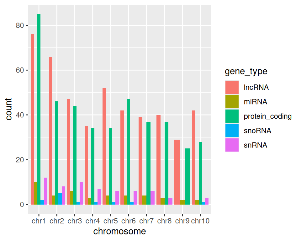
8.9.1 stat=“identity” parameter
stat represents a statistical transformation of the data. It typically aims to summarize the data.
geom_bar() provides different options for stat:
- count (default):
- provide x: x contains categories, used to split the bars
- number of occurrences of each value / category in x are reported
- no input is expected in y.
- identity:
- provide x: x contains categories, used to split the bars
- y is numerical: corresponds to the height of bars
- data in y is either used as is, or the sum can be computed, depending on the barplot aes design
Let’s import data from:
DataViz_source_files-main/files/stats_continents_barcelona_2013-2023_long.csv
in an object that we will call statsbcn.
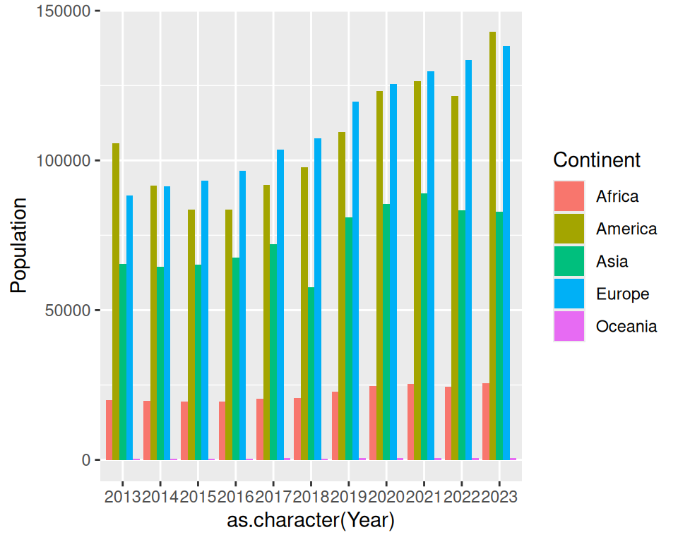
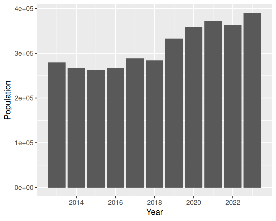
The data contains the number of foreign residents in Barcelona from 2013 to 2023.
statsbcn <- read_csv("DataViz_source_files-main/files/stats_continents_barcelona_2013-2023_long.csv")How many rows and how many columns does the data contain?
In the barplots we created until now, R takes categories in the columns specified in x= and counts the number of occurrences of each category.
If we set stat=“identity” in geom_bar(), R uses the sum of the variable specified in y=, grouped by the variable specified in x.
In the following example, we plot the sum of foreign residents in Barcelona (Population/number provided in y) per year (Year/category provided in x):
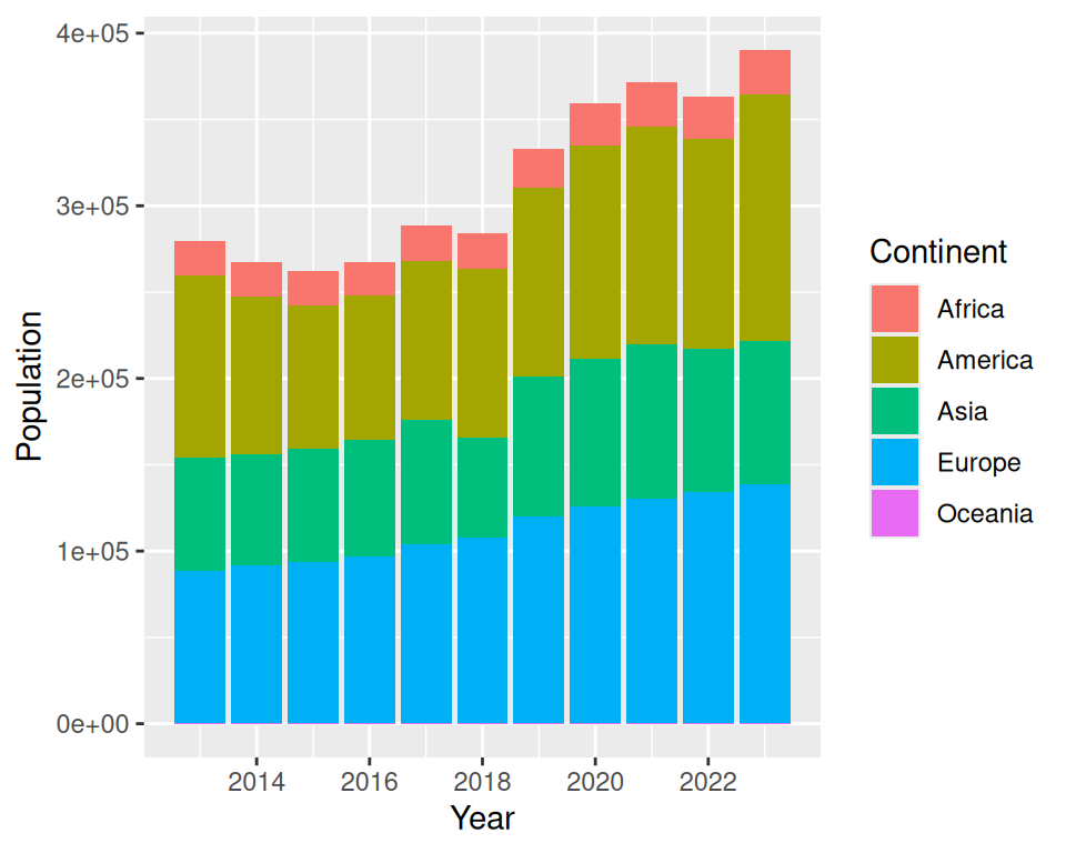
We can then map, for example, fill to Continent: this allows us to give more granularity to the visualization:
We can further play with the position, as previously done.
- Position fill :
ggplot(statsbcn, aes(x=Year, y=Population, fill=Continent)) +
  geom_bar(stat="identity", position="fill")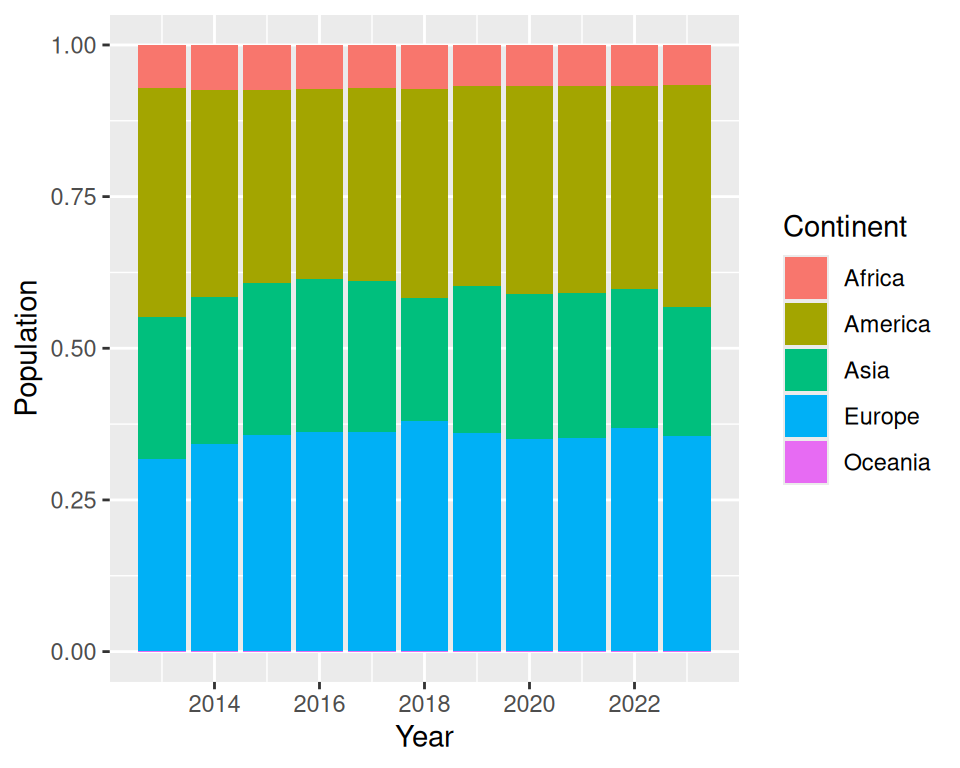
- Position dodge :
ggplot(statsbcn, aes(x=Year, y=Population, fill=Continent)) +
  geom_bar(stat="identity", position="dodge")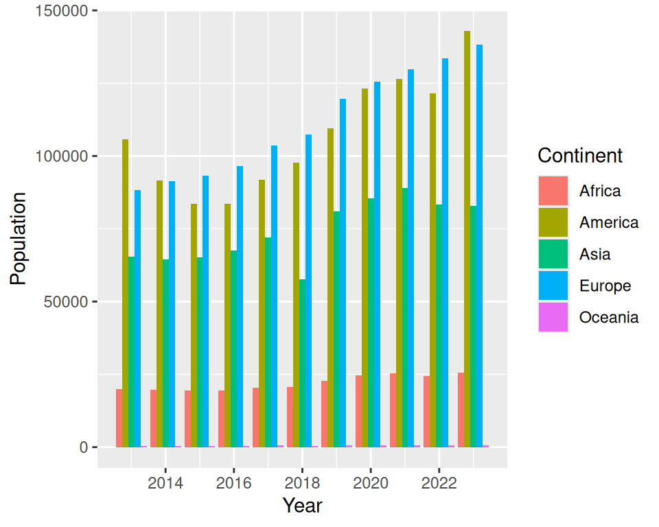
We can control the bars width (hence, the spacing between 2 bars) using the width parameter of geom_bar():
ggplot(statsbcn, aes(x=Year, y=Population, fill=Continent)) +
  geom_bar(stat="identity", position="dodge", width = 0.8)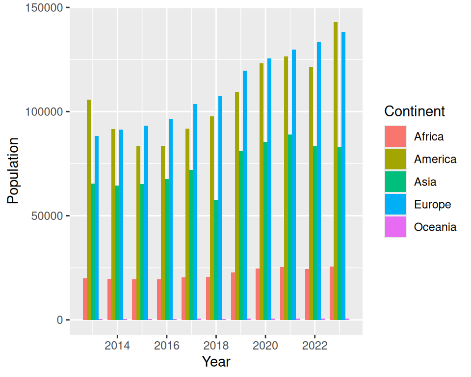
More advanced (as reference, or if someone asks): display all labels:
Convert “Year” column as character, instead of numbers:
# convert the x-axis from a continuous to a discrete variable (as.character)
ggplot(statsbcn, aes(x=as.character(Year), y=Population, fill=Continent)) +
  geom_bar(stat="identity", position="dodge")