8.5 Scatter plots: more features
Let’s customize our scatter plot a bit more.
We may want to show the gene names that the points represent.
This is done by:
- setting the label parameter, in the ggplot aes() function
- adding the geom_text() layer
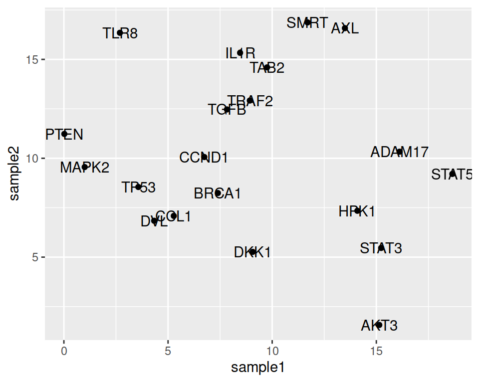
Not bad, but let’s adjust the location of the labels, so they do not overlap with the points.
We can set the nudge_x parameter, to move the labels horizontally (on the x axis).
ggplot(data=geneexp, mapping=aes(x=sample1, y=sample2, label=Gene)) +
  geom_point() +
  geom_text(nudge_x=1.5)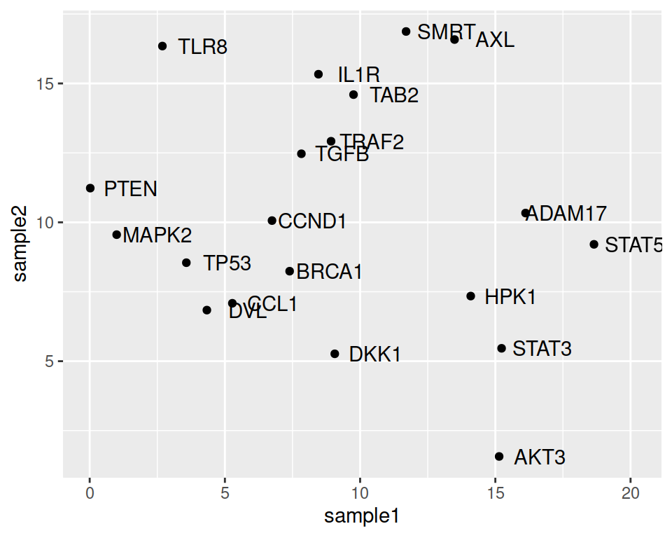
We can also decrease or increase the label size:
ggplot(data=geneexp, mapping=aes(x=sample1, y=sample2, label=Gene)) +
  geom_point() +
  geom_text(nudge_x=1.5, size=3)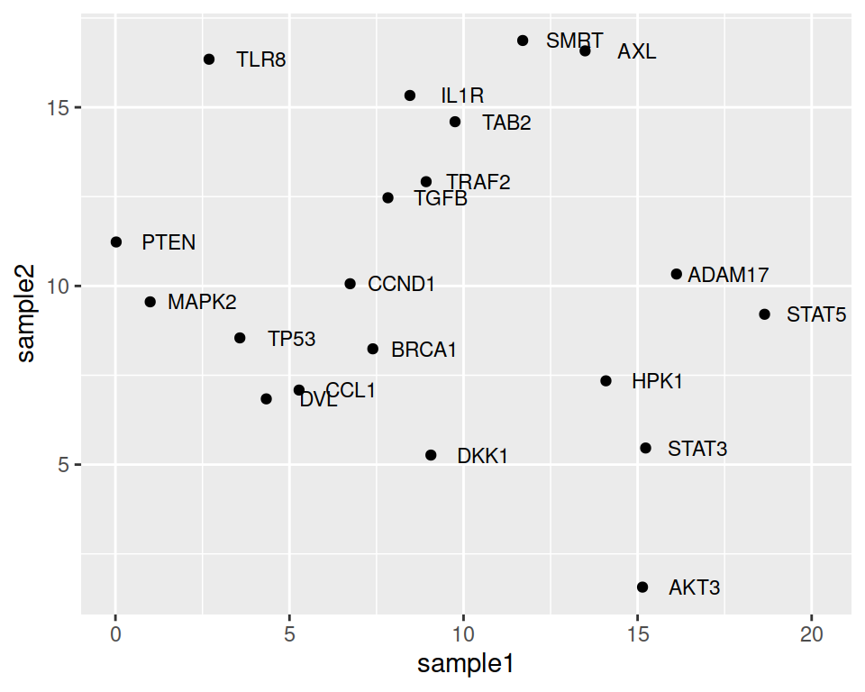
Note that the automatic organization of labels, so that they do not overlap, can be done using the {ggrepel} package. You only need to load the package and change geom_text() to geom_repel_text():
ggplot(data=geneexp, mapping=aes(x=sample1, y=sample2, label=Gene)) +
  geom_point() +
  geom_text_repel()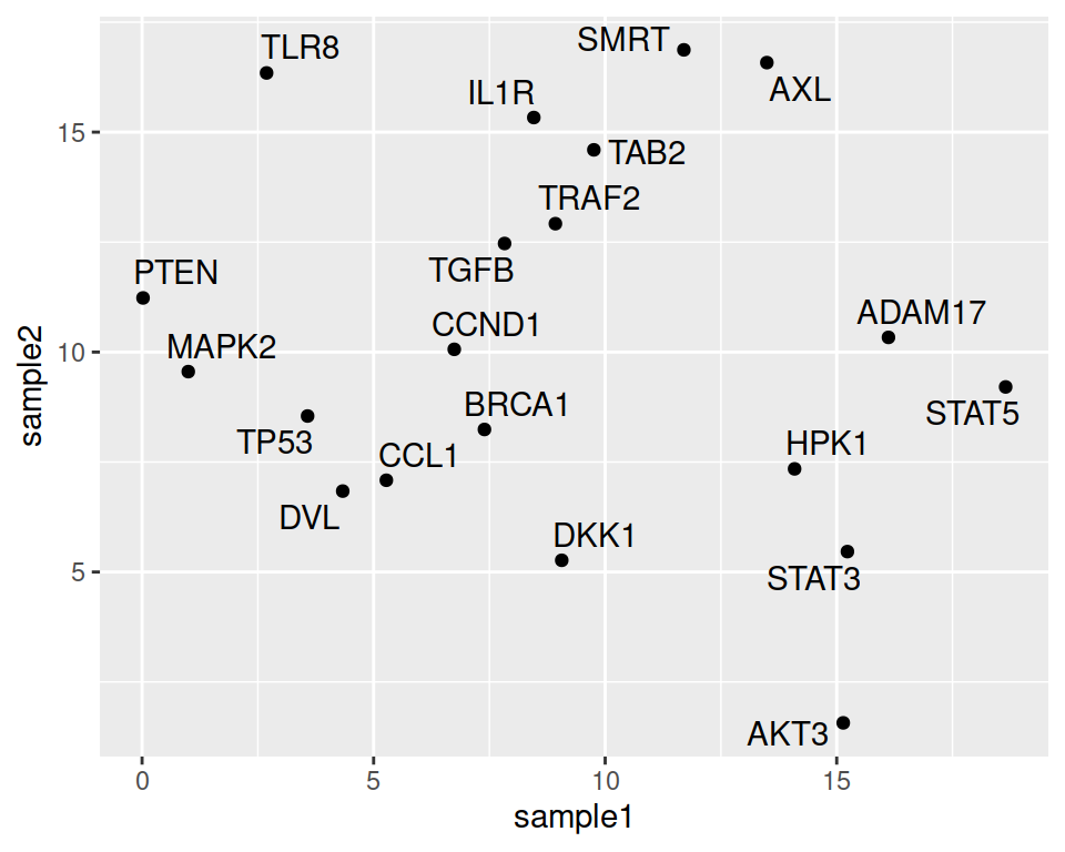
Last but not least: point color and shape can be dependent on another column / variable of the data.
Columns to conditionally color or shape the points should be specified inside the aes() function.
For shape:
ggplot(data=geneexp, mapping=aes(x=sample1, y=sample2, label=Gene, shape=DE)) +
  geom_point() +
  geom_text(nudge_x=1.2, size=3)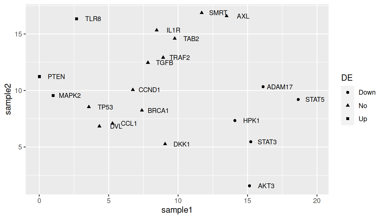
For color:
ggplot(data=geneexp, mapping=aes(x=sample1, y=sample2, label=Gene, color=DE)) +
  geom_point() +
  geom_text(nudge_x=1.2, size=3)
TIP: remove the weird double labeling in the legend (a letter behind the point): set show.legend=FALSE in geom_text():
ggplot(data=geneexp, mapping=aes(x=sample1, y=sample2, label=Gene, color=DE)) +
  geom_point() +
  geom_text(nudge_x=1.2, size=3, show.legend=FALSE)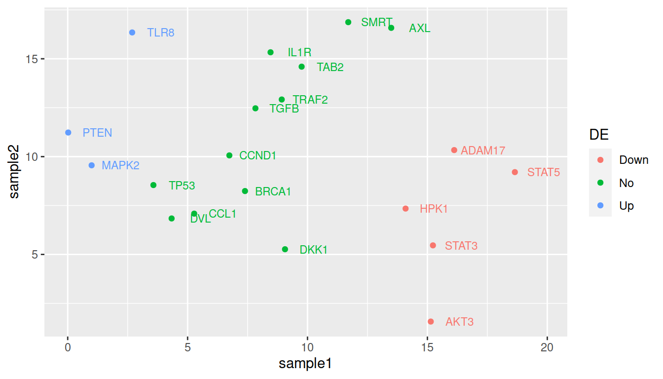
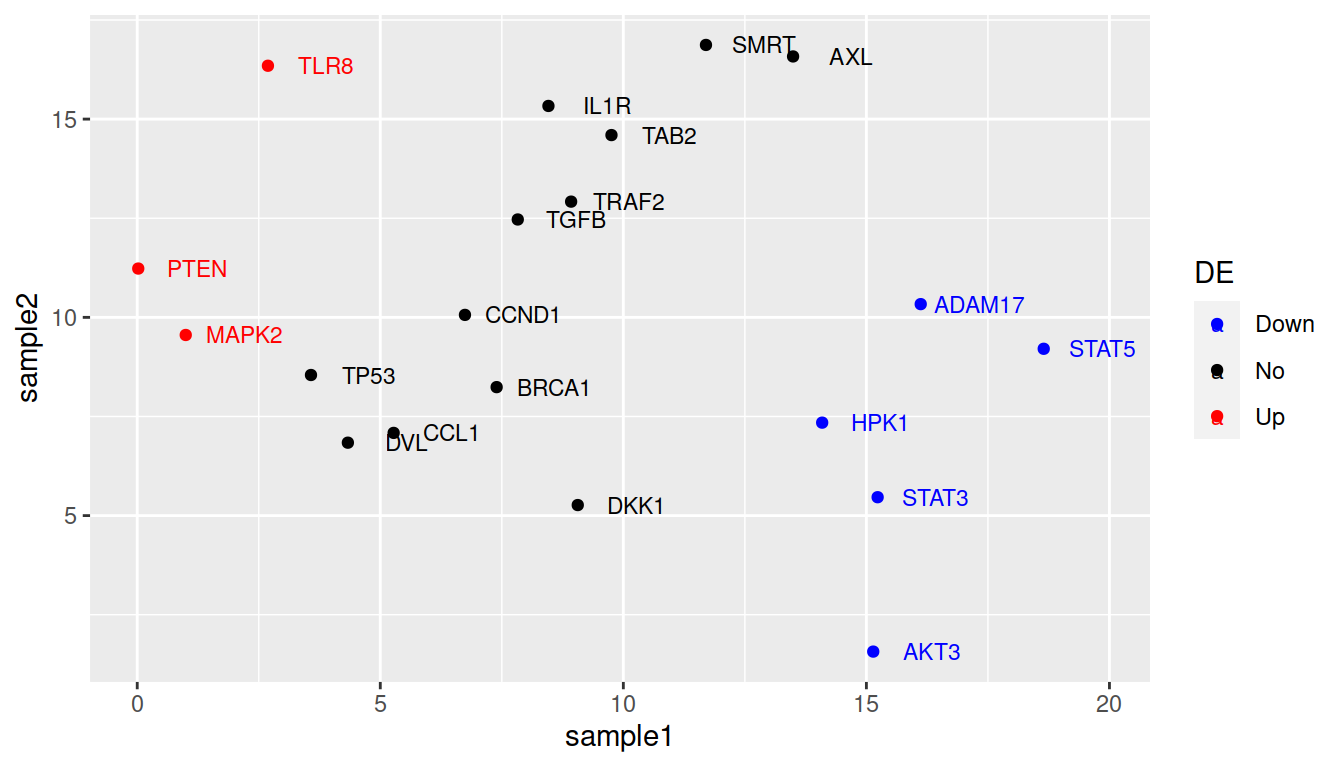
More advanced (as reference, or if someone asks): how to change default colors:
Colors can be set manually using (yet another) layer: scale_color_manual().
ggplot(data=geneexp, mapping=aes(x=sample1, y=sample2, label=Gene, color=DE)) +
  geom_point() +
  geom_text(nudge_x=1.2, size=3) +
  scale_color_manual(values=c(Down="blue", No="black", Up="red"))