8.10 Fine-tuning text
Being able to change font size (axis text, title, legend, etc.) in your graph can be very important for readability.
Changing text size in ggplot2 graphs should be done using the theme() package, that unfortunately utilizes a difficult structure.
We will illustrate some font size modifications on our very first scatter plot.
Change overall font size:
ggplot(data=geneexp, mapping=aes(x=sample1, y=sample2)) +
  geom_point() +
  ggtitle("scatter plot") +
  theme(text = element_text(size = 20))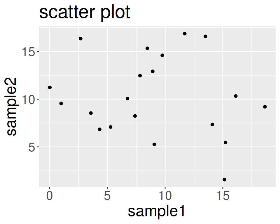
Change font size of axis text:
ggplot(data=geneexp, mapping=aes(x=sample1, y=sample2)) +
  geom_point() +
  ggtitle("scatter plot") +
  theme(axis.text = element_text(size = 20))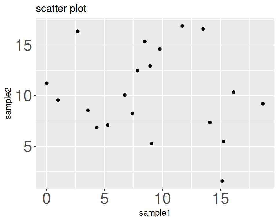
Change font size of axis titles:
ggplot(data=geneexp, mapping=aes(x=sample1, y=sample2)) +
  geom_point() +
  ggtitle("scatter plot") +
  theme(axis.title = element_text(size = 20))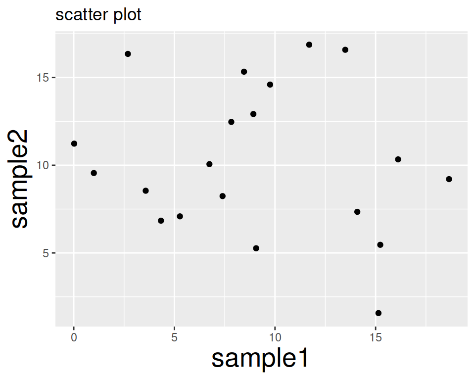
Remove axis titles (x-axis title given as an example):
ggplot(data=geneexp, mapping=aes(x=sample1, y=sample2)) +
  geom_point() +
  ggtitle("scatter plot") +
  theme(axis.title.x = element_blank())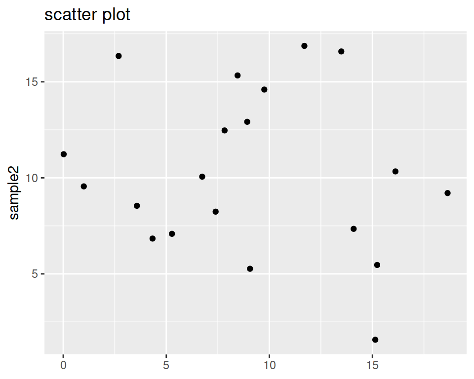
Shift a bit the main title (it is by default centered to the left):
ggplot(data=geneexp, mapping=aes(x=sample1, y=sample2)) +
  geom_point() +
  ggtitle("scatter plot") +
  theme(plot.title = element_text(hjust = 0.5))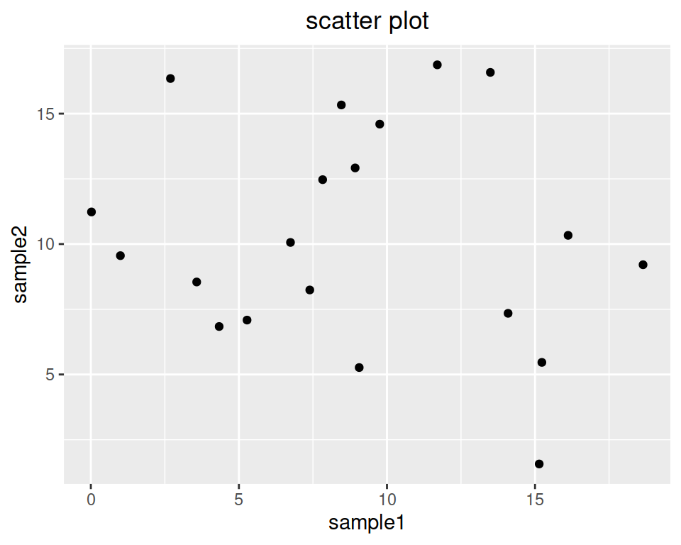
Change font size of the main title:
ggplot(data=geneexp, mapping=aes(x=sample1, y=sample2)) +
  geom_point() +
  ggtitle("scatter plot") +
  theme(plot.title = element_text(size = 20, hjust = 0.5))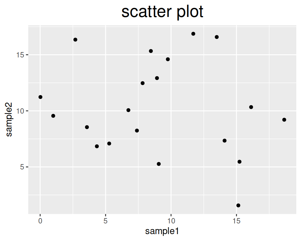
Change the color of the title, and make it bold:
ggplot(data=geneexp, mapping=aes(x=sample1, y=sample2)) +
  geom_point() +
  ggtitle("scatter plot") +
  theme(plot.title = element_text(size = 20, hjust = 0.5, face = "bold", colour = "blue"))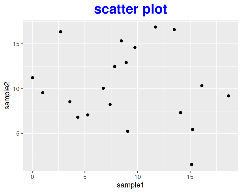
You can also use theme() to rotate the x-axis label of plots, for example:
ggplot(data=geneexp, mapping=aes(x=sample1, y=sample2)) +
  geom_point() +
  ggtitle("scatter plot") +
  theme(axis.text.x = element_text(angle=90))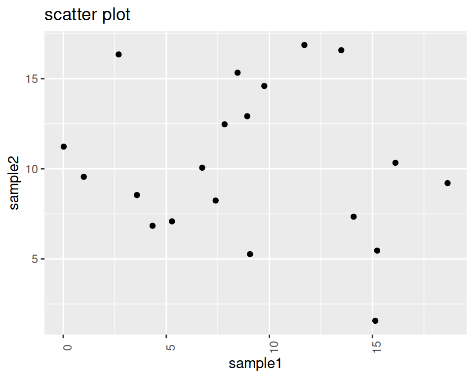
If you want to learn more, you can check this complete guide on how to modify the ggplot2 theme.