10.3 Custom scatter plot
Read in data sent by an attendee from the last edition of the course:
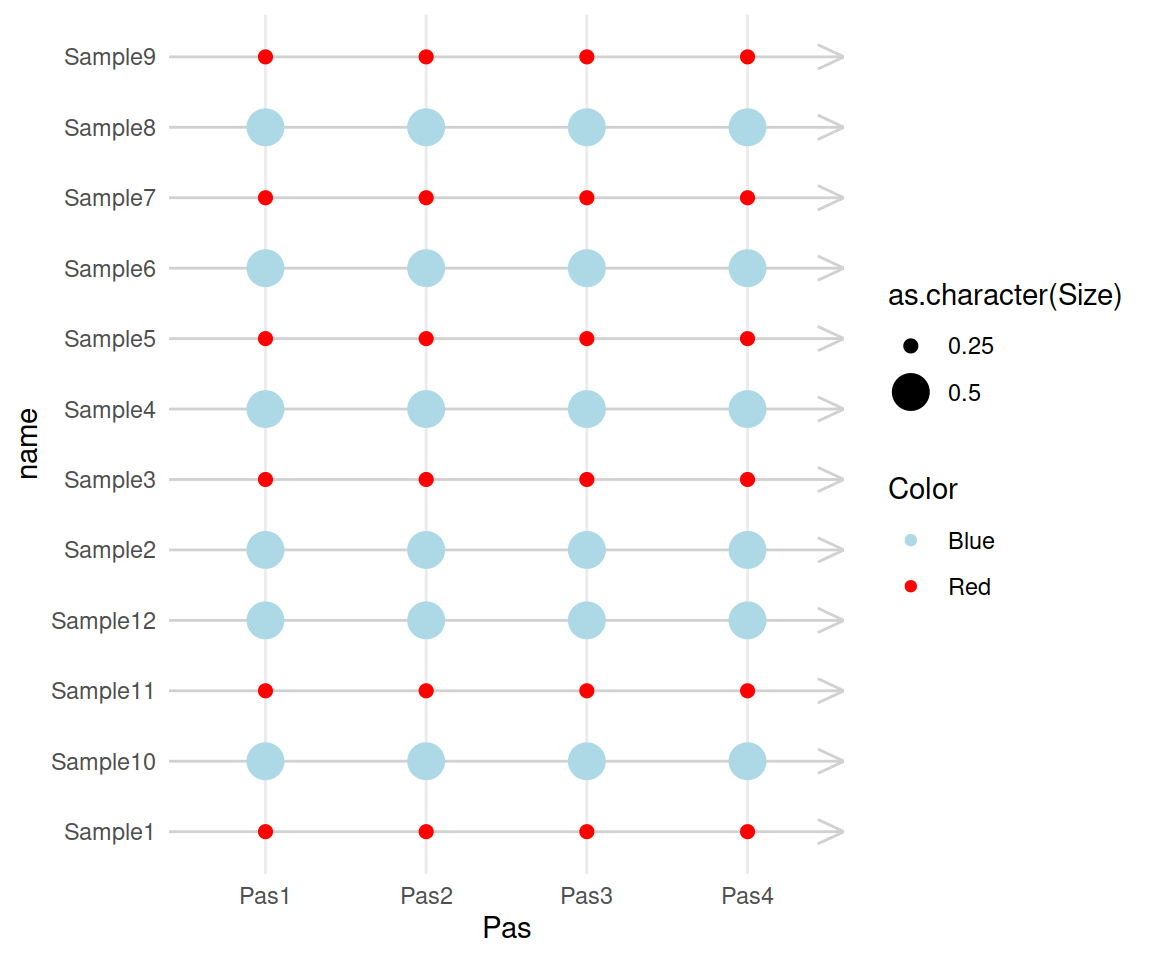
The idea is to visualize the “Pas” on the x-axis and the samples (column “name”) on the y-axis, while controling size and color from another column.
We need to convert this to a “long” format so as to move all “Pas” columns into one:
Then we build a scatter plot, based on this new long object:
ggplot(orgs_long, aes(x=Pas, y=name, size=as.character(Size), color=Color)) +
  geom_point() +
  scale_color_manual(values=c(Blue="lightblue", Red="red")) +
  theme_minimal() +
  theme(panel.grid.major.y = element_line(color="grey82", arrow = arrow(angle = 25, length = unit(.15, "inches"),type = "open")))
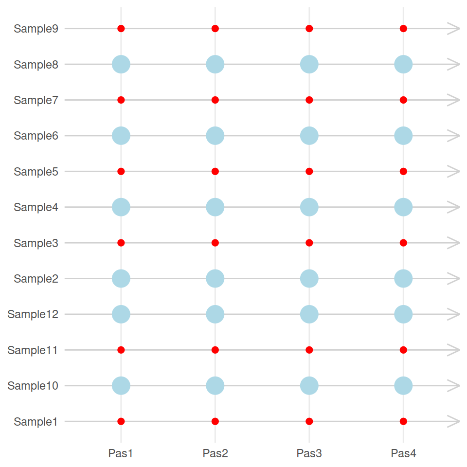
Remove the legend and the axis names:
ggplot(orgs_long, aes(x=Pas, y=name, size=as.character(Size), color=Color)) +
  geom_point() +
  scale_color_manual(values=c(Blue="lightblue", Red="red")) +
  theme_minimal() +
  theme(panel.grid.major.y = element_line(color="grey82", arrow = arrow(angle = 25, length = unit(.15, "inches"),type = "open")), legend.position="none", axis.title = element_blank())