8.6 Barplots
A barplot (or barchart) is a graph that represents categorical data with rectangular bars, which heights are proportional to the values they represent.
The first layer of the ggplot() function will be similar. However, note that we start with only the x= parameter set in aes() function (this is the basic way to plot a barplot):
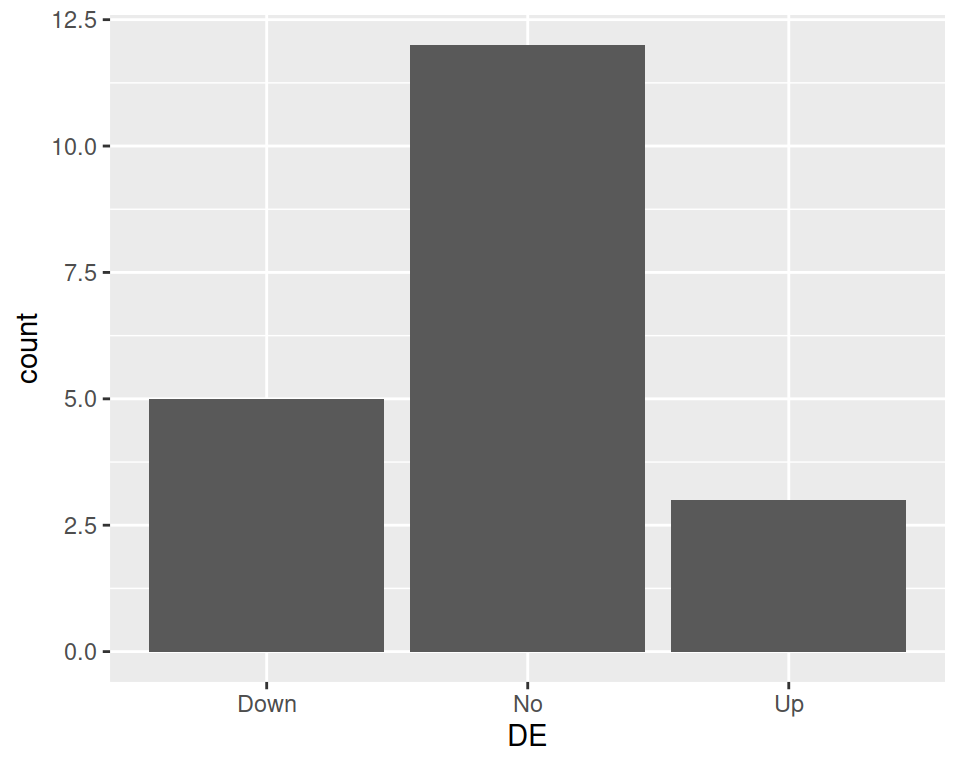
Using our previous geneexp data, we can produce a bar plot out of the DE column, such as:

This produces a barplots containing 3 bars: Down, No and Up: their height represents the number of genes found in each category.