8.2 Scatter plot
8.2.1 Base plot
We can start from the geneexp object, that holds the content of file expression_20genes.csv: we want to plot sample1 on the x axis and sample2 on the y axis.
The base layer will be the following:
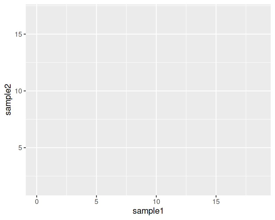
Try to copy-paste it in the console, and hit Enter. As you can see, nothing is actually plotted yet, but the base is set.
Adding to this the geometrics called geom_point(), we tell ggplot to produce a scatter/point plot:
# This line is a comment: a comment is not interpreted by R.
# Example of a scatter plot: add the geom_point() layer
ggplot(data=geneexp, mapping=aes(x=sample1, y=sample2)) +
  geom_point()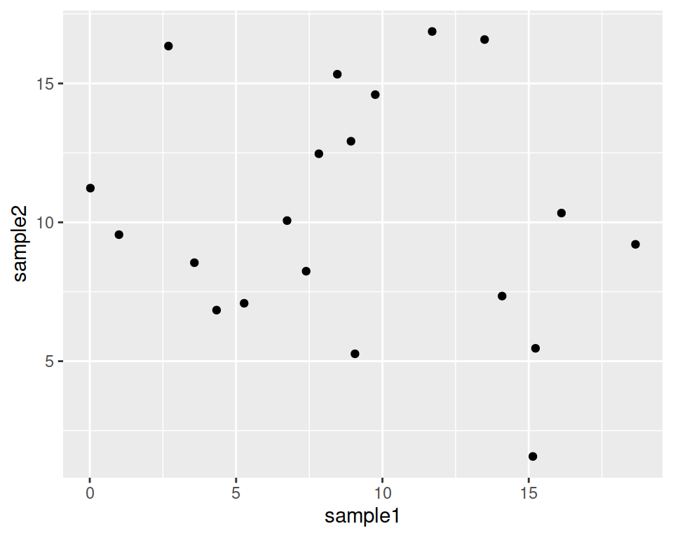
Please, copy the code above in your script!
Your plot should appear in the “Plots” tab in the bottom-right panel.
8.2.2 Customize the points
geom_point() also takes some parameters, including the point color and size:
Color all points in red:
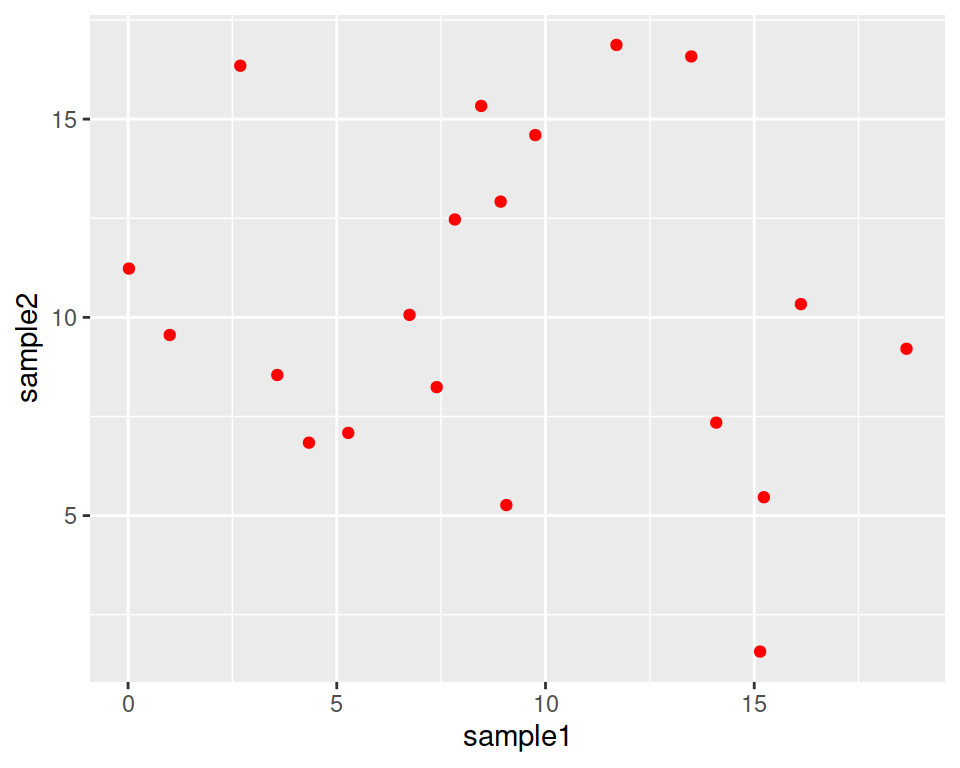
Make points larger (size default is 1.5):
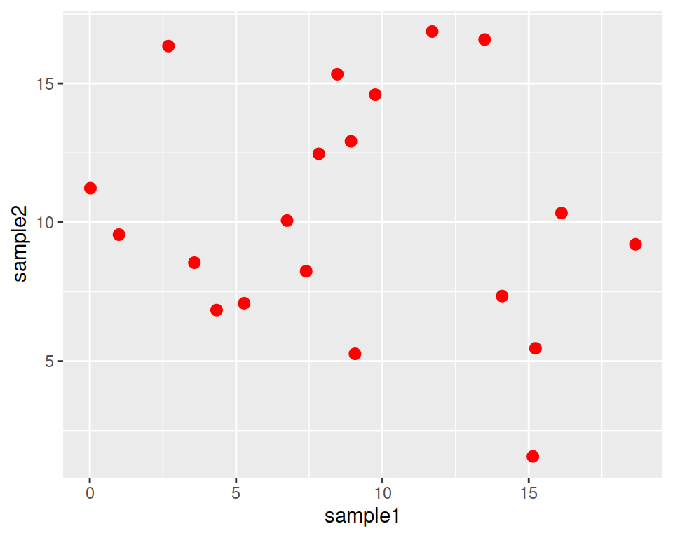
This is a good place to introduce the help pages of functions!
Functions in ggplot2 (and tidyverse in general) are richly documented.
While documentation can be quite technical it is always good practice to take a look at it.
You can access the help page of a function in the Help tab in the bottom-right panel. Give it a try with “geom_point”:
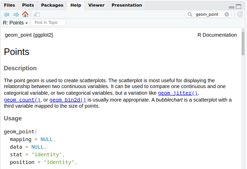
Back to our customization: you can set different shapes for the points!
This is done by setting the shape parameter in geom_point().
For example, triangles:
ggplot(data=geneexp, mapping=aes(x=sample1, y=sample2)) +
  geom_point(color="red", size=2.5, shape="triangle")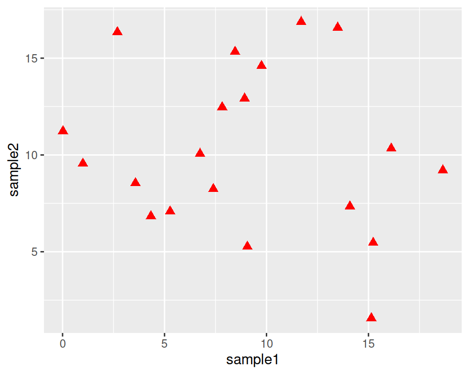
See more options in the following image:
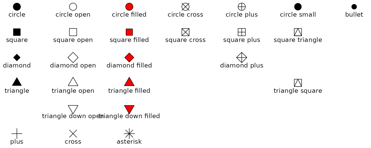
Image from ggplot2 documentation
8.2.3 Add more layers
We can add more layers to the plot, using the same structure (+ layer_name())
8.2.3.1 ggtitle()
Add a title using the ggtitle() layer:
ggplot(data=geneexp, mapping=aes(x=sample1, y=sample2)) +
  geom_point(color="red", size=2.5, shape="diamond") +
  ggtitle(label="my first ggplot")
label is a parameter of ggtitle() function.
8.2.3.2 Background
Not a big fan of the grey background? This is the default “theme”, but there are more options.
For example:
ggplot(data=geneexp, mapping=aes(x=sample1, y=sample2)) +
  geom_point(color="red", size=2.5, shape="diamond") +
  ggtitle(label="my first ggplot") +
  theme_linedraw()
ggplot(data=geneexp, mapping=aes(x=sample1, y=sample2)) +
  geom_point(color="red", size=2.5, shape="diamond") +
  ggtitle(label="my first ggplot") +
  theme_bw()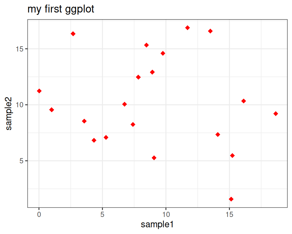
ggplot(data=geneexp, mapping=aes(x=sample1, y=sample2)) +
  geom_point(color="red", size=2.5, shape="diamond") +
  ggtitle(label="my first ggplot") +
  theme_grey()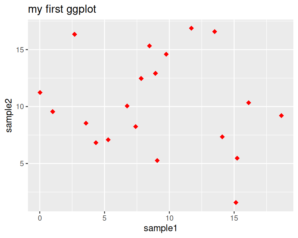
A good page to check the different backgrounds: https://ggplot2-book.org/themes#sec-theme
8.2.3.3 Regression line
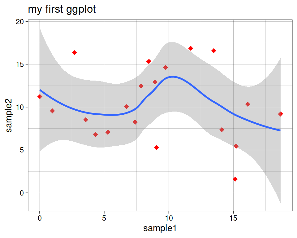
Add a regression line with geom_smooth(). A smoothed line can help highlight the dominant pattern/trend.
ggplot(data=geneexp, mapping=aes(x=sample1, y=sample2)) +
  geom_point(color="red", size=2.5, shape="diamond") +
  ggtitle(label="my first ggplot") +
  theme_linedraw() +
  geom_smooth()