19.2 Scatter plot
# Example of a scatter plot: add the geom_point() layer
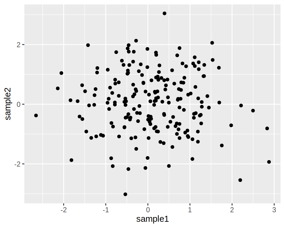
ggplot(data=dataframe, mapping=aes(x=column1, y=column2)) + geom_point()- Example of a simple scatter plot:
# Create a data frame
df1 <- data.frame(sample1=rnorm(200), sample2=rnorm(200))

# Plot !
ggplot(data= df1 , mapping=aes(x=sample1, y=sample2)) +
    geom_point()
- Add layers to that object to customize the plot:
- ggtitle to add a title
- geom_vline to add a vertical line
- etc.
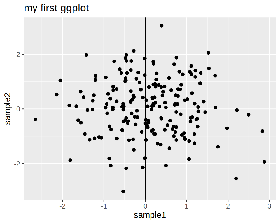
ggplot(data= df1 , mapping=aes(x=sample1, y=sample2)) +
  geom_point() +
    ggtitle(label="my first ggplot") +
    geom_vline(xintercept=0)
Bookmark that ggplot2 reference and that good cheatsheet for some of the ggplot2 options.
- You can save the plot in an object at any time and add layers to that object:
# Save in an object
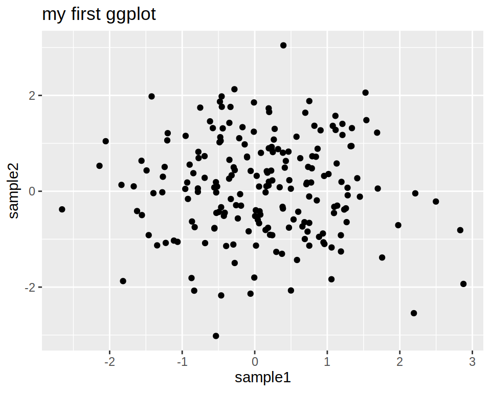
p <- ggplot(data= df1 , mapping=aes(x=sample1, y=sample2)) +
    geom_point()
# Add layers to that object
p + ggtitle(label="my first ggplot")
- What is inside the aes (aesthetics)function ?
- Anything that varies according to your data !
- Columns with values to be plotted.
- Columns with which you want to, for example, color the points.
- Anything that varies according to your data !
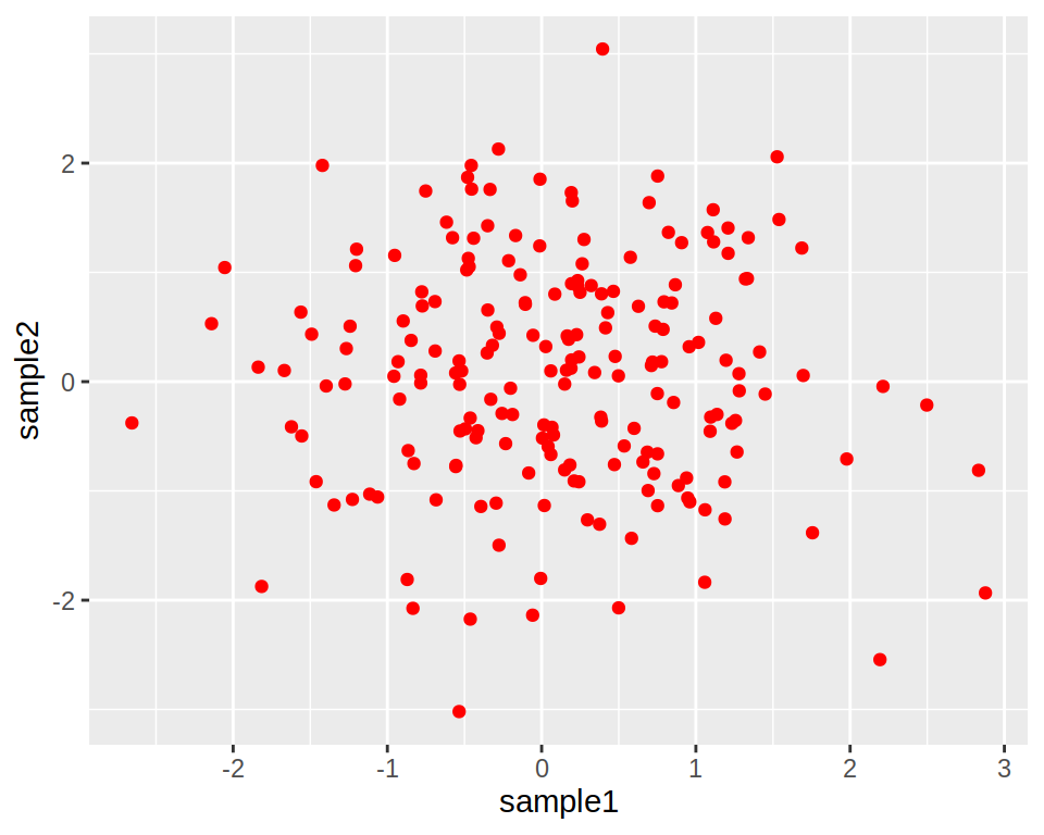
Color all points in red (not depending on the data):

Color the points according to another column in the data frame: