19.9 Exercise 12: ggplot2
Create the script “exercise12.R” and save it to the “Rcourse/Module3” directory: you will save all the commands of exercise 12 in that script.
Remember you can comment the code using #.
correction
19.9.1 Exercise 12a- Scatter plot
1- Load ggplot2 package
correction
2- Download the data we will use for plotting:
3- Read file into object “project1”
About this file: * It is comma separated (csv format) * The first row is the header * Take the row names from the first column
correction
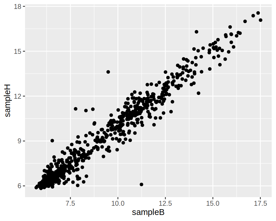
4- Using ggplot, create a simple scatter plot representing gene expression of “sampleB” on the x-axis and “sampleH” on the y-axis.
5- Create an extra column to the data frame “project1” (you can call this column “expr_limits”): if the expression of a gene is > 13 in both sampleB and sampleH, set to “high”; if the expression of a gene is < 6 in both sampleB and sampleH, set to “low”; if different, set to “normal”.
correction
# Initialize all values to "normal"
project1$expr_limits <- "normal"
# "high" if project1$sampleB > 13 and project1$sampleH > 13
project1$expr_limits[project1$sampleB > 13 & project1$sampleH > 13] <- "high"
# "low" if project1$sampleB < 6 and project1$sampleH < 6
project1$expr_limits[project1$sampleB < 6 & project1$sampleH < 6] <- "low"
6- Color the points of your scatter plot according to the newly created column “expr_limits”. Save that plot in the object “p”
correction
7- Add a layer to “p” in order to change the points colors to blue (for low), grey (for normal) and red (for high). Save this plot in the object “p2”.
8- Save p2 in a jpeg file.
a. Try with RStudio Plots window (Export)
b. Try in the console:
19.9.2 Exercise 12b- Box plot
1- Convert “project1” from a wide format to a long format: save in the object “project_long” Note: remember melt function from reshape2 package.
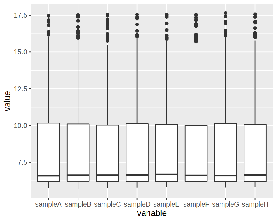
2- Produce a boxplot of the expression of all samples (each sample should be represented by a box)
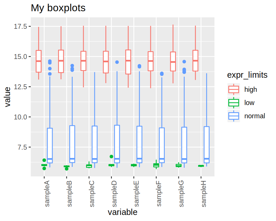
3- Modify the previous boxplot so as to obtain 3 “sub-boxplots”" per sample, each representing the expression of either “low”, “normal” or “high” genes.
correction
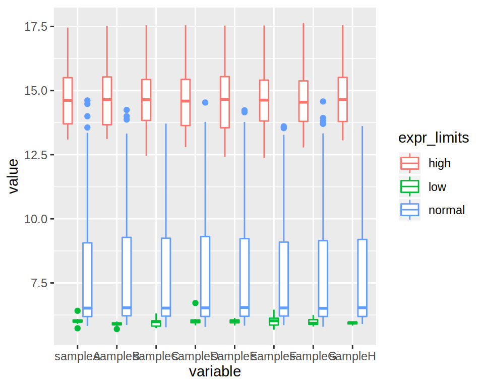
4- Rotate the x-axis labels (90 degrees angle).
This is new ! Google it !!
correction
ggplot(data=project_long, mapping=aes(x=variable, y=value, color=expr_limits)) +
geom_boxplot() +
theme(axis.text.x = element_text(angle = 90))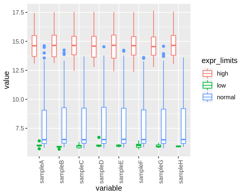
5- Finally, add a title to the plot.
19.9.3 Exercise 12c- Bar plot
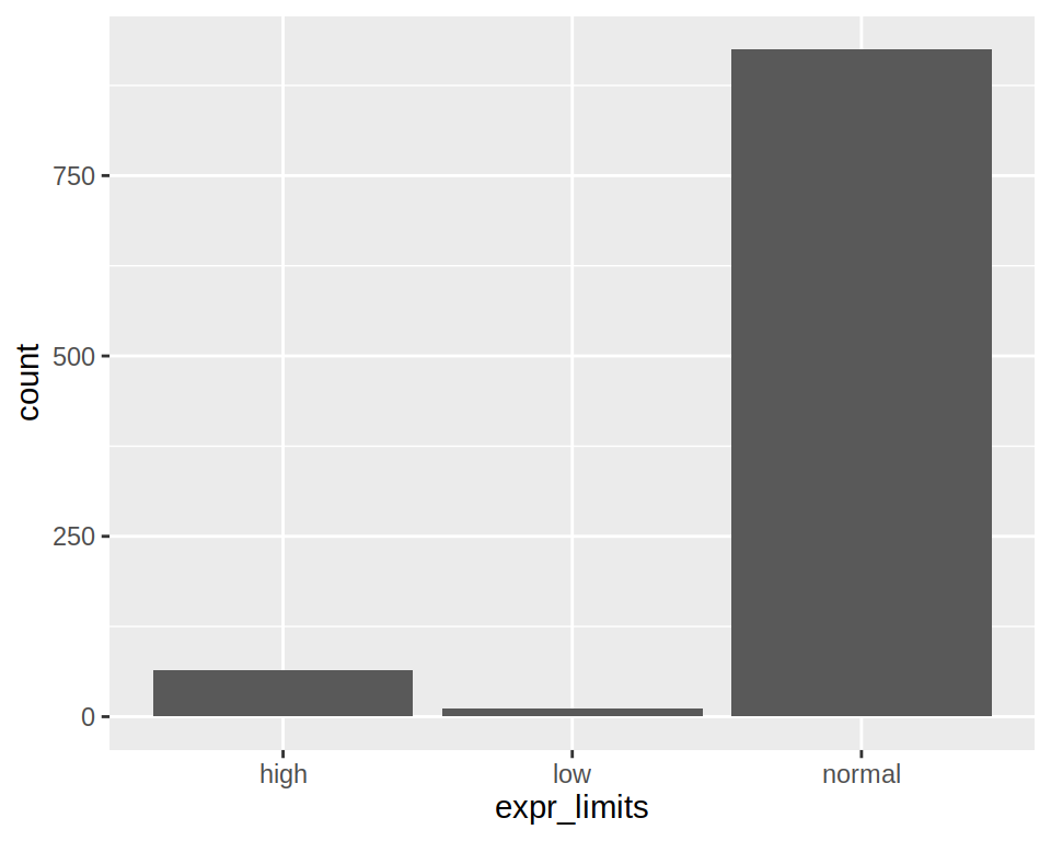
1- Produce a bar plot of how many low/normal/high genes are in the column “expr_limits” of “project1”.
2- Add an horizontal line at counts 250 (y-axis). Save the plot in the object “bar”
correction
3- Swap the x and y axis. Save in bar2.
correction
4- Save “bar” and “bar2” plots in a “png” file, using the png()** function: use grid.arrange (from the gridExtra package) to organize both plots in one page !**
correction
## png
## 219.9.4 Exercise 12d- Histogram
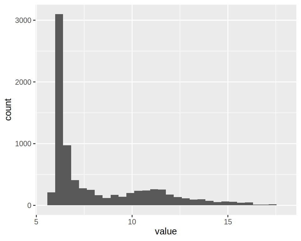
1- Create a simple histogram using project_long (column “value”).
2- Notice that you get the following warning message" stat_bin() using bins = 30. Pick better value with binwidth.
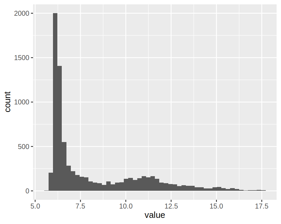
Set “bins”" parameter of geom_histogram() to 50.
3- This histogram plots expression values for All samples.
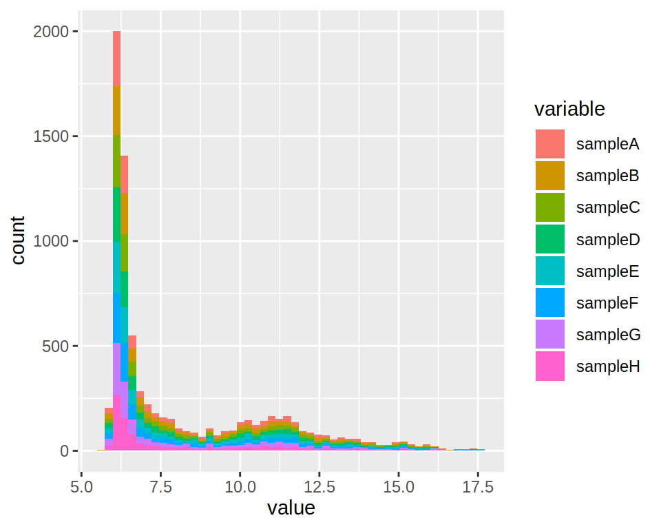
Change the plot so as to obtain one histograms per sample.
4- By default, geom_histogram produces a stacked histogram.
Change the “position” argument to “dodge”.
correction
5- A bit messy ?? Run the following:
hist2 <- ggplot(data=project_long, mapping=aes(x=value, fill=variable)) +
  geom_histogram(bins=50) +
  facet_grid(~variable)
facet_grid() is another easy way to split the views!
6- Change the default colors with scale_fill_manual().
You can try the rainbow() function for coloring.
7- Zoom in the plots: set the x-axis limits from from 6 to 13.
Add the xlim() layer.
correction
8- Change the default theme to theme_minimal()
correction
9- Save that last plot to a file (format of your choice) with ggsave()
